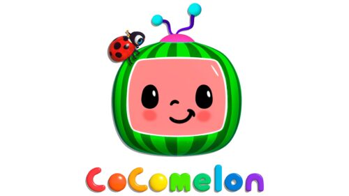
The Cocomelon logo is childish and cheerful. Designed as a friendly character, it appeals to little ones. The emblem invites you to experience new sensations and learn in a light song form.
Cocomelon: Brand overview
| Founded: | 2006 – present |
| Founder: | Moonbug Entertainment and Treasure Studio |
| Headquarters: | United States |
| Website: | cocomelon.com |
Cocomelon is the most viewed American entertainment YouTube channel for toddlers in the US, specializing in 3-D animation of children’s rhymes and songs. It belongs to Moonbug Entertainment. It has 158 billion views and 902 videos on the channel.
Meaning and History
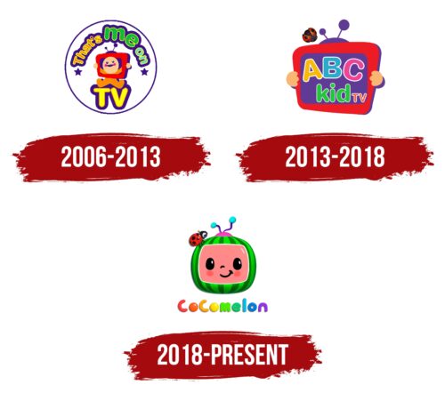
The Cocomelon logos embody the idea of the channel’s gradual progression from a personal hobby to a multimillion-viewer portal, which has brought fortune to the founders’ family. Each sign marks a successive stage moving from the private to the common and then to the original. The modern logo is unique and exclusive, distinguishing the portal amidst thousands with children’s content. Rebranding is associated with rethinking concepts and changing names. Three logos represent three different channel names.
What is Cocomelon?
It’s an internet channel on YouTube offering English-language educational songs and rhymes for toddlers up to 3 years old. It teaches numbers, colors, letters, shapes, and other age-appropriate content. The page has 159 million subscribers. The franchise includes a website, social media pages, and a specialized store with children’s products featuring the channel’s characters.
2006 – 2013
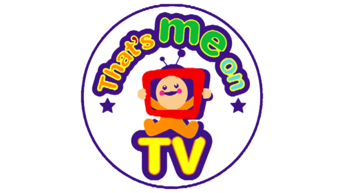
The first emblem consisted of a circle, within which a child held a TV, looking through its screen. At the bottom was the abbreviation “TV.”
The channel was created by Korean journalist Jay Jeon for the free education and learning of his children. He filmed and uploaded videos with his wife. To allow children to associate themselves with the characters, the phrase “This is me on” was used in the logo. The basis for this phrase was taken from a children’s English song about body parts with the same name: “This is me!”
The television is depicted as a red frame, similar to the YouTube logo. The child is bald and dressed in a baby onesie, hinting at the young age of the audience.
The circle symbolizes harmony and the small world of children. The channel is like a special planet that toddlers enter when watching videos. The two stars at the beginning and end of the inscription enhance this impression.
Bright colors immediately catch the attention of children.
2013 – 2018
It was only in 2013 that the channel moved to the idea of cartoons and videos for all children. A logo change marked this new era. Until 2013, the channel featured short 2-minute videos focused on teaching kids the alphabet – precisely the goal pursued by the Jeon couple.
The 2013 rebranding expanded content, which was reflected in the logo’s change and the disappearance of the infant. The viewer’s age increased to 3-4 years, as did the duration of the videos.
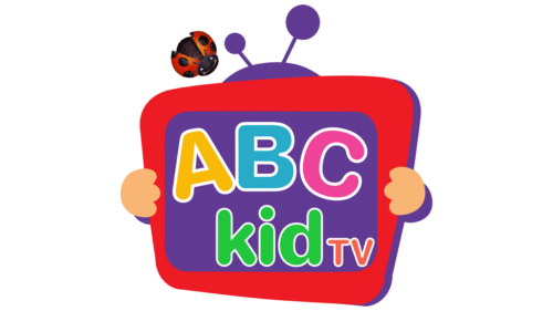
The new emblem featured the image of a television being held by a child’s hands. The screen was transformed into a chalkboard, with the new channel name, ABC Kid TV, above a ladybug. The insect symbolizes curiosity and a desire to explore the world.
The letters written on the chalkboard also indicate the maturing of the audience and the transition to more serious educational videos.
2018 – today
In 2018, the channel acquired its individuality with a new name. The founders considered the previous one to be more rigid and scholastic. The word “Cocomelon” doesn’t have a specific translation, but it’s easily pronounced by toddlers.
One could assume that it is a combination of two words: Coco from “coconut” and melon from “watermelon.” The idea of creating new words by combining existing ones is characteristic of toddlers. The Jeon family used a new fruit name for their channel as an embodiment of children’s curiosity, development, and imagination.
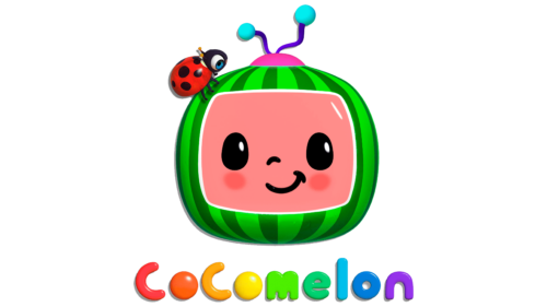
The new logo character in the form of a watermelon confirms the fruity idea. The TV screen has been transformed into the face screen of a tele-watermelon. The fruit is juicy, bright, and sweet, which is why it is loved by most children. The content of the channel, like a watermelon, is full of fun and light music in which educational seeds are immersed.
The association underscores that children, like fruit, grow and mature. The channel facilitates this process through the knowledge it provides.
The ladybug remained in the emblem. It is part of the video stylization, as all clips start and end with it.
Font and Colors
The Cocomelon logo includes the following:
- All the colors of the rainbow.
- Reflecting the diversity of content.
- The distinctness of children from each other.
- The unique world that children are yet to explore.
The font is voluminous; the letters O are replaced with M&M’s candies, making the inscription unique and “sweet.”
Cocomelon color codes
| Neon Orange | Hex color: | #ff6526 |
|---|---|---|
| RGB: | 255 101 38 | |
| CMYK: | 0 60 85 0 | |
| Pantone: | PMS 1655 C |
| Canary Yellow | Hex color: | #ffee04 |
|---|---|---|
| RGB: | 255 238 4 | |
| CMYK: | 0 7 98 0 | |
| Pantone: | PMS 102 C |
| UFO Green | Hex color: | #00d372 |
|---|---|---|
| RGB: | 0 211 114 | |
| CMYK: | 100 0 46 17 | |
| Pantone: | PMS 354 C |
| Steel Blue | Hex color: | #007ddb |
|---|---|---|
| RGB: | 0 125 219 | |
| CMYK: | 100 43 0 14 | |
| Pantone: | PMS 285 C |
| Blue Violet | Hex color: | #9331e7 |
|---|---|---|
| RGB: | 147 49 231 | |
| CMYK: | 36 79 0 9 | |
| Pantone: | PMS 2592 C |
