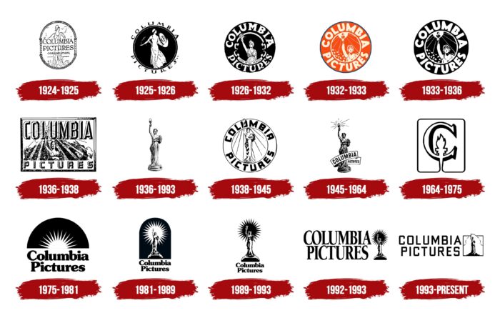
The Columbia Pictures logo symbolizes inspiration because that’s what helps talented people make films. This is something without which the work of directors, camera operators, actors, and representatives of other film professions is impossible. The emblem also represents creativity and success.
Columbia Pictures: Brand overview
| Founded: | June 19, 1918 |
| Founder: | Harry and Jack Cohn, Joe Brandt |
| Headquarters: | Culver City, California, U.S. |
| Website: | sonypictures.com |
There isn’t a movie buff in the world who isn’t familiar with one of America’s leading film and television companies, Columbia Pictures. Founded back in 1924, today, the public company is part of the Sony Pictures Motion Picture Group, whose owner since 1989 is Sony Pictures Entertainment. The latter is a subsidiary of the world’s largest multinational corporation, Sony Group Corporation, third behind Hitachi and Panasonic. Sony Group Corporation is the largest media conglomerate in the world.
In turn, Columbia Pictures, which is among the top five U.S. studios, consists of several divisions, the largest of which is TriStar Pictures.
Over the years, the company went on a difficult and thorny development path. While constantly improving, trying to be among the first to apply the achievements of technology in its field, it often changed its image. As a result, for nearly a century of its existence, the company has been rebranded 14 times, changing its logo and television screen saver. Often the new logo existed for only one year and was changed to the next development of the brand mark.
Meaning and History
The history of the famous television company began with the founding of its predecessor, CBC Film Sales Corporation. It was a family project of the Cohn brothers. The business was strictly a family business. Family members and close relatives were involved. Only a few employees and producer Joe Brandt were not related to the family. The company was unprofitable with a very low rating; many jokingly translated its acronym as Corned Beef and Cabbage.
For five years, the family struggled to survive the business until, in 1924, the company’s founders decided to take the last resort – to rebrand (as it is called today) the company. The attempt to distance themselves from the bad name that had proven itself was unexpectedly successful. The new Columbia Pictures name helped reverse the decline.
Nevertheless, the future American film and television leader until the middle of the 20th century showed the lowest level of income among similar film companies. This did not allow the expansion of the budget to the required level. Keeping the company afloat were the successful comedies of Hawkes and Capra. It Happened One Night, Mr. Smith Goes to Washington, and the comedian’s Three Stooges, which were not particularly demanding on production costs, as well as several low-budget series for homemakers. The need to save money meant that sets and props were not replenished, and the same items and decorations had to be used in different films. Supporting income for the company was also provided by Walt Disney Studios, which used Columbia Pictures to distribute its cartoons.
The forties of the last century could have been criticized because of the departure of Frank Capra and his comedies. But an accident saved the company. Harry Cohn happened to meet Rita Hayworth, a film actress and dancer who came to fame after starring in “Gilda.” From that moment on, the company’s business took off. Especially after Harry Cohn’s fortunate and timely decision to refocus one of its divisions instead of animation on the production of simple series, the boom in which began in the early ’50s.
During the current decade, three of the company’s pictures won Oscars at once. And as early as 1962, “Lawrence of Arabia,” directed by David Lean, became the fourth Oscar winner. The company took significant steps toward achieving flagship status in its business at the national level.
The ’60s were critical for many studios. Columbia Pictures turned to investors who could support it during these difficult times. In 1980, the company was taken over by the Coca-Cola group. But by the end of the ’80s, its controlling stake was acquired by Sony Corporation. From this moment began a meteoric rise of the film company, continuing to this day.
The historical events and the company’s ups and downs were reflected in its brand signs, frequent logo changes, and image. And the iconic changes are only one of them.
1924 – 1925
1925 – 1926
1926 – 1932
1932 – 1933
1933 – 1936
1936 – 1938
During this period, the logo was rectangular in shape. The Columbia lettering was above the woman’s head; at the top of the image, Pictures were placed at the very bottom in a free field, typed in a smaller font.
1936 – 1993
The company’s symbol of its U.S. national identity – a female silhouette carrying a torch high above her head – gained completeness and volume during this period. By appearing in the flickering light in the background, which supposedly created the torch, it provided visual memorability and a better brand mark than all past versions. This female figure also had its prototype, actress Evelyn Venable. It underwent several modifications in the following years while maintaining its overall focus.
1938 – 1945
The female silhouette with the torch was already made full-length and enclosed in a circle, which, in turn, was the inside of an even larger circle. In the free field between them, the first word of the company name was typed in black capital letters in an arc at the top. At the bottom was the second word. The size and typeface type was chosen to be the same.
1945 – 1964
Considerable changes were made to the logo. The drawing of the female figure standing on a small pedestal, created in 1936, was refined. Her torch radiated light, which was symbolically depicted, departing from it in different directions of different lengths of the rays. The name was made on a ribbon that, in a right-to-left movement – first down and then behind the figure, rising – encompassed the legs of the female figure. Columbia is written in large capital letters on the foreground portion of the ribbon and Pictures on the background portion of the ribbon. This part of the ribbon and the font are smaller than the front, which creates a visual effect of distance.
But in this version of the logo, some changes throughout the further period existed on the screens until 1975. The last time it appears in the film “Harry and Walter Go to New York.”
1964 – 1975
1975 – 1981
1981 – 1989
This was a time of the active search for a new image. The company was constantly experimenting with its logo. The basis of the logo made by Frankfort Communications is still the same woman holding a torch in her right hand. But the symbol of light emitted by the torch covered a large area behind the figure, creating a head and shoulders halo in the form of a circle with evenly departing conical rays around its circumference. It was blue in color and flickered on the screen. Underneath it was the text of the company name in Souvenir font. However, in the TV version, only the top half of the halo was used, with the inscription below it. The half-circle itself was orange or red.
1989 – 1993
1992 – 1993
1993 – today
Columbia Pictures: Interesting Facts
Columbia Pictures, a major player in Hollywood, has an impressive history full of breakthroughs, unforgettable movies, and major contributions to the entertainment world.
- Early Days: Founded in 1918 by Harry Cohn, Jack Cohn, and Joe Brandt as C.B.C. Film Sales Corporation, Columbia Pictures started by making low-budget movies.
- Rise to Fame: Once a part of “Poverty Row,” Columbia succeeded in the 1930s thanks to collaborations with talented people.
- Oscar Milestones: “It Happened One Night” from Columbia won the “Big Five” Academy Awards in 1935. The studio also saw the first woman nominated for Best Director, Dorothy Arzner, with “The Awful Truth.”
- Famous Logo: Columbia’s widely known logo, the “Columbia Lady,” a Roman soldier with a torch, has been updated several times.
- Corporate Changes: Columbia was bought by Coca-Cola in 1982 and later by Sony Corporation in 1989, moves that helped it enter new markets.
- Leading in HDTV: Under Sony, Columbia Pictures led in high-definition television, showcasing the technology’s possibilities through its movies.
- Spider-Man Success: The studio holds rights to the Spider-Man series, which has been a major success that has significantly boosted its reputation and finances.
- Notable Films: Columbia has created hits like “Lawrence of Arabia,” “Ghostbusters,” “Men in Black,” and “The Social Network,” highlighting its wide-ranging film production capabilities.
- Tech Innovations: Columbia was an early user of Technicolor and stereo sound, enhancing the viewing experience and setting new industry standards.
- Awards: Columbia Pictures has won numerous awards, including many Academy Awards, showcasing its commitment to high-quality films.
Columbia Pictures’ evolution from a small studio to a key part of Hollywood’s elite reflects its lasting impact on movie history, technological advancements, and the global entertainment scene.
Font and Colors
Modern color digital television and the Internet demanded to meet all the conditions for high-quality transmission of visual information. The latest logo is made in full color with the use of dynamics. The blue sky in the clouds, illuminated by the pinkish-red color created by the torch, is conveyed with photographic precision. The glare and the iridescent circle created by its light, spreading out in waves, are conveyed very naturally. Behind the torch, above the female figure’s head, is the word Columbia in Gothic volumetric type. Beneath the figure is an inscription in small, gold-colored type – Sony Pictures Entertainment company.
A female figure stands atop a stepped pedestal. She is wearing a Greek chiton and a blue cape, which she supports with her left hand. Her brown hair with a golden tint harmonizes favorably with the background while standing out very clearly and attracting attention.
This version of the logo is familiar to movie buffs worldwide today.
Columbia Pictures color codes
| Black | Hex color: | #000000 |
|---|---|---|
| RGB: | 0 0 0 | |
| CMYK: | 0 0 0 100 | |
| Pantone: | PMS Process Black C |


