The rays of the color spectrum are visible in the elements of the emblem. Merging, they creates bright and rich images. It’s interesting on the giant’s channels. There are programs for every taste, and everyone will find something suitable. The Comcast logo is an example of exciting diversity.
Comcast: Brand overview
| Founded: | June 28, 1963 |
| Founder: | Ralph J. Roberts |
| Headquarters: | Philadelphia, Pennsylvania, U.S. |
| Website: | corporate.comcast.com |
Meaning and History
In the early years, the TV broadcasting company had a completely different name: it was founded as American Cable Systems and existed in this status until 1969. Then it received the name Comcast Holdings (officially in 2001) and then became Comcast Corporation. Moreover, her services range was originally such and expanded, so she often changed her legal status.
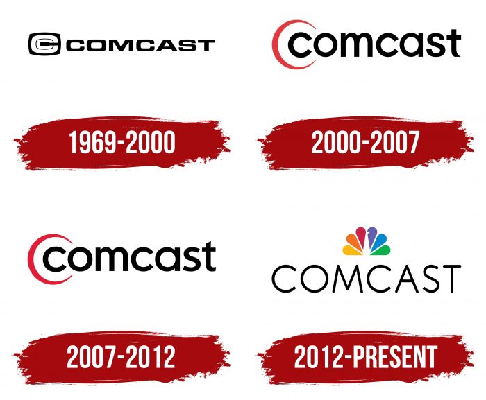
The active promotion of the corporation began after the purchase of NBCUniversal from General Electric. In 2011, she received 51 percent of the shares, and a year later – the remaining 49. After becoming the full owner, Comcast began to reorganize. A redesign of personal attributes accompanied each stage of development. In total, there are four logos in its history.
What is Comcast?
Comcast is a US telecommunications company with three media divisions: Sky, NBCUniversal, and Comcast Cable. It appeared in 1963 and is located in Philadelphia, Pennsylvania.
1969 – 2000
The debut emblem contains the company name made up of two stems. The word “Comcast” includes the concepts of “communication” and “broadcast”: the beginning is taken from the first, the end from the second. The text is written in a classic sans-serif font: letters are even, squat, wide, consisting of thickened strokes. The internal breakdown is minimal, so the signs are close to each other. There is an icon that is one and a half times larger than the inscription on the left. It shows the first letter of the title. It has a double face and looks like a character within a character – a small “C” in a large. Its background is an uneven black rectangle.
2000 – 2007
A new sample of the company’s visual identity was presented in December 1999 and officially approved in 2000. It is no different from the previous version in terms of structure and content, but outwardly it has undergone significant changes. The designers have replaced the font using elongated lowercase letters. They made the last character “t” a key feature. It has the lower protrusion of the leg cut obliquely, making it look like a short pointed element. The icon also transformed: from heavy and complex, it turned into light and simple. The sign looks like a crescent moon surrounding the first letter in the word “Comcast.”
2007 – 2012
During this period, only the last two letters were changed. The “s” has wide internal gaps, and the “t” has the clipped segment at the bottom disappeared, so the symbol looks standard.
2012 – today
In 2011, after acquiring a controlling stake in NBCUniversal, the company focused on its revival. The first thing she did was eliminate the thin red semicircle in the first letter in the title. As a result, in December 2012, Comcast adopted the NBC logo – in the form of a “peacock tail” with a rainbow palette (time of its appearance – 1986th year).
Comcast: Interesting Facts
Comcast is a big company that helps people watch TV, use the internet, and make phone calls. It started way back in 1963 in a place called Tupelo, Mississippi.
- How It Started: Ralph J. Roberts and his two friends started Comcast, first called American Cable Systems. At first, it was just a small TV company.
- New Name: They changed the name to Comcast in 1969, which comes from the combination of “Communication” and “Broadcast.”
- Lots of Customers: Comcast is big in the United States, providing many people with TV and internet service.
- Buying NBCUniversal: 2011 Comcast got even bigger when it bought NBCUniversal. They started making TV shows and movies and even got into theme parks.
- Xfinity: In 2010, Comcast started calling its services for regular people, such as TV and internet, “Xfinity,” to clarify what services they were offering.
- Cool Tech: Comcast has developed some neat technology, like the X1 platform, which combines live TV, rented movies, and streaming apps.
- Investing in Startups: Comcast Ventures is part of a company that gives money to new companies starting up and working on things like virtual reality and online security.
- Helping Families: Comcast’s Internet Essentials program helps low-income families get cheap Internet access. It also gives away computers at a discount and teaches people how to use the Internet.
- Buying Sky: In 2018, Comcast became even bigger by buying Sky, a European company that does many of the same things Comcast does.
- Caring for the Planet: Comcast is trying to be better for the environment by using less energy and investing in things like wind and solar power.
Comcast has grown from a tiny cable company to one of the biggest companies that brings entertainment and the internet to people’s homes. It is always trying to come up with new ideas and help where possible.
Font and Colors
At all times, the corporate logo has been associated with the name of a telecommunications corporation. The word “Comcast” has been played in several variations and supplemented with icons. First is an irregular rectangle with a double “C.” Then – with a thin red crescent, repeating the initial letter. At the end – a rainbow “fan” of a teardrop shape, located in the center above the text.
The modern emblem uses a typeface that most closely resembles two types of fonts from the Comfortaa family – Light and Regular (with different weights). Their main difference from the logo version is that all the ends are rounded, not just the beginning. And the angle at “M” is more linear, not curved. After changing the icon, the logo palette became much more diverse. In addition to black, yellow, orange, red, purple, blue, and green, it appeared.
FAQ
What is the Comcast logo?
The logo combines the colorful peacock emblem with the word “COMCAST” written below it. This design represents Comcast’s ownership of NBCUniversal, as the peacock has been a symbol of NBC since the 1950s.
The peacock emblem features vibrant colors, each feather representing one of NBC’s divisions. These colors signify diversity and creativity. Including the peacock in Comcast’s logo highlights the connection between the two brands and their shared values.
The word “COMCAST” is written in a clean, modern font below the peacock. This simple design makes the logo easily recognizable and conveys professionalism and reliability.
The logo shows the brand’s connection to NBCUniversal and its dedication to delivering diverse and innovative content to its customers.
What is Comcast known for?
Comcast is a major player in the broadcasting and cable television industry. Regarding revenue, it is the world’s second-largest broadcasting and cable TV company, following AT&T. The brand holds key positions in the telecommunications market.
Comcast is the third-largest pay-TV company and the second-largest cable TV company by subscribers. This wide reach in TV services shows its influence and ability to deliver various content to millions of viewers. The brand’s large subscriber base highlights its role in shaping entertainment and information.
The company is the largest home Internet service provider in the United States. This leadership in the broadband market shows the brand’s commitment to providing reliable and high-speed internet access to homes nationwide. Its services help millions of users stay connected, work remotely, stream content, and access information.
Are Xfinity and Comcast the same?
Yes, Xfinity and Comcast are related. Comcast owns Xfinity and launched the brand in 2010. Xfinity is the brand Comcast uses to offer internet, TV, home security, and phone services.
Xfinity was created to improve and focus on the company’s consumer services. The brand covers high-speed internet, cable TV with many channels and on-demand options, home security systems, and digital phone services.
Comcast is the parent company, while Xfinity represents the consumer side. This helps distinguish between the corporate entity and the services provided to customers. Rebranding to Xfinity allowed Comcast to update and expand its offerings to meet modern demands and technology standards.
What is the company Comcast?
Comcast is a US-based global media corporation that provides mobile communications, high-speed Internet, and television services. It is one of the world’s largest broadcasting and cable television companies. The brand produces content and operates through various brands, such as Xfinity, NBCUniversal, and Sky.
The Xfinity brand offers high-speed internet, cable TV, home security, and digital phone services.
NBCUniversal is another major part of the brand, producing and distributing films, television programs, and other media content. It also runs well-known networks and studios, including NBC, Telemundo, Universal Pictures, and Universal Parks & Resorts.
Sky, a European media and telecommunications company, further expands the brand’s reach. Sky offers television, broadband, and mobile services in several European countries.
Who founded Comcast?
Julian A. Brodsky and Ralph J. Roberts, a father-and-son team, founded the company. They started it as a family business and led it for many years, becoming one of the world’s largest and most influential media corporations.
Ralph J. Roberts played a crucial role in the company’s early growth. He focused on buying small cable systems and integrating them into a unified network, which laid the foundation for the brand’s future success. Julian A. Brodsky managed the company’s finances and investments, ensuring steady growth and stability.
Under their leadership, the company expanded its services beyond cable TV to include high-speed internet, mobile communications, and content production. They guided the brand through the fast-changing telecommunications industry, helping it evolve and adapt to new technologies and market demands.
Does Comcast have a logo?
Yes, the brand has a logo. Initially, it featured the name “Comcast,” derived from “COMmunication” and “broadcast,” emphasizing the company’s focus on telecommunications and broadcasting.
After acquiring NBCUniversal, Comcast adopted the multicolored peacock emblem from NBC. With its vibrant, teardrop-shaped elements, the peacock became part of the logo, symbolizing the integration of NBCUniversal and the expanded range of services the brand offers.
The current logo combines the colorful peacock with the word “Comcast” written below it. The multicolored peacock represents creativity and a wide array of offerings, while the clean, modern font of the company name conveys professionalism and reliability.
