 Comedy Central Productions Logo PNG
For the TV channel, the Comedy Central Productions logo is an opportunity to claim their rights to their own filmed content. This symbol accompanies all original broadcasts, reminding you not to copy them. And the emblem also indicates the creativity of television people.
Comedy Central Productions: Brand overview
| Founded: | April 1, 1991 |
| Founder: | Paramount Media Networks |
| Headquarters: | New York, U.S. |
| Website: | cc.com |
Meaning and History
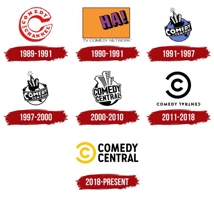
The basis for Comedy Central Productions was two independent channels that appeared at different times and worked separately. One of them was called Ha!, and the second – was Comedy Channel. They merged in April 1991 to form CTV: The Comedy Network. Just a few months later, the brand was renamed Comedy Central. Throughout the history of its existence, it has changed seven logos. His final distinguishing symbol consists of two yellow “C”s, which look like a copyright sign.
What is Comedy Central Productions?
Comedy Central Productions is a television channel owned by Paramount Media Networks. It is available in the US and also has international versions. The main content is designed for teenagers and middle-aged people. Mostly these are comedy programs, serials, and films.
1989 – 1991
Before merging with Ha!, the Comedy Channel Originals used an emblem in the form of a large letter “C,” stylized as a horseshoe. Its main part was white, and the artists made the contours and protruding edges red. Inside the “C” was an inscription consisting of the words “Comedy” (top), “The” (middle), and “Channel” (bottom).
1990 – 1991
The second predecessor of Comedy Central Productions, known as Ha! TV Comedy Network Originals, used an orange square logo until 1991. It is believed that it was developed by employees of Fred / Alan, who also promoted Nickelodeon.
In the upper right corner of the quadrilateral were purple letters “H” and “A” with an exclamation mark. To make them appear voluminous, the designers added unevenly wide black outlines. And the inscription “TV COMEDY NETWORK,” made in sans-serif capital characters and located under the geometric figure, was completely black.
1991 – 1997
In 1991, due to the merger of the two TV channels, the Comedy Central Productions network appeared. Its logo was based on a blue planet – obviously Earth with one large dark continent. The space object surrounded a wide black ribbon with white text “COMEDY CENTRAL.” All letters were converted to uppercase, with the first “C” standing alone. In the planet’s northern hemisphere, the artists depicted three multi-story buildings in a cartoon style. On the roof of one of the skyscrapers was a television transmitter. The author of this version is PMcD Design.
1997 – 2000
In 1997, two important events occurred at once in the television network’s history. First, the animated sitcom South Park premiered. Secondly, the multi-colored logo is no longer so colorful: the designers from H-Gun Labs made the blue planet turn white. In addition, they slightly changed the shape of the continent and other minor details.
2000 – 2010
The dawn of the new millennium was marked by yet another redesign of the Comedy Central Productions emblem. It was held by the employees of the studio Imaginary Forces. They modernized and enlarged three high-rise buildings and, at the same time, removed the television transmitter from the roof. The planet turned black. The continent and the ribbon disappeared: instead, a large white dialogue cloud appeared, which served as the basis for the inscription.
2011 – 2018
In the Lab studio, 2011 created the so-called Comedymark for the television network – a logo that looks like a copyright sign. This association arose because it consisted of two “C”s: a smaller ordinary letter was inside a large “C” turned in the opposite direction. The same mirror effect was used in the text: the word “COMEDY” looked standard, while “CENTRAL” was turned upside down and read backward. At the same time, they were both written in black capital glyphs without serifs.
2018 – today
Unveiled in 2018, the logo was the result of a collaboration between Comedy Central’s in-house designers and Loyalkaspar staff. They repainted the Comedymark yellow, placed it on the right, split the wordmark into two lines, and placed it on the left. At the same time, the font has changed: now, the letters are stretched vertically.
Font and Colors
The copyright-like symbol distinguishes Comedy Central Productions from other television networks. The fact is that Viacom, which owns this brand, pays a lot of attention to copyright. Therefore, the emblem, consisting of two “C,” recalls the prohibition of copying the channel’s content.
In the previous logo, the designers used the Brandon Grotesque typeface to create compact lettering. The Comedy Central wordmark can now be recognized by a grotesque called Comedy Sans. This is the basis of corporate typography. The brand’s color scheme is also unique: in addition to the traditional combination of black and white, it features a bright yellow shade known as Summer Ale.
Comedy Central Productions color codes
| Golden Poppy | Hex color: | #fdc600 |
|---|---|---|
| RGB: | 253 198 0 | |
| CMYK: | 0 22 100 1 | |
| Pantone: | PMS 7549 C |
| Black | Hex color: | #000000 |
|---|---|---|
| RGB: | 0 0 0 | |
| CMYK: | 0 0 0 100 | |
| Pantone: | PMS Process Black C |
