The unfinished elements of the logo are reminiscent of jigsaw puzzles, which, when assembled, teach a beautiful picture. The Conforama logo reflects the furniture delivery system developed by the company. The sign promises: parts connect quickly.
Conforama: Brand overview
| Founded: | 12 December 1967 |
| Founder: | Pierre and Guy Sordoillet, Jean Moll and Jacques Ragageot |
| Headquarters: | Lognes, Seine-et-Marne, France |
| Website: | conforama.fr |
Meaning and History
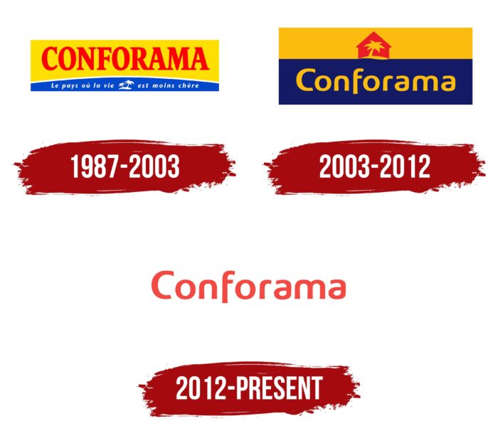
The key to Conforama’s success is its identity – simple at first glance but quite recognizable. It had changed several times, most recently when the French chain of stores was taken over by Steinhoff International, a South African-German-Dutch holding. Before that, Conforama was owned by Pinault SA group (since 1991), even earlier – by the financial company Agache-Willot (since 1976). Until 1976, it was owned by its founders, four Frenchmen who opened the first outlet in the municipality of Saint-Priest in 1967.
In 2020, the home goods retailer was taken over by the French-Austrian holding company Mobilux. This saved it from liquidation due to financial difficulties. But the transition to a new owner did not affect the Conforama logo: the company continues to use the orange word mark adopted in 2012 and is in no hurry to change it.
What is Conforama?
Conforama is one of the largest European companies in the market of household goods, which positions itself as a trendsetter in interior design. It has a network of 200 stores with three product categories: furniture, furnishings, and appliances. The headquarters of the retailer is located in France.
1987 – 2003
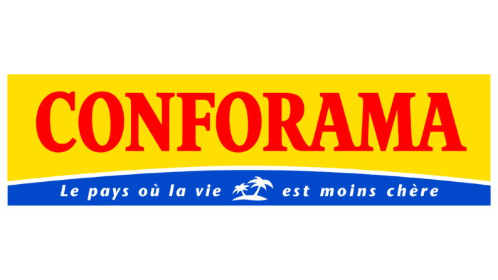
When Agache-Willot still owned the chain of stores, it started using the logo with the image of an oasis. But this element was not considered the main one at the time. Firstly, it was very small. Secondly, the designers placed it at the very bottom, between the words “vie” and “est” in the phrase “Le pays où la vie est moins chère.” The motto, which translates from French as “The country, where life is less expensive,” was written in white italic type inside a convex rectangle of blue.
The red word “CONFORAMA” occupied the main part of the graphic sign. It was above the slogan of the retail chain and contrasted against the yellow quadrangle with a concave bottom. To make the brand name even more noticeable, the creators of the logo chose a bold font with long serifs, roughly similar to SoftMaker’s Garamond Nova Pro Condensed Bold.
The artists’ Oasis looked like two white palm trees sticking out of an equally white patch of ground. It symbolized the coveted place everyone was looking for, a vegetation-rich corner in the middle of an oppressive desert. The company compared itself to a bountiful spring, giving life to something new. This theme was played up not only in the image of the oasis but also in the two quadrangular shapes in the background of the inscription: the yellow block was associated with sand or the sun, and the blue with water.
2003 – 2012
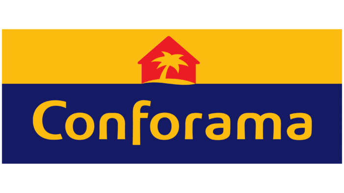
In the early 2000s, the oasis, which used to be at the bottom, became a central component of the logo and lost one of the two palm trees. The designers brought it to the forefront to play up the “spring of grace” concept. Wanting to make the comparison more obvious, they placed a red house in the background of the only remaining palm tree. Like the typical children’s drawings, the building consisted of a triangle and a square. It symbolized Conforama’s main occupation: selling furniture and home furnishings. At the same time, the house depicted by the artists was the epitome of an ideal because the lack of details made it look like a mirage in the desert.
The oasis became yellow and took its place at the top, inside the same yellow rectangle. Correspondingly, the name of the chain of stores was moved down into the blue quadrangle. And the letters themselves were also yellow, which visually balanced the two parts of the logo. And for greater harmony, the designers balanced the top and bottom, almost equalizing the rectangular bases in width. The motto was removed, so the only inscription was the word “Conforama.” It was radically different from the previous version because all letters except the “C” were lowercase. A round geometric grotesque font replaced the elongated serif typeface.
2012 – today
In 2011, the French home goods retailer became owned by Steinhoff International. After changing ownership, it decided to reposition itself and return to television with a new advertising campaign. The rebranding included a redesigned logo that eliminated all elements except the main inscription. Employees of W&Cie PR agency decided to simplify its look, so they did away with the paradise oasis and multicolored underlays. The only thing left is the chain’s name with the typography preserved, and now it’s not yellow but orange.
Font and Colors
The modern visual style of Conforama suggests the use of a simple verbal sign. It was taken from the previous emblem, which featured an oasis in the background of a house. The company thought its name was famous enough to be recognized without the famous island with a palm tree.
The designers decided to go for typography because the Conforama logo doesn’t contain anything but lettering. The round, streamlined font looks unusual, first of all, because of the truncated glyphs. Also noteworthy is the elongated foot of the letter “f,” which extends downwards beyond the line. This grotesque looks roughly similar to Bruum FY Bold by FONTYOU, Hereabouts Bold by Derrick Jackson, and Geon Extra Bold by “cretype.” The orange color makes the brand name look bright. And brightness is exactly the characteristic that best describes the work of an interior fashion trendsetter.
Conforama color codes
| Coral Red | Hex color: | #f24941 |
|---|---|---|
| RGB: | 242 73 65 | |
| CMYK: | 0 70 73 5 | |
| Pantone: | PMS Warm Red C |
