The Continental Airlines logo is a sign and a symbol of air adventures and travel. Lightness, freedom, beauty, and openness of the world – this is what this emblem represents.
The light blue color of the Continental Airlines lettering is reminiscent of the sky and the world of air travel. The square on the right side of the logo reflects stability, reliability, and trust, which are one of the brand’s main values. The voluminous globe located inside the square symbolizes international flights and inexhaustible opportunities for travelers anywhere in the world. The white-blue color of the ball complements the overall color scheme of the logo, embodying harmony and peace.
The Continental Airlines emblem reflects professionalism, stability, and safety in air travel but also calls for adventure and expedition, allowing travelers to discover new horizons and experience the world.
Continental Airlines: Brand overview
| Founded: | May 1934 – March 3, 2012 |
| Founder: | United Continental Holdings |
| Headquarters: | Texas, United States |
Continental Airlines – a now-defunct major American airline operated flights to 130 destinations. The carrier had 340 aircraft in its fleet and more than 40,000 employees. It merged with United Airlines in 2010 to form United Continental Holdings. The merger was completed in 2012.
Continental Airlines’ history began in 1934 when Walter Varney, a pioneer in US aviation, founded Varney Speed Lines. Initially, the company focused on flying mail routes between El Paso, Texas, and Pueblo, Colorado, as mail contracts were the primary source of income for many airlines at the time.
In 1937, Robert Six, a young entrepreneur from Texas, acquired a 40% stake in Varney Speed Lines and shifted the company’s focus to include passenger services. Consequently, the same year, the company was rebranded as Continental Airlines to reflect Six’s vision of building a major airline connecting various parts of the country. During World War II in the 1940s, the airline, like other airlines, played an active role in military transport by providing planes and crews for troop and cargo transport, which helped enhance its infrastructure and expertise.
In 1953, the company made a move by acquiring Pioneer Airlines. This allowed for a substantial expansion of its route network in Texas and nearby states, thereby becoming one of the largest regional airlines in the southwestern US. In 1955, it introduced its first turboprop aircraft, the Vickers Viscount, which greatly improved passenger service quality and operational efficiency on short and medium routes.
1958, the company entered the transcontinental market by launching flights between Chicago and Los Angeles. This marked a pivotal moment in its growth, enabling it to compete with major national carriers. Throughout the 1960s, the company continued to expand its route network and modernize its fleet, introducing its first jet aircraft, the Boeing 707, in 1959. This aircraft significantly enhanced the speed and comfort of air travel. The airline began operating international flights, including routes to Mexico and Hawaii.
In the 1970s, the company experienced rapid growth, expanding its international network with flights to Australia and New Zealand. By 1973, it became the first airline to operate an all-jet fleet, increasing its operational efficiency. With the Airline Deregulation Act of 1978 in the US, the company gained the ability to expand its route network more aggressively by opening new routes and increasing flight frequencies on existing routes.
In the 1980s, the company faced various challenges. There was a staff strike in 1981, followed by a bankruptcy declaration in 1983. However, under the leadership of Frank Lorenzo, the company underwent significant restructuring. Costs were cut, and operations were optimized, leading to the airline emerging from bankruptcy in 1987. The company expanded its international network by opening routes to Europe and Asia.
In the 1990s, the company continued to grow and strengthen its market position. In 1992, it signed a codeshare agreement with SAS, expanding its presence in Europe.
Then, in 1998, the company became a founding SkyTeam global aviation alliance member. As the new millennium began, the September 11, 2001, terrorist attacks brought challenges to the aviation industry. Despite this, the airline modernized its fleet and improved passenger service quality.
In 2009, the company left the SkyTeam alliance and joined Star Alliance, enhancing cooperation with other major carriers and expanding its global network.
In 2010, the airline announced a merger with United Airlines, creating one of the world’s largest airlines. On October 1, 2010, it officially became a United Continental Holdings, Inc. subsidiary. The final merger with United Airlines took place on March 3, 2012. This marked the end of the company’s 78-year history as a separate entity, with all operations now consolidated under the United brand.
Meaning and History
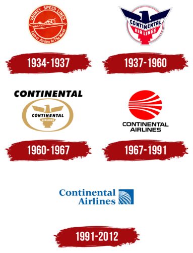
The company changed its name several times, expanded its air fleet, and added new flight directions, which led to rebranding. The basis of all images is the form of a circle pointing to Earth. Dreams of intercontinental flights never left the owners of Continental Airlines. This desire could only be realized 50 years after its establishment. The second constant symbol of the company is the eagle. The bird connected the carrier with the country of its foundation and was removed only after a change of owners, which included European and Canadian investors.
What is Continental Airlines?
An American airline that, as of 2012, operated about 3,000 flights per day and was the second-largest carrier in America. Its revenue amounted to about 15 billion dollars. The company’s logistics included three major Houston, Newark, and Cleveland hubs.
1934 – 1937
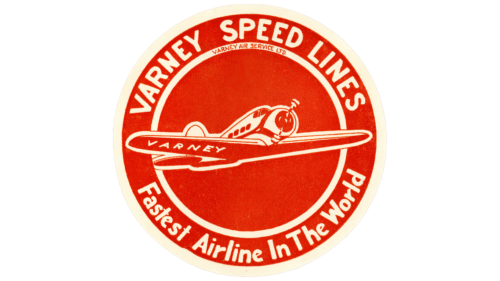
The first emblem is made in a circle, reminiscent of a seal stamped on luggage and mail shipments. Its red color hinted at sealing wax. The choice relates to the company’s business, founded as Airmail.
On the outer side of the seal, the carrier’s name, Varney Speed Lines, is arranged in a circle. The company name is taken from its founder and first owner, Walter T. Varney, who originated transportation in the USA.
In the center of the emblem is an airplane – the prototype of the Lockheed Vega, the first ship on which mail was delivered. It accommodated four passengers and a pilot. It was distinguished by its strength, range, and the highest speed at the time. That’s why the ambitious note: the fastest carrier in the world, is added at the bottom of the emblem.
The owner’s surname, Varney, is written on the liner’s wing.
1937 – 1960
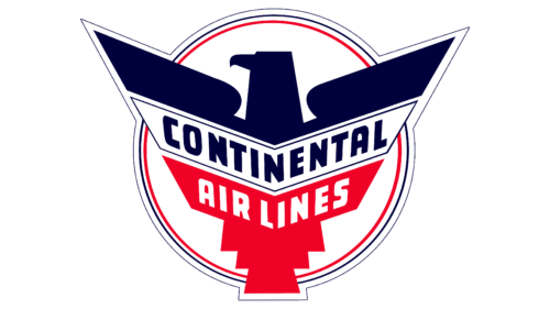
The government canceled the air mail contracts. Robert Six acquired the financially struggling carrier in 1936 and changed the name to Continental Airlines a year later. The renaming prompted the introduction of a new logo.
The circular shape was maintained in the background. It’s formed by three lines: red, black, and a thin black one that borders the whole composition. The figure represents the globe, reflecting the carrier’s ambition for intercontinental flights.
In the foreground, there’s a schematic image of an eagle with outstretched wings. The bird symbolizes America and, at the same time, represents flight. Therefore, it’s a perfect symbol for an airline. The wings of the eagle are schematically drawn and resemble two airplane keels.
The use of red at the bottom and in the line of the inner circle hints at the initial company, Varney Speed Lines, which formed the basis for the new enterprise. The color emphasizes the main feature that Continental Airlines plans to maintain – speed.
The black part demonstrates the new carrier’s globality, confidence, and reliability.
Inside the eagle is the name – Continental Airlines, indicating flights within the continent. The main destinations were El Paso, Denver, and Oklahoma City.
1960 – 1967
In 1960, the company changed its fleet of airplanes and began non-stop flights. Up to that point, during the flight, the airliner would land in small towns along the route.
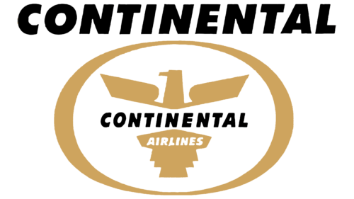
This new step in development was reflected in updating the visual identity. The logo predominately featured gold to emphasize the convenience and exclusivity of the new flights. The carrier’s airplanes also received “golden” tails.
The circular shape transformed into an oval. The symbol still represented the globe. Inside the shape is an image of an eagle, considerably smaller because there was only one airplane for non-stop flights in the fleet at that time, and only five were planned.
The figure of the bird is divided into two parts by the inscription Continental. Considering the eagle represents America, this design shows flights within the country. Above the entire image, the name is repeated in large letters, conveying the company’s scale and confidence in the future.
1967 – 1991
Over seven years, the miles covered increased by 61%, indicating significant growth. Continental Airlines approached the final abandonment of piston and turboprop airplanes and switched to jet Boeing 727. This allowed for expanding flight directions and improving the quality of services.
The progress was captured in a new emblem developed by designer Saul Bass.
The red circle in the center hinted at the once high-speed flights of Varney Speed Lines. The color emphasized the minimal time spent on the flight. The shape depicted the Earth. White lines, tracing the surface of the circle, represented routes and runways. Starting from one point, they diverged in different directions to show the impressive coverage of destinations.
Below the image, the name Continental Airlines was displayed on two levels with thin black letters. The overall image of the emblem represented a modern and ambitious enterprise that was actively expanding.
1991 – 2012
In 1990, Continental Airlines declared bankruptcy due to rising fuel costs related to the Gulf War. The carrier was reorganized. The new investors were Air Partners and Air Canada.
The revitalized company completely revised its visual identity. The design firm Lippincott & Margulies from New York worked on the new symbol.
The blue inscription of round, chubby letters ended with a blue square. The figure reminded one of a piece of sky seen through a window. Its shape embodied confidence and new possibilities. A window to a new world, flights to distant countries.
Inside the square, a part of the globe was drawn in white lines, with parallels and meridians marked. The area of the globe corresponds to the location of North America, where the carrier is based.
A more detailed globe indicated that the company had realized a long-held dream – it began intercontinental flights to Europe.
2010 the merger process with United Airlines was initiated, which lasted two years. In 2012, the company ceased to exist. Interestingly, both merged carriers had the same founder in the past – Walter T. Varney. The new holding retained a similar visual identity with the Earth in a blue square.
Font and Colors
The light blue color symbolizes the sky. Therefore, it perfectly represents a company involved in air transport. White elements are like clouds soaring high.
The inscription is slightly childish but confident and clear. The lowercase letters emphasize that Continental Airlines is part of a group of other companies. The font is similar to Lapidary 333 Std Bold. The slanted glyphs of t, i, n, and l resemble airplanes taking off.
Continental Airlines color codes
| Lapis Lazuli | Hex color: | #0060a9 |
|---|---|---|
| RGB: | 0 96 169 | |
| CMYK: | 100 43 0 34 | |
| Pantone: | PMS 7694 C |

