The Continental logo is elegant and compact. It is executed with a capitalistic gloss. The emblem shows the nobility, professionalism, quality, and rich history of the manufacturer.
Continental: Brand overview
| Founded: | 8 October 1871 |
| Founder: | Schaeffler Group |
| Headquarters: | Hanover, Germany |
| Website: | continental.com |
Continental – a German tire manufacturing group with a turnover of around 40 billion euros. It sells goods in 57 countries. The main owner is Schaeffler Group, which has owned 46% of its shares since 2008. The rest are distributed among other investors in the US and Europe.
Meaning and History
The emblem is closely associated with Hannover, where the company’s headquarters have been located for over 150 years. The symbols of the city intertwine with the logo. Each change in visual identity is a step towards simplicity and a greater understanding of the brand by its audience. The brand has gone through the process of deciphering and shortening its name to a bright, stylish, and comprehensible identity. The horse connects the present and historical past of the company and is present on every emblem.
What is Continental?
A German conglomerate specializing in tire and auto parts production with representation in 60 countries worldwide. At facilities located in the United States, China, Russia, France, and Italy, 200,000 workers are employed.
1882 – 1951
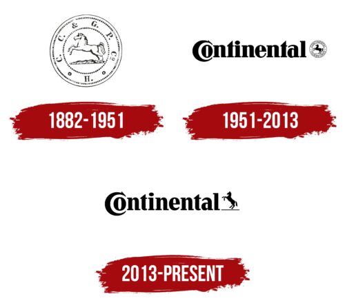
The first logo represents a coin with a double border. Abbreviated initials are around the edge. In the center is an image of a rearing horse.
The company’s name was long: Continental-Caoutchouc & Gutta-Percha Compagnie. Therefore, the emblem uses only the first letters, after each of which there is a period. Two small circles separate the name from the letter H, which stands for Hannover – the city where the company was founded.
The rearing horse is part of the coat of arms of Hannover. Among the first products of the brand were rubberized wheels for carriages. Therefore, the animal simultaneously symbolizes respect for the homeland and a hint at the company’s products.
The circular shape of the logo hints at wheel products. Inside the emblem, two additional circles were created. They separated the internal images and adorned the trademark. The circles were made of small pieces reminiscent of the natural rubber raw material for production.
The main drawback of the logo was that the letters of the name looked like encryption, so looking at the emblem, it was difficult to decipher to whom it belonged and what product the manufacturer offered.
1951 – 2013
2013 – today
The emblem has been completely transformed. The logo consists of the brand name, shortened to one word, and the symbol of a horse.
The first letter C embraces the second, O, creating a semblance of a wheel and indicating the direction of the company’s work. The union of symbols resembles a globe, telling about the worldwide distribution of products. The C and O are similar to the abbreviation of Compagnie, so the emblem is like a compact version of Continental Compagnie.
The word Continental is an ancient name meaning the continent of Eurasia, which was considered the main one, and the European society from which the manufacturer emerged, was considered the fundamental, ancient center of culture. The word comes from the Latin “continens” (union). Therefore, the name tells the history of the company, which has had many mergers, acquisitions, and joint projects:
- In 1928, the company was merged with other German rubber manufacturers.
- In partnership with chemical companies, Continental developed synthetic rubber.
- After World War II, the manufacturer actively acquired competitors and expanded its operations to other European countries, becoming a union of branches.
The horse stands on its hind legs on a thin line, symbolizing the earth. The rearing animal indicates the brand’s dominance in the market. The horse represents agility and speed, qualities provided by the company’s tires. The horse was a symbol of Continental’s historical past when the company sold products for horse-drawn carriages.
Font and Colors
Black is the main color in the Continental logo. In a literal sense, it symbolizes the color of rubber and tires produced by the company. In a figurative sense, it represents power, scale, and a confident position in the global market.
The font is unique due to its serifs. The element at the top of the C turns the letter into an abstract image of a galloping horse. Unusual serifs make the letters appear “shod,” just as the company “shoes” vehicles. The elements indicate venerable age and attention to detail. They hint at winter tire sets with patterns and studs for a good grip on the asphalt.
Continental color codes
| Black | Hex color: | #000000 |
|---|---|---|
| RGB: | 0 0 0 | |
| CMYK: | 0 0 0 100 | |
| Pantone: | PMS Process Black C |


