


 Coursera Logo PNG
The Coursera logo stands out for its individuality and elegant simplicity. It embodies restraint and conciseness while maintaining unique elements that give it character. The modern version of the logo differs significantly from previous ones, reflecting a minimalist aesthetic in every aspect. This is also emphasized by the color palette, which leans toward natural tones. On a white background, like clouds floating in the sky, soft blue letters attract the eye and hold attention while creating a sense of aesthetic pleasure.
The logo is visually appealing and conveys the essence of the most popular educational platform. The font, with neat serifs and smooth curves, turns the letters into distinct geometric symbols, each with a different shape. The bold typeface gives the inscription massiveness and solidity, creating an impression of stability and reliability. This suggests that the logo successfully communicates Coursera’s dependability as an educational platform and the high level of knowledge it offers.
Coursera began in 2011, when computer science professors Andrew Ng and Daphne Koller explored online higher education. In October, Ng released a machine learning course that enrolled more than 100,000 students worldwide. The response led to the company’s formal launch in April 2012 with $16 million from Kleiner Perkins Caufield & Byers and New Enterprise Associates.
Its first academic partners were Stanford, Princeton, the University of Michigan, and the University of Pennsylvania. By the end of 2012, Coursera had over 2 million registered users, agreements with 33 universities, and another $22 million in funding. In 2013, the platform introduced Specializations and began developing career-focused courses with companies and organizations.
In 2014, Coursera launched a mobile app and its first fully online master’s program with the University of Illinois. Coursera for Business followed in 2015, while a master’s degree in accounting appeared in 2016. The service expanded its international partnerships in 2017, then opened its first bachelor’s program with the University of London in 2018.
Coursera Plus launched in 2019, giving subscribers access to most courses and Specializations. Coursera for Campus arrived in 2020, allowing universities to add online courses to their curricula. The company completed an IPO on the New York Stock Exchange in 2021, and by 2023 its catalog included digital marketing, data analysis, artificial intelligence, degree programs, and professional training.
Meaning and History
What is Coursera?
This massive online learning platform has revolutionized education by making top-tier university courses accessible to a broad audience. From computer science to philosophy, the platform offers a wide range of courses, specializations, and full degree programs designed by leading universities worldwide. Its intuitive interface allows users to easily engage with interactive quizzes, peer-reviewed assignments, and video lectures at their own pace, removing traditional barriers to higher education. The platform helps democratize learning by providing access to informal skill-building courses and professional certificates, promoting continuous development and career growth.
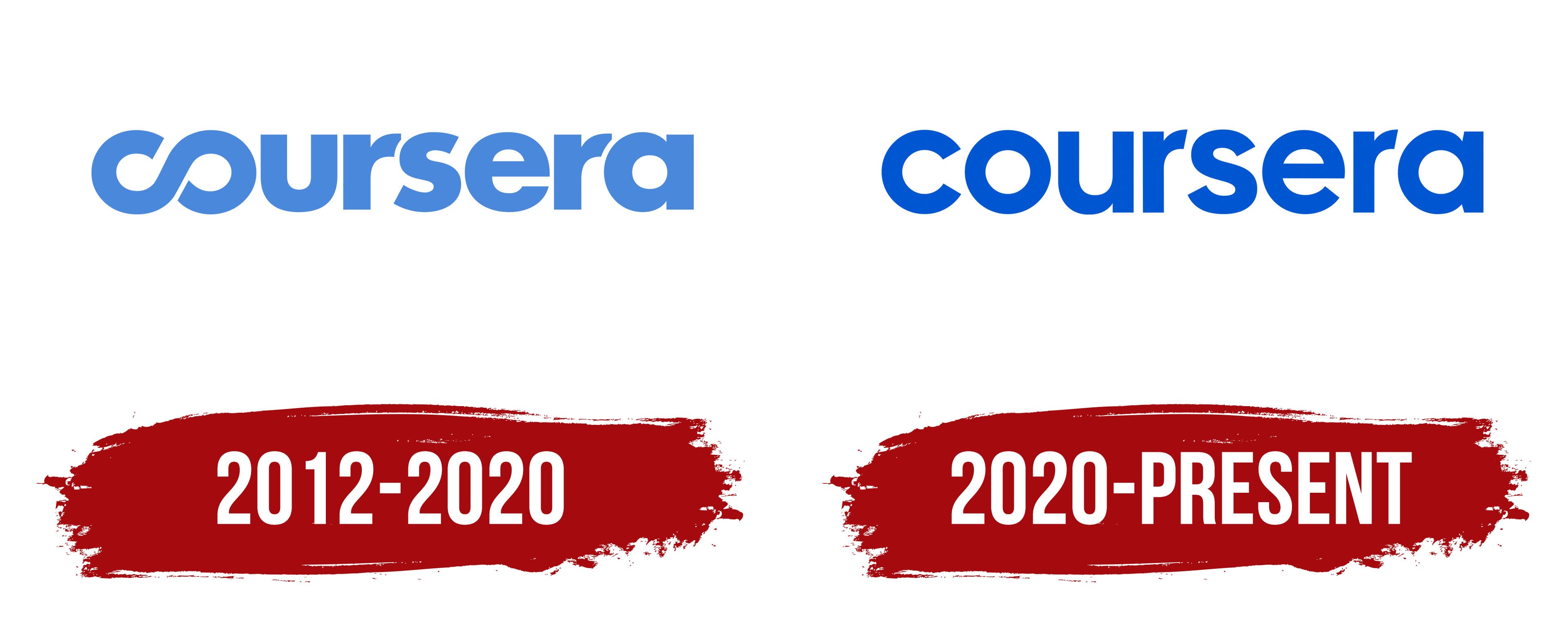
2012 – 2020

Coursera’s educational platform first introduced its original logo in 2012, simultaneously launching online courses on its website. At that time, the logo looked attractive and had a complete design with several unique features.
The brightness of perception was achieved through an original color palette. On a white background, uniform letters in a soft blue shade stood out, creating a light and modern image. All the letters were large, capitalized, and necessarily bold, giving the logo a sense of solidity.
The identity was particularly memorable due to an original symbol that stood out. The first two letters, “C” and “O”, were merged into a single element, evoking an association with the infinity symbol. This effectively emphasized the platform’s concept of offering a range of courses, programs, and tests for learning. The platform’s name was set on a single line, and the spacing between the letters, except for the first two, remained consistent, adding clarity and balance to the logo.
2020 – today
The new version of the Coursera logo embodies simplicity and modernity. Unlike previous designs, the infinity symbol was removed, and now each emblem letter appears close to each other, creating a sense of unity and harmony. This approach symbolizes the platform’s commitment to offering its users worldwide the unity of knowledge and learning it strives to provide.
The main focus became a rich blue color. This shade symbolizes trust, professionalism, and stability, making it a perfect fit for a quality education platform. The blue color refreshes and adds dynamism, emphasizing growth and the pursuit of excellence.
The font in the logo is sans-serif, with soft, rounded lines that make it easy to read and visually appealing. The rounded forms of the letters create a sense of openness and accessibility, values crucial for the educational platform. The font also highlights the modern approach to learning that Coursera offers: no complexities, only accessibility and simplicity.
The emblem’s style is minimalist but not without depth. Every detail, from the font to the color, works towards the overarching idea: learning is available to everyone, and knowledge unites us. This branding emphasizes the company’s main mission to provide quality education to people worldwide, regardless of their location.
At the time of the identity change, the platform was already one of the leading educational services in the world, and its new visual mark reflects this status. The platform was actively evolving, adding new courses and programs, and the minimalist logo reflected this evolution. Everything unnecessary was removed, leaving the essential access to knowledge and learning that changes lives.