


![]() Cox Logo PNG
Cox Logo PNG
The Cox logo is like a colorful hummingbird that instantly delivers information to users. The company logo emphasizes the use of scientific achievements to advance development and the distribution of only useful and interesting content.
Cox Communications began with newspapers, not cable. In 1898, James M. Cox bought the failing Dayton Evening News for $26,000 and renamed it Dayton Daily News. Within two years, the paper ranked among the top 100 newspapers in the United States. Cox later became a congressman, Ohio governor, and the 1920 Democratic presidential nominee with Franklin Roosevelt.
The family entered radio in 1935 with WHIO in Dayton. In 1939, Cox bought the Atlanta Journal and WSB radio in Atlanta. On September 29, 1948, WSB-TV made Atlanta’s first television broadcast, later known as “Eyes of the South.” In 1962, Cox Enterprises entered the cable business by buying CATV systems in Pennsylvania. Then they expanded into California, Oregon, and Washington.
In 1964, its broadcasting and cable assets became public as Cox Broadcasting Corporation. In 1968, cable was separated into Cox Cable Communications. By 1971, Cox Cable was the second-largest cable company in the U.S., competing with Time Inc. and TCI. In 1968, Cox also bought auto auction sites in Manheim, New Jersey, and Fredericksburg, laying the base for Manheim.
Cox Broadcasting became Cox Communications in 1982. In 1985, Cox Enterprises took itself private in a $1.3 billion deal. In 1993, Cox became the first U.S. multisystem cable operator to offer business telecom services. After buying Times Mirror cable assets in 1995, Cox went public again. In 1997, it became the first cable operator to offer residential phone service. Autotrader.com launched in 1999. In 2004, Cox Enterprises bought out Cox Communications for $8 billion, and in 2014, it grouped Manheim, Autotrader, Kelley Blue Book, and vAuto under Cox Automotive.
Meaning and History
![]()
Each major Cox Enterprises business unit has its own branding. This primarily concerns the private enterprise’s Cox Media Group, Cox Automotive, and Cox Communications. They have different names and individual logos that are not related to each other, either in design or color. The parent company is also no exception: it uses its identity system and is in no hurry to introduce a single branding for its subsidiaries.
The emblem of telecommunications giant Cox Communications has evolved with it. It dates back to 1962 when the Cox Broadcasting Corporation appeared. Most of the design changes were related to the cable operator’s reorganization, which changed its legal status and name quite often. But in any case, the word mark included the inscription “COX” (until 1970, “CBC”), decorated in various styles.
What is Cox?
Cox is a brand of the global conglomerate Cox Enterprises, Inc. It often refers to Cox Communications, a subsidiary company that provides telecommunications services to residents of the United States. It was formed in 1962 and initially worked in the cable television industry. Later, it became a provider of broadband internet, telephone services, and home automation systems. The company continues to develop new technologies, such as IoT and 5G.
1962 – 1970
![]()
In 1962, the radio company Cox Enterprises acquired several cable networks, forming the Cox Broadcasting Corporation in 1964. The new structure combined two business lines: cable and broadcast. Its services were used by tens of thousands of subscribers from all states, so the emblem depicted a black outline map of the United States. The designers divided the country’s territory into three parts and placed one letter from the abbreviated brand name, CBC, in each. The lettering and intermediate lines were white.
1970 – 1979
![]()
With the introduction of the updated logo, the US map disappeared. The telecommunications company began to use the wordmark with its full name. “COX” was written in large, bold type in the middle. At the bottom was the phrase “Broadcasting Corporation,” where all letters except the first were lowercase. To style the text, the designers chose two different sans-serif typefaces and permanent black color.
1979 – 1996
![]()
In 1968, the cable business became part of the newly formed Cox Cable Communications division. After some time, this brand got a logo with a stylized inscription “COX.” “C” and “O” looked like two identical half rings. They were turned over on their side and connected like links of one chain. The “X” looked like two crystals folded crosswise. Numerous angles, straight lines, and irregular geometric shapes made the word very illegible. The primary color remains black, and the secondary color remains white.
1996 – 2007
![]()
In 1995, Cox Communications, formed in 1982 as Cox Cable Communications, regained public company status. And two years later, she added telephone services to the list, which became possible after the adoption of the Telecom Act in 1996.
In the wake of these events, the telecommunications giant updated its logo. For the first time, he had a multi-colored sign that looked bright and unusual. At the same time, the standard arrangement of the elements has not changed. Above, as before, was the big word “COX,” and the second part of the name occupied the bottom line. The letters in “COMMUNICATIONS” were also in capital letters, but much smaller.
The designers chose light blue as their main color. But the logo was not monochrome because one of the diagonal “X” lines was divided into three stripes: red, green, and blue.
2007 – 2018
![]()
The updated logo was missing the word “COMMUNICATIONS,” and the “COX” was given a gradient. The complementary colors have disappeared, but more shades of blue have appeared. As a result, the letters became three-dimensional.
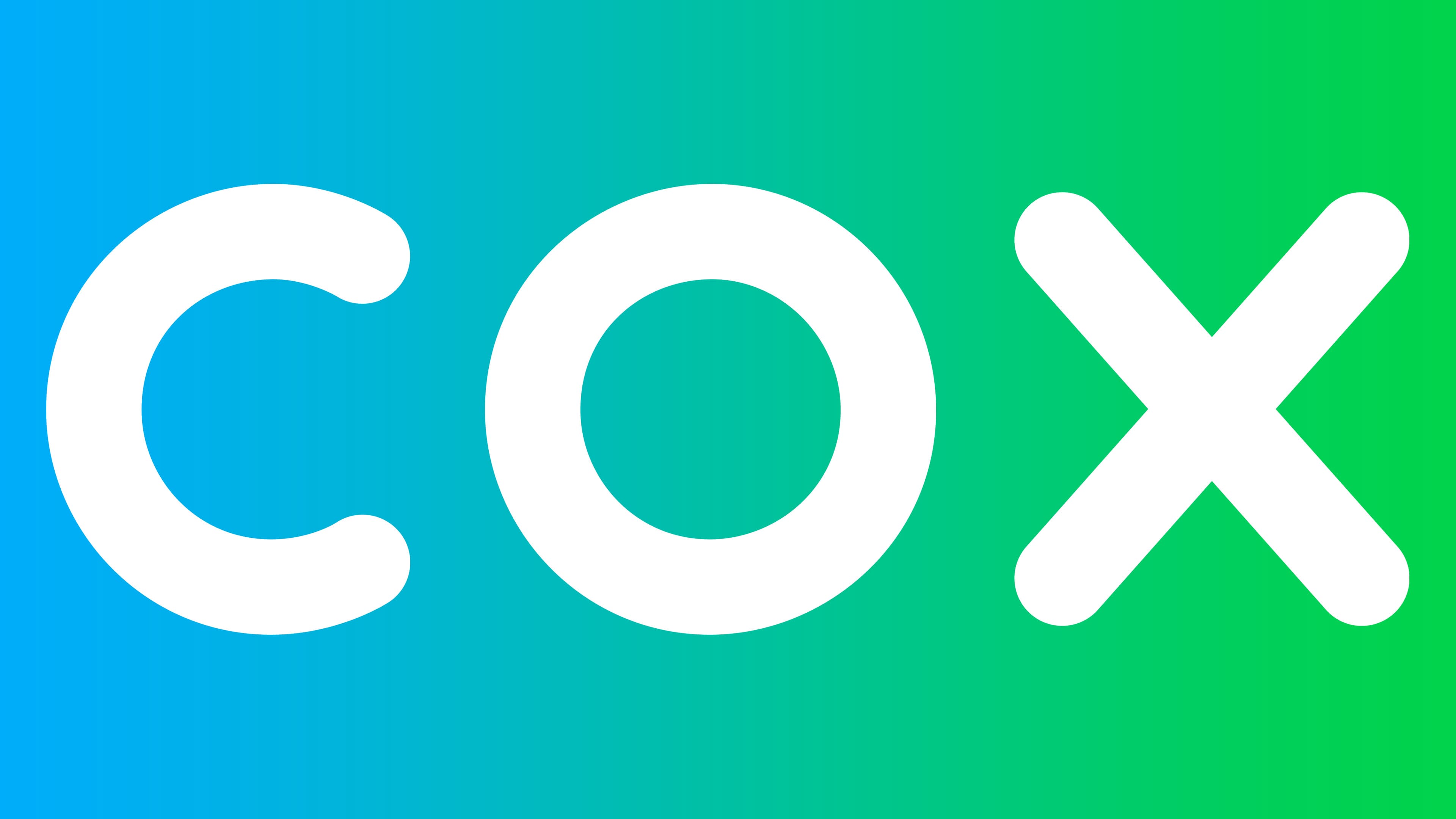
2018 – today
![]()
In 2018, the company made the logo simple and friendly. To do this, the designers removed the three lines in the letter “X,” removed the glossy effect, rounded all the corners, and chose a thinner font. The gradient remains only in the middle: the left side “O” is light blue, and the right side is green.
Font and Colors
When Cox had a red-green-blue icon, it represented the RGB color model, the standard for digital pixel monitors and modern televisions. The current emblem has no hidden meaning. It was created to look confidential and correspond to the slogan “Bringing us closer.”
The logo contains only one word, “COX,” without additional decorative elements. The “C” is very similar to the “O” that had the left side cut off. This is what the letter looks like in one of the Futura versions. The designers modified the standard font to create a custom typography style.

The green and blue color scheme is less symbolic than a palette based on red, green, and blue. But the design aligns with modern trends: there is no chrome shine or three-dimensional shadows. The gradient is present only in the very center. The “C” is completely green, and the “X” is blue.