


![]() CPB Logo PNG
CPB Logo PNG
Despite its massiveness, the CPB logo is simple. It lacks intricate elements or deep concepts. It’s straightforward and clear: an emblem that literally represents the brand. Its minimalism is linked to the accessibility of programs aimed at the country’s general population.
Meaning and History
![]()
The Public Broadcasting Act of 1967 requires CPB to be transparent, clear, objective, and balanced to avoid the perception that the leadership is covertly pursuing an internal policy. That is, national programs must cover events soundly, and the distribution of funds among them must be objective, without personal priorities. The Corporation clearly conveys this requirement for Public Broadcasting’s concise, simple logo. The designers chose the only suitable option that suggests no extraneous ideas, only the principles of fairness, honesty, and law and order.
What is CPB?
CPB is the abbreviation for the Corporation for Public Broadcasting. It is a non-profit organization that finances local television and radio stations, distributing 70% of its revenues among them. The organization has existed since 1967, from the moment Lyndon B. Johnson ordered support for public broadcasting for widespread public access. The company was established as mandated in the Public Broadcasting Act. Its headquarters is located in Washington, D.C.
1967 – 1969
![]()
The CPB logo consists of an abbreviation that is strict, business-like, and concise. The inscription is made with extra-bold block-style letters. The glyphs are spaced optimally apart, making them highly readable. They have no serifs, and the balanced combination of straight and curved lines makes them as comprehensible as possible. At the same time, the text conveys formality, demonstrating the corporation’s high significance. All elements of the emblem are colored black.
1969 – 1975
![]()
The designers “encrypted” the name, compactly combining all components of the abbreviation. They gathered three capital letters in the center, which are well discerned among stripes of different thicknesses: wide (vertical) on the right and left, thin (horizontal) in the middle. This difference not only adds dynamism to the logo but also makes the glyphs recognizable, as “P” resembles “B” without the bottom segment, and “C” has the initial form of “B” without the central part. The improvised monogram is taken in a solid ring, which, due to a thin white stroke, also has the form of “C.” Overall, it is a multi-structured word symbol.
1975 – 1983
![]()
During this period, the beginnings of the rounded logo appeared, in which all letters resemble rings with one open side at the point where the line does not connect to the opposite stroke. The font was shifted to lowercase, making “p” and “b” look like mirror opposites, with their ends pointing in different directions. The logo is colored in black.
1983 – 2001
![]()
The emblem’s transformation is linked to the addition of another ring in addition to those forming the letters. The inscription is enclosed within a common frame and, thus, centrally positioned. The leg of “p” and the top of “b” are so extended that they reach the edge of the circle and merge with it, forming a unified structure. Only the first glyph of the abbreviation “c” stands alone. The font remained lowercase but gained miniature serifs.
2000 – today
![]()
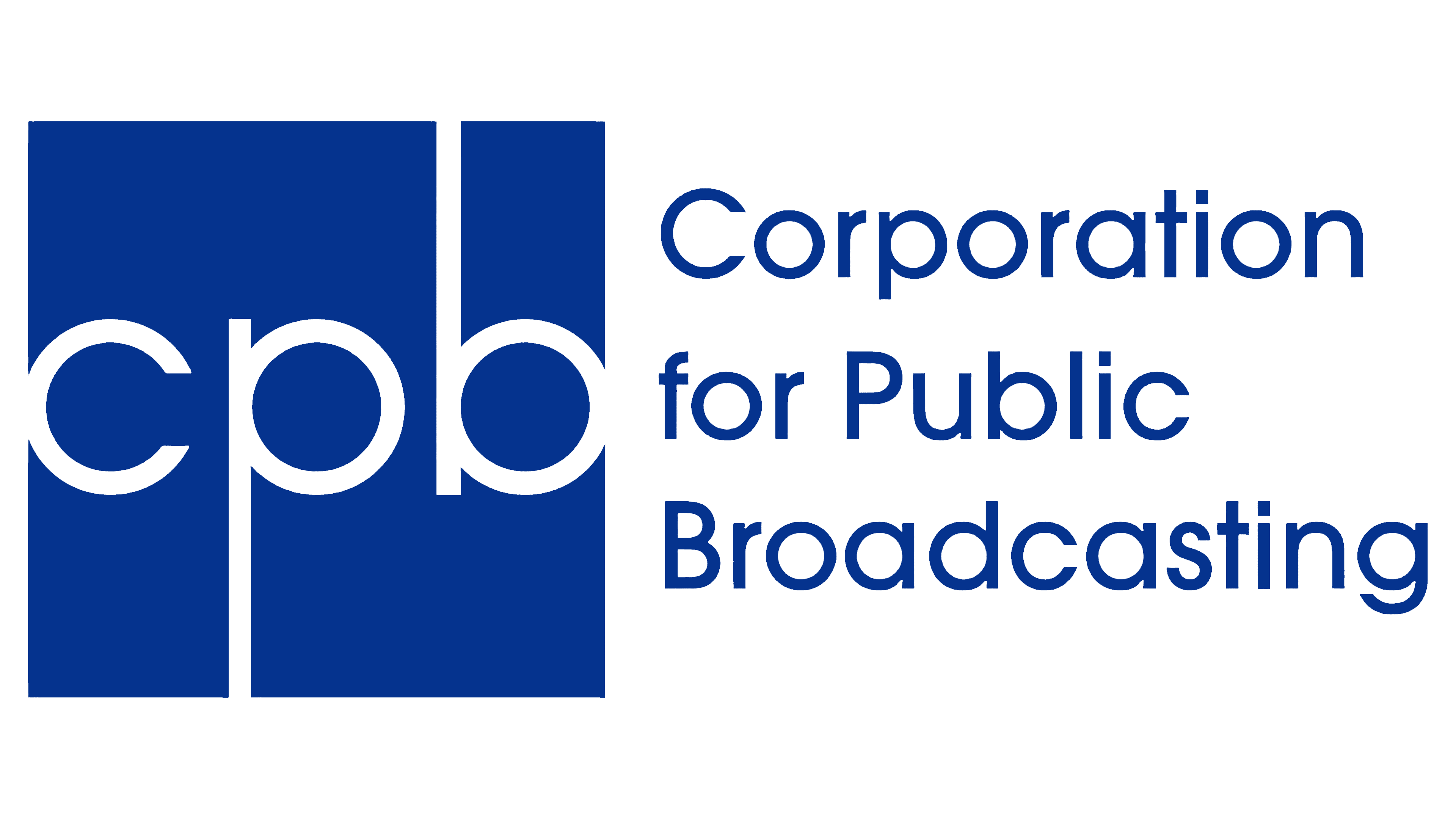
The emblem features the abbreviation in an unusual placement inside a blue square, not a white circle. Lowercase letters are centered and made more recognizable by connecting all lines in “b” and “d,” leaving no gaps. Conversely, they enlarged the slit in “c,” expanding it several times. The designers removed serifs and hints of them to emphasize the corporation’s transparency, honesty, and professionalism. Protruding stripes became even longer, now reaching the edge of the geometric figure and blending into the surrounding space, demonstrating the company’s openness.
Font and Colors
Individual fonts have been selected for the inscriptions in logos from different years, adapted to the design of the graphic elements. Some are heavy, geometric, and blocky; others are light, smooth, and thin. In most cases, they have many curves and few angles, making them appear like rings.
The corporate palette is businesslike and strict. It predominantly features the classic black-and-white combination. The former is used for the inscriptions, the latter for the background. Later, another color was added, blue, signifying honesty, openness, and aspiration for development.