


![]() Curious Pictures Logo PNG
Curious Pictures Logo PNG
The logo of Curious Pictures, this animation studio, fully reflects its creative work. Designers were able to combine completely different elements and get amazing results. They created an emblem for Curious Pictures that very accurately characterizes the brand.
Meaning and History
![]()
The long history of Curious Pictures has been accompanied by successful work on projects for broadcasting stations and television networks. But the animation studio did not adopt its current name until 1993. When it first appeared in the USA, it was known as Stowmar Enterprises. In 1981, employees of this organization founded Broadcast Arts and started creating computer graphics for MTV. Daring, humorous content splashed across the media, prompting so many TV channels to order commercials from the young company.
In 1993, the studio was named Curious Pictures, after which it expanded the office and installed modern equipment. This allowed it to hire a large team of directors to increase the number of projects it runs, including animated series and sketch shows. In this form, the company existed until 2014, when it was finally disbanded.
Over more than 35 years of successful activity, Curious Pictures has changed its name several times, and with it, all other elements of its visual identity. The earliest logos have not survived, so their history goes back to 1982 when the company first started as Broadcast Arts. At the same time, the most famous are the word marks adopted after 1993, because they exploit the external similarity between the question mark and the letter “P.”
What is Curious Pictures?
Curious Pictures was a defunct company specializing in animated television productions and video games. It was founded in 1978 as Stowmar Enterprises and disbanded in 2014. It has owned two offices in recent years: one in Los Angeles and one in New York.
1982 – 1987
![]()
The first Broadcast Arts logo was featured in one demo but was never used on television. The brand name occupied the top half, stylized as a neon sign. The word “Broadcast” was on the first line, and “Arts” was on the second, center-aligned line. The thin, sans-serif letters emitted a diffused blue light that faded into the surrounding darkness.
Under the inscription was a device with a rectangular body and two cylindrical protrusions along the edges. It stood on a narrow stand, probably on a table. To the right and left of the car, red sparks flew, which were especially visible in the animated version.
1987 – 1993
![]()
Introductory videos for Norman’s Corner and the unsold pilot for The Jackie Bison Show featured the new Broadcast Arts logo. It also contained the name of an American animation studio, but its style had changed. The inscription was on a black background with blurred white spots. In the word “BROADCAST,” all letters were capitalized, while the initial “B” differed in its size: it was higher than the rest of the glyphs, but the designers positioned it to protrude from the line, not from above, but from below.
The first eight letters were bold and blue. Against their background, the dark, thin last “T” stood out noticeably, set inside a blue rectangle with a pink gradient. The “T” was formed by negative space and looked like a cutout in a square plate.
“BROADCAST” was pierced with a red stripe running from left to right. This line ended near the last letter, and immediately after it, the word “Arts” began. The designers made it look scribbled by using an illegible cursive font.
1993 – 2001
![]()
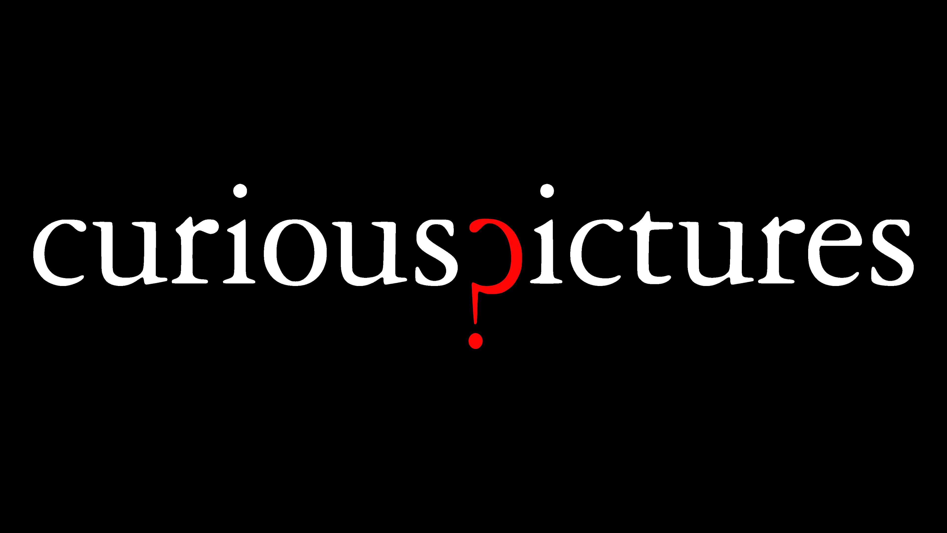
In 1993, a turning point came in the company’s history: it was renamed Curious Pictures. It updated its identity, entrusting the process to the Pentagram creative team led by Paula Scher. The developers created a minimalist wordmark and placed it on a clean white background. It was a black inscription in lowercase with serifs. A red question mark was lowered down between her “curious” and “ictures” parts. It replaced “p” and even resembled this glyph.
1999 – 2014
![]()
The redesign carried out in 1999 was not too revolutionary. All that the authors of the Curious Pictures logo changed was the color. As a result, the letters became light gray, and the red question mark took on a darker tint. This version was used until 2014, when the company was disbanded.
Font and Colors
Pentagram designers creatively played with the visual resemblance between the letter “p” and the question mark, incorporating it into the animation studio’s logo. It turns out that “?” simultaneously serves as a substitute for “p” in the word “pictures” and performs its main syntactic function. The first part of the inscription asks: “Curious?” And then, the same question mark is used instead of “p” in the next half of the line.
The name “Curious Pictures” is set in a font as close as possible to Adobe Garamond Pro Regular. This is an antiqua modeled after the elegant typeface of the Parisian engraver Claude Garamond and the italics of the French typographer Robert Granjon. The high contrast of the font (a noticeable difference between the main and additional strokes) makes the logo appear dynamic.
If we talk about the latest version of the color scheme, it presents light gray and dark red. The original design, created by Pentagram in 1993, paired black lettering with a bright red question mark.