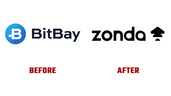
Zonda users could appreciate its new design by performing the first operations after its rebranding. The advantages created by the change in visual identity, a well-thought-out new color scheme, which expanded the possibilities of identifying each currency with which the exchange conducts transactions, were immediately noted. But, at the same time, some shortcomings appeared. Today, the brand is part of the world’s largest digital currency exchanges, providing the opportunity to conduct transactions with 50 currencies and tokens, including traditional ones, to more than a million users. Its anti-money laundering policy and active participation in the fight against financial terrorism, and the use of strict AML and KYC procedures guarantee the maximum security of trades and transactions. New visualization is a way to quickly adapt the program to the requirements of modern reality create simple and intuitive tools to provide maximum visual information with effective conciseness.
The wind in the Andes was the inspiration that set the right mood for the brand’s new look. The name that has been developed and applied is rather abstract. But, oddly enough, it fully reflects the new spirit, and general changes convey the energy, upward momentum, and variability characteristic of financial winds. However, the reference to the “winds of the Andes” is not the goal but only provides a common unity, maintaining a given tone. The design and construction of the logo do not understand its purpose. At the same time, the accent elements of the new identity were created in accordance with the new style of growth forms, each of which has its color, which makes it possible to conveniently and visually highlight this or that currency and its current evolutions. The dynamics of shapes and colors create a visual unification, creating vibrant systems through which different portfolios are effectively presented. The icons are very beautiful but not very informative; they do not provide an outside viewer with an understanding of their purpose.
The company’s true spirit is directly reflected in the bright slogan – Trade tomorrow, today, inviting experienced investors and beginners to trade the future currencies. The performance of a verbal sign also creates some heaviness in its perception. The option of “ink” letters accumulating in the corners attracts all the attention, making these elements dominant over the entire text, diverting attention from the main topic. The use of only severe black also does not provide attractiveness, pushing away from itself and the overall composition.
