Pizza retailer Curry Pizza House, known in California and beyond, has announced its logo and design changes. The company’s products are distributed in 11 locations throughout California, the taste of which is loved and demanded by more than one generation of Californians. With a rich historical heritage founded by a Native American company, the company follows its traditions to adhere to the traditional recipe for preparing spices and flavors, which makes Curry Pizza House pizza unique and especially delicious.
Today the time has come for significant changes, when it is impossible to stay at the top of the business, even with high-quality offers, without keeping up with the times. The development of the new corporate identity was created by the creative studio Barnada from Boston, Massachusetts. Specializing in branding, design, and marketing strategy, the company’s specialists were able to combine the history of the company and a new look, reflecting the aspiration of Curry Pizza House in a renewed brand. The creative approach to the rebranding provided an opportunity to reflect a tribute to the pizzeria founder’s Indian roots while creating a modern, attractive, and bold enough image.
A spicy motto and updated symbols are now used on all advertising media and in the corporate style of signs, packaging, business cards, posters, take-out bags, packaging and stands, branded T-shirts, and baseball caps. The pizzeria informed the admirers of its products about its changes in social networks. You can also find out about the innovations from the posts on Instagram, where messages from the pizzeria are constantly broadcast.
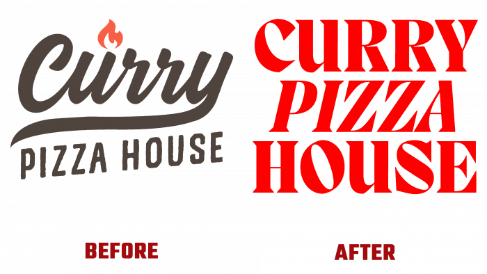
Despite the originality of the old brand, its replacement looks just as effective and timely. Courage and some sharpness, while observing the laconism of steel, added “spice” to the new logo, which is guaranteed to be recognizable. The original serifs on the font seem to guarantee the sharpness of the spices and the ability to cut the pizza. The chosen bright red shade stimulates the appetite and makes you want to taste the advertised culinary masterpiece. By highlighting the central word PIZZA in italics, the developers have created the necessary accent.
All symbols are collected in a single group, although each individual is individual in its way. This symbolizes the use of a wide variety of flavors in one company for its product, providing various tastes and unforgettable aromas exuded by Curry Pizza House hot pizza. The monograms and frames are presented in an original solution that will make such graphics most perceived when placed on the company’s website or Instagram pages.


