


![]() Danny Phantom Logo PNG
Danny Phantom Logo PNG
The Danny Phantom logo conveys the terrifying atmosphere of the animated series it’s associated with. It embodies horror because of the thin line between the real and the ghostly. The contrasting colors add tension and make the emblem, which at first glance seems simple and playful, startling.
Meaning and History
![]()
The boy became a hybrid of a ghost and a human after a critical incident in a magical portal built by his parents. His name and nickname form the basis of the logo for the popular media franchise that has extended far beyond the animated series. It now includes a clothing line (mainly printed shirts and T-shirts), video games, graphic novels, character figurines, and much more. Each element maintains a connection to the original teenager, Danny Phantom, who set out to save the world from a ghost invasion. The search for a suitable emblem began almost simultaneously with the work on the cartoon’s concept when Butch Hartman learned that Nickelodeon wanted to launch a series for boys. This happened in 2001, so the logo’s prototype appeared in 2002.
What is Danny Phantom?
Danny Phantom is a franchise based on an American animated series about a teenager who penetrates the world of ghosts. Besides the animated film, it includes books, comics, a novel, video games, official and fan releases, toys, and a clothing line. Butch Hartman created the adventure cartoon. The client is the television studio Nickelodeon. A total of 53 episodes (3 seasons) were produced, with the first airing in 2004 and the last in 2007.
2002 (prototype)
![]()
Although the logo only features the name, it’s camouflaged as ghosts. They hide in the word “Phantom” from the second line. The “P” and “O” look like ghosts with narrow eye sockets and twisted mouths. The grimace of horror is only imprinted in these glyphs, while the rest convey a ghastly fear through trembling lines. The wavy letters are outlined with similarly sinuous but very thin stripes. The first line is occupied by the teenager’s name, set in a bold geometric font. Both words are united by the slanted layout of the letters, with the upper line being much shorter than the lower.
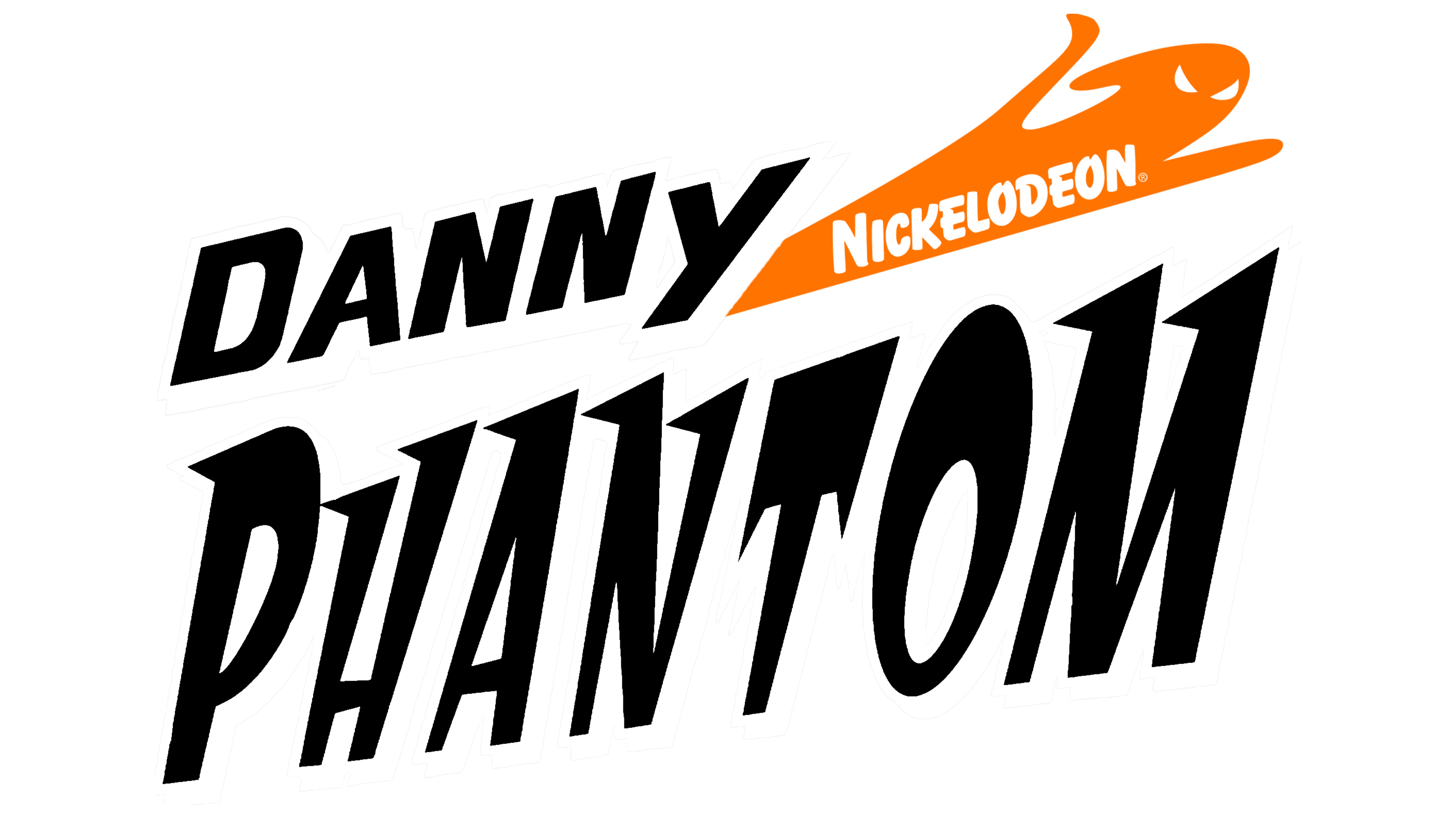
2003 – 2007
![]()
The logo features the inscription and a graphic image, as the designers separated the drawing from the text. The name of the animated series is divided into two levels. The first row is half the length of the second, but they share many similarities. Both “Danny” and “Phantom” are done in an italic font and are diagonally positioned with a leftward slant. The letters are bold, uppercase, and voluminous in both cases due to light shadows underneath them. However, in the second line, each glyph has a sharp serif pointing to the left (the serifs on “T” point downward, and “O” lacks them). A ghost flying to the right is drawn alongside, with outstretched arms, slit eyes, and a hood.
Short version
![]()
The clothing line often features another print associated with the Danny Phantom brand. It’s a shortened version of the logo, consisting of an abbreviation made from two letters, as they look nearly identical. The designers noticed the similarity between “D” and the upper segment of “P,” and combined them into a single symbol. The glyph is bold, slanted, and open-ended, as the line forming the letter is not completed, i.e., not connected to the opposite side. Three sharp spikes protrude from the left side.
Font and Colors
All inscriptions are done in a custom typeface, closely related to the ghost theme. The wavy edges of the letters hint at figures trembling in fear, while the smooth, hook-like shapes suggest the danger lurking in ghosts. The glyphs are bold, italic, and uppercase.
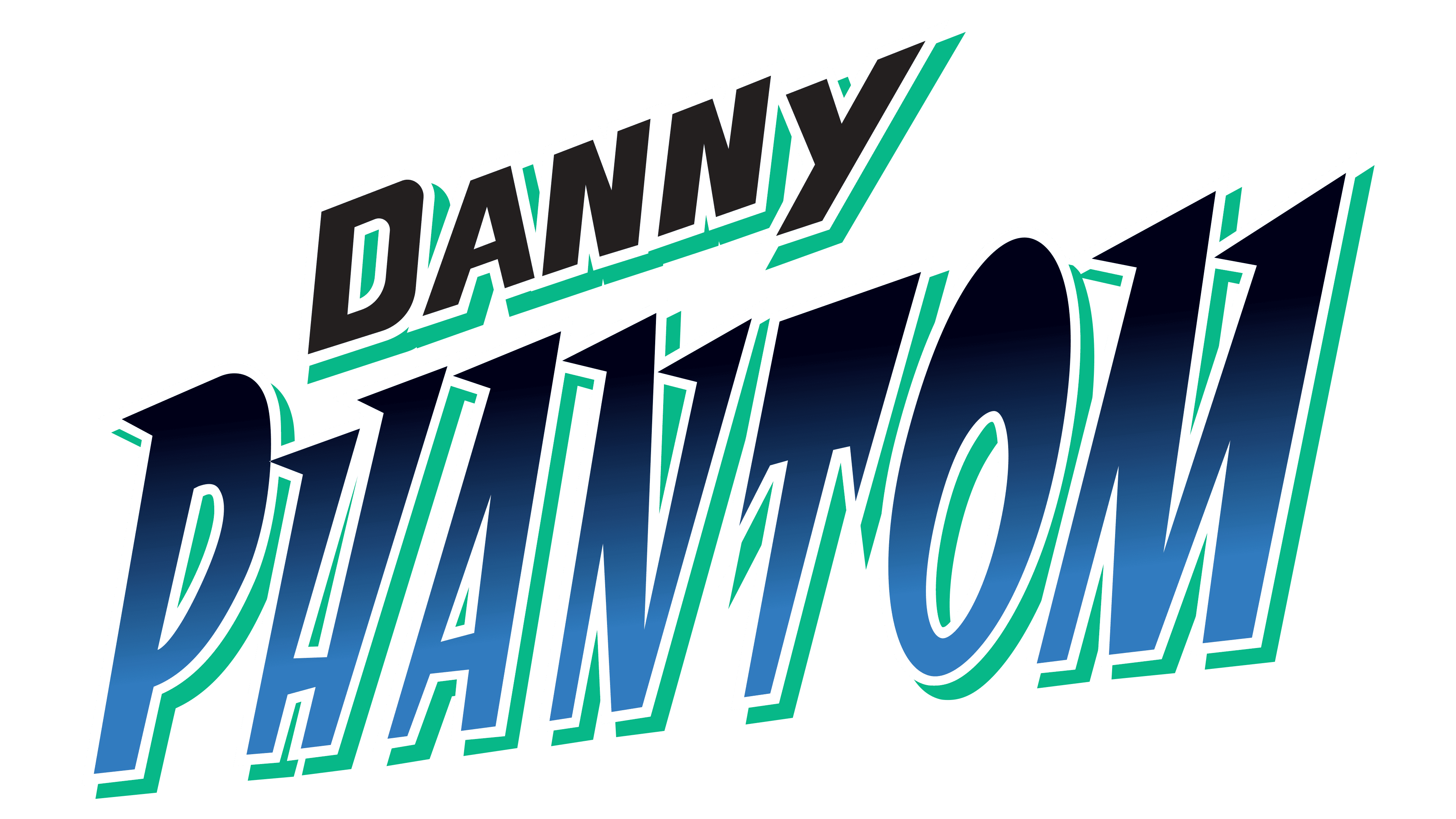
In the early version of the emblem, the palette is sparse – monochromatic. In the later version, turquoise (shadows of letters), gray (trail of the flying entity), and orange (phantom) are added to the basic colors.