Users’ attention is the main thing for the commercial portal, which is why the prominent Daraz logo is used there. The key emphasis is on color – it is orange and bright enough. The second task of logo design is to communicate to potential customers the nature of the company’s activities. This is signaled by the open box, which invites you to look inside and choose the right one.
Daraz: Brand overview
| Founded: | 2012 |
| Founder: | Muneeb Maayr and Farees Shah |
| Website: | daraz.com |
Meaning and History
Pakistani entrepreneur Munib Maair borrowed money from Rocket Internet, a startup sponsor, to launch the portal. Initially, it was supposed to sell fashionable clothes. However, by 2015, the store was converted into a multifunctional platform for selling goods by various sellers by attracting sponsorships of 50 million euros from the English CDC Group and Daraz shareholders. This interested a larger competitor, and Alibaba Group acquired the company to expand trade with Asian countries.
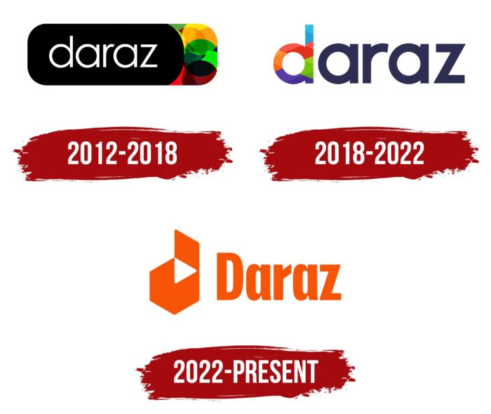
The logo of the commercial resource was updated once after joining the Chinese group Alibaba.
What is Daraz?
Pakistani e-commerce and logistics site headquartered in Singapur, covering Pakistan, Nepal, Bangladesh, and Sri Lanka. Every month it is visited by 40 million buyers who choose among 100 thousand sellers.
2012 – 2018
The first portal logo was created for a fashion store. It has a rectangular background with rounded corners. In its form, it resembles the “buy” or “order” button on online platforms. This choice perfectly conveyed the principle of the online shopping store.
The button is stylized as an ajar jewel case, upholstered in black velvet. On the black cover is a white inscription Daraz. The case is slightly ajar, the lid is shifted to the left, and multi-colored gemstones can be seen inside on the right. They are presented in the form of intersecting multi-colored circles. Jewelry conveys the idea of fashionable expensive goods. And different colors show a large selection of colors. Bright colors represent stylish, catchy things. Overall, the logo creates a sense of elegance and style.
The lowercase letters of the title supported the idea of the box. Daraz is just a room. Important design firms whose things are sold in the store. Without them, the platform is of no value. That is why the box is framed without frills. All attention is drawn to its content. Thin white letters are:
- A symbol of novelty.
- Regular updating of the assortment.
- New fashion collections of four seasons.
In 2015, the direction of the store changed. But the logo was not changed. It was also well suited to represent a platform that sells consumer products. It’s just that now the gems represented various companies and various goods. And the color mix personified the necessary things for every color and taste. Scrolling through the site’s pages, the user was looking for their “jewelry” at the best price.
2018 – 2022
In 2018, the Chinese online trading group Alibaba added the platform to its “collection,” ” including the world-famous Aliexpress and Taobao.
The new owners redesigned the logo. The black background has been removed from the title. The perception of black in different countries is ambiguous. Therefore, only the name was left in the logo to avoid incorrect associations. However, the designers tried to keep a slight similarity with the previous visual sign, making the first letter multi-colored.
The updated d is painted with red, orange, green, blue, and purple intertwined stripes creating a play of hues. They indicate the connection of different countries, roads, and logistical routes the platform delivers goods to its users. The color scheme is a symbol of versatility. You can buy everything from clothes and cosmetics to furniture and electronics on the portal.
The lack of a capital letter supports the idea of equality for all sellers on the platform. Giving everyone the same level of service and equal opportunity.
The main color of the modern logo is blue. It shows experience, calmness, and care for users. This is a neutral color, combined with a multi-colored “d”; it indicates a tolerant attitude and the union of different cultures and products on the platform. Shades of the first letter:
- Blue – the platform is designed to fulfill the dreams of users.
- Red – hot offers, discounts, competition.
- Orange – goods for the whole family, customer care.
- Green – novelties, constant growth.
- Purple – everything for everyday life, the right logistics.
The logo contains all the colors of the rainbow, which indicates the maximum diversity.
Letters in the form of a combination of circles and lines resemble several fonts at once: II Vorkurs Bold, Kolka Demi Bold, VVE Giallo Bold.
2022 – today
The Daraz platform has updated its identity in 2022 to match the emerging e-commerce market. She was helped in this by the creative agency Design Studio, which is based in London and cooperates with such large international companies as Deliveroo, Panasonic, and British Airways. Before changing the face of the South Asian brand, experts conducted extensive research and consulted with users.
The current Daraz logo has nothing to do with previous versions. After the transformation, it became orange, although this color was previously used in limited quantities. The font has also changed: the brand name is now written in bold letters, stretched vertically. Moreover, the glyph “D” is translated into upper case.
To the left of the wordmark is an icon that is shaped like a lowercase “d.” The role of the intra-letter gap is performed by a white triangle – the so-called play button. This symbol is located disproportionately, with an offset to the upper right corner. The arrow represents the continuous progress of the Daraz Group and the introduction of innovations. It is also associated with video content and hints that the commercial platform has begun selling goods through live broadcasts by recording streaming videos.
Font and Colors
The Design Studio agency designed the inscription for the Daraz logo. Specialists have made the wordmark unique by using bold grotesque of non-standard form. All letters are compressed on the sides to match the proportions of the adjacent emblem, and their corners are rounded. This is not a standalone font but an individual set of glyphs. The closest option to it is Neusa ExtraBold from The Northern Block.
The orange hue of the logo contrasts sharply with the previous Daraz palette, which was current until 2022. Such changes signal that the platform is deepening ties with its parent company Alibaba Group, as its corporate color is also orange.
Daraz color codes
| Mystic Red | Hex color: | #f85506 |
|---|---|---|
| RGB: | 248 85 6 | |
| CMYK: | 0 66 98 3 | |
| Pantone: | PMS Orange 021 C |
