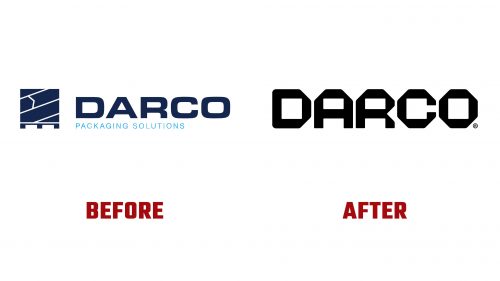
Darco, a Belgian manufacturer known for its packaging solutions, has introduced a new logo and brand identity. Established in 1994, Darco has built a reputation in the European market for ensuring pallet stability during transit. Their products are designed to maintain the integrity of packages and pallets, offering innovative stabilization technologies and customized solutions for secure transportation.
The new logo, created by the design agency Hunt, marks a significant departure from the previous design. The old logo featured a literal icon, which lacked refinement. The new logo focuses on a robust and structural wordmark that conveys sturdiness, precision, and stackability, reflecting Darco’s focus on efficient packing for shipping.
The wordmark comprises uppercase letters with wide letterforms, seamlessly aligning to suggest stability and order. The design employs octagonal letterforms, which provide a sense of strength and durability. This choice fits Darco’s identity, as it subtly cues the company’s commitment to packing and securing goods for transit.
The new identity’s typography uses a lighter-weight Neue Haas Grotesk Display. While elegant, this typeface feels somewhat standard and doesn’t fully match the boldness of the logo. Incorporating numerals in the same style as the logo in various applications, such as signage and employee guides, creates a dynamic contrast and adds visual interest.
The icon set developed for the new identity follows the design cues of the logo, featuring clean and precise lines that echo the structural elements of the wordmark. These icons are used in packaging and labels, enhancing the overall visual cohesion of the brand. Their current application already contributes significantly to the brand’s professional and polished appearance.
Darco’s new identity is complemented by a brand message: “Pack to protect.” This tagline encapsulates Darco’s mission to safeguard customers’ products and reduce damage and waste, aligning with a positive environmental impact. The new visual style and this message position Darco as a distinctive and trustworthy brand in a price-driven market.
The new branding employs a limited color palette, primarily shades of blue and white, conveying a sense of reliability and professionalism. Gradients and subtle textures add depth to the design without overwhelming it. The overall effect is one of modernity and efficiency, aligning with Darco’s commitment to high-quality packaging solutions.
Graphic elements in the new identity include precise lines and geometric shapes that reflect the structural integrity of Darco’s products. The layout is clean and organized, emphasizing clarity and functionality. This approach ensures that the brand’s communication remains straightforward and effective.
The logo’s proportions are meticulously balanced, with each letterform crafted to maintain a sense of harmony and stability. The angular cuts and edges of the octagonal letters add a unique character to the wordmark, distinguishing it from more conventional designs. This attention to detail underscores Darco’s dedication to precision and quality in their packaging solutions.
In addition to the logo and typography, the new identity includes a refined color scheme that enhances the overall visual appeal. The primary colors are complemented by accent hues that can be used across various applications, from digital interfaces to physical packaging. This flexibility ensures that the brand remains cohesive across all touchpoints.
The redesign process involved a thorough evaluation of Darco’s existing brand assets, leading to the creation of new marketing materials that reflect the updated identity. These materials include brochures, business cards, and a redesigned website, all featuring the new logo and visual style. The result is a comprehensive brand overhaul that positions Darco as a modern and reliable partner in the packaging industry.


