![]()
Dataforeningen updated its logo together with Bielke&Yang. The Norwegian technology association has operated since 1953 and remains the country’s largest independent platform for the tech community. Through groups, networks, and regional communities, it brings together professionals, experts, and enthusiasts to share knowledge, engage in discussions, and support industry development.
Bielke & Yang needed to update the brand for a new audience and bring different parts of the community under a single brand. The foundation was the idea of data culture. Technology is not treated as technology for its own sake, but as an environment shaped by curiosity, experience, debate, experimentation, and professional work. For that reason, the logo is not as strict as a corporate seal. It is closer to an early technology aesthetic, where form could be strange, a little rough, and alive.
![]()
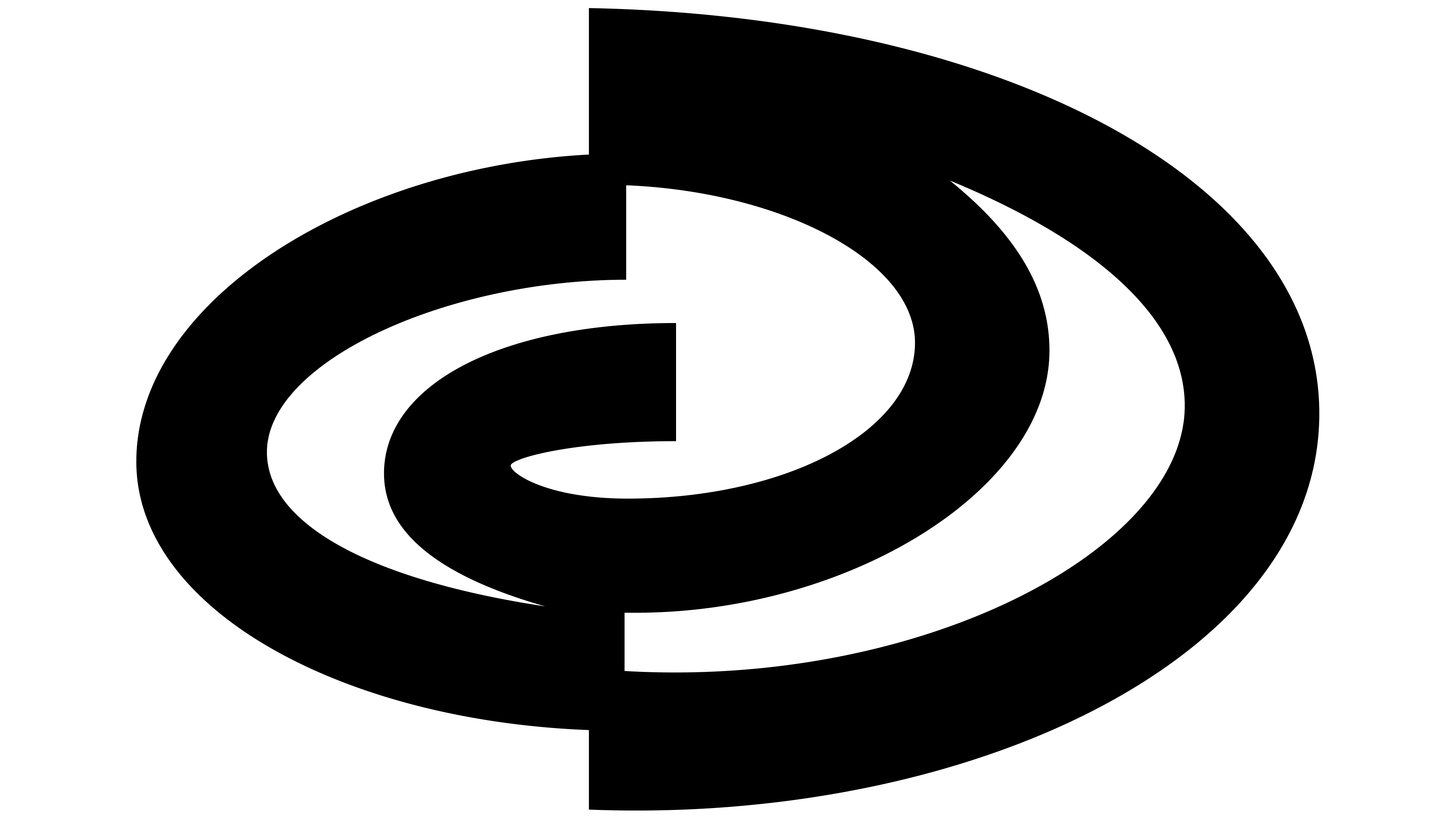
The old mark was built around an abstract letter “D,” but the stencil style and wide spacing between the letters pushed perception toward “ID.” The new logo retains the “D” idea but makes it the main symbol. The symbol is built from lines and gaps, so it recalls a letter, a technical diagram, and a fragment of an interface.
The logo does not show data, a network, or a computer. The symbol conveys the culture around technology, slightly imperfect, curious, human, and open to different readings. For an association with a broad network of professional groups, this image serves as a shared marker across disciplines, generations, and perspectives.
![]()
The name Dataforeningen translates as “Data Association.” The new mark connects it with the past of digital culture without copying retro style. The logo evokes old technology companies, rough interfaces, and the early computer environment. At the same time, the presentation remains relevant to today’s professionals. Bielke & Yang created a community symbol in which knowledge, experience, and interest in data converge into a shared professional culture.