The DC Comics logo is a graphic embodiment of innovation and showcases creativity, experience, and professionalism. The logo represented the largest publisher of popular comics in America, whose name later became the brand’s name.
DC Comics: Brand overview
| Founded: | 1934 |
| Founder: | Malcolm Wheeler-Nicholson |
| Headquarters: | Burbank, California, U.S. |
| Website: | dccomics.com |
Meaning and History
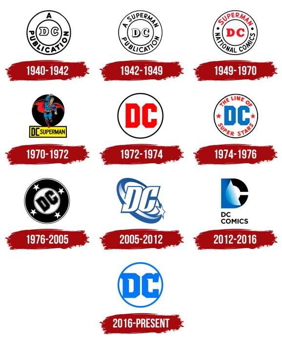
DC Comics had ten logos, different in content but identical in shape. All of them have circular outlines and are found on magazine covers, in promotional materials, and on souvenirs.
What is DC Comics?
DC Comics is a comic book publisher, a subsidiary of Warner Bros. Discovery, and a division of DC Entertainment. It has been involved in creative work since 1937, when its publications first featured legendary heroes such as Wonder Woman, Batman, Superman, Green Lantern, and others. The company itself was founded earlier in 1934 under the name National Comics Publications.
1940 – 1942
Although the publishing house appeared in 1934, its first trademark was published six years later – in 1940. It consisted of two black rings with the inscription “A PUBLICATION” between them. The center was occupied by the abbreviation “DC.”
1942 – 1949
The updated logo included the phrase “A SUPERMAN PUBLICATION”. The letters “D” and “C” in the center appeared voluminous due to black shadows.
1949 – 1970
In November 1949, designers changed the old inscription to SUPERMAN NATIONAL COMICS, making the first word red and separating it from the others with two dark dots.
1970 – 1972
The emblem adopted in 1970 had several versions. Most often used as a yellow rectangle with a black border and the inscription “DC SUPERMAN.” Above or below was a black circle with an image of a superhero in a blue-red costume.
1972 – 1974
On the covers of several issues released from 1972 to 1974, an exclusive logo was placed: a red abbreviation “DC” in a black ring.
1974 – 1976
Next to the inscription “DC” appeared the words “THE LINE OF SUPERSTARS” and two small five-pointed stars.
1976 – 2005
The new icon, designed by Milton Glaser in 1976, was called the “DC bullet.” Its main elements were a small white circle, a wide black ring, four stars, and the letters “DC.”
2005 – 2012
The emblem, created by Richard Bruning and Josh Beatman, was known as DC spin. In the center was the abbreviation “DC,” around which a whirlwind with one star rotated.
2012 – 2016
The penultimate logo contained a black letter “C” with a blue sticker in the shape of the letter “D.” Below was the company name.
2016 – today
The new branding of DC Comics builds on previous versions. It is a blue inscription “DC” in a ring of the same color.
DC Comics: Interesting Facts
DC Comics is a big name in comic books and has been around since 1934. It started as National Allied Publications and got its name from one of its comic series, Detective Comics, where Batman first appeared.
- The Start: It all began in 1934, and they chose to keep the “DC” from Detective Comics, which is famous for introducing Batman.
- Superman Comes Along: In 1938, Superman appeared in Action Comics #1 for the first time, starting the superhero trend. He’s known as the first real superhero.
- Batman’s Introduction: Batman showed up a year later, in 1939. He’s just a regular guy who’s smart and strong, and he uses cool gadgets to fight bad guys.
- Wonder Woman Makes an Entrance: Wonder Woman was one of the first female superheroes to appear in 1941. She’s become a big deal for representing strong women.
- Many Worlds: DC Comics invented multiple universes so that the same characters could have different stories in each universe.
- Creative Rights: In the late 1980s, DC Comics started letting comic creators keep the rights to their work, which was a big deal and attracted lots of talent.
- Two Big Comics: In 1986, they published “The Dark Knight Returns” and “Watchmen,” which were important for adding deeper stories and darker themes to comics.
- Rivalry with Marvel: DC and Marvel have been competitors for a long time, sometimes even writing stories in which their characters meet.
- Movies and TV Shows: Many DC characters, such as Batman, Superman, Wonder Woman, and others, have been in successful movies and TV shows, making them known to more people.
- Changing Logos: DC Comics has changed its logo several times to match new directions and ideas. The latest one, from 2016, celebrates the company’s past while looking forward to the future.
DC Comics has a long history and has influenced comics and movies for many years. It has played a big part in making superheroes popular.
Font and Colors
The current publisher’s logo appeared in May 2016. It was announced on the seventeenth and adorned the cover of DC Universe: Rebirth Special #1 within eight days. It looks minimalist and consists of only two elements: a white circle with a blue outline and the inscription “DC.” There is no hint of a superhero theme.
The abbreviation is made in a geometric font with large serifs and cut corners. Sharp bends inside the letters are a graphic embodiment of innovation. The blue-white palette reflects creativity, experience, and professionalism.
DC Comics color codes
| Moroccan Blue | Hex color: | #0476f2 |
|---|---|---|
| RGB: | 4 118 242 | |
| CMYK: | 98 51 0 5 | |
| Pantone: | PMS 2727 C |
