![]() Death Note (manga) Logo PNG
Death Note (manga) Logo PNG
The Death Note logo is mystical. It embodies phantasmagoria, sacredness, emotionality, calmness, and the complexity and simplicity of the manga’s main character’s worldview. Just a few details convey the peak of tension, the confrontation, and the pursuit of justice, regardless of the means used to achieve it.
Meaning and History
![]()
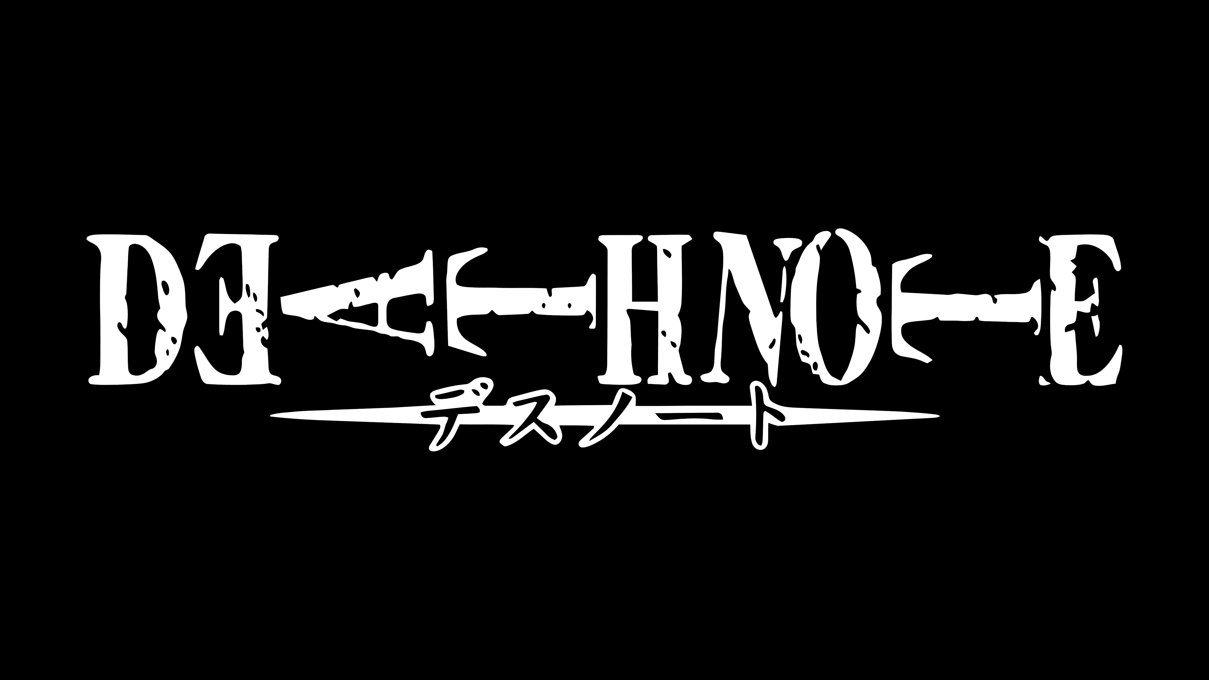
The events in the franchise unfold not only around a teenager and his mystical notebook. They also encompass the confrontation between Light Yagami and the detective trying to catch him, a mysterious member of an elite Japanese police task force. The logo reflects this struggle, shown in a double-edged stripe under the title. It illustrates how stark and rigid the opposition between the two key figures is. Moreover, whether each is a hero or antagonist is a philosophical question, with readers, viewers, and gamers making their individual choices.
What is Death Note?
Death Note is a Japanese media franchise that includes manga, anime, novels, feature films, mini-series, TV dramas, soundtracks, and video games. It tells the story of a high school teenager named Light Yagami who finds a strange notebook belonging to a shinigami. With its help, the main character gains the supernatural ability to kill people, thereby meting out retribution.
2003 – 2008
![]()
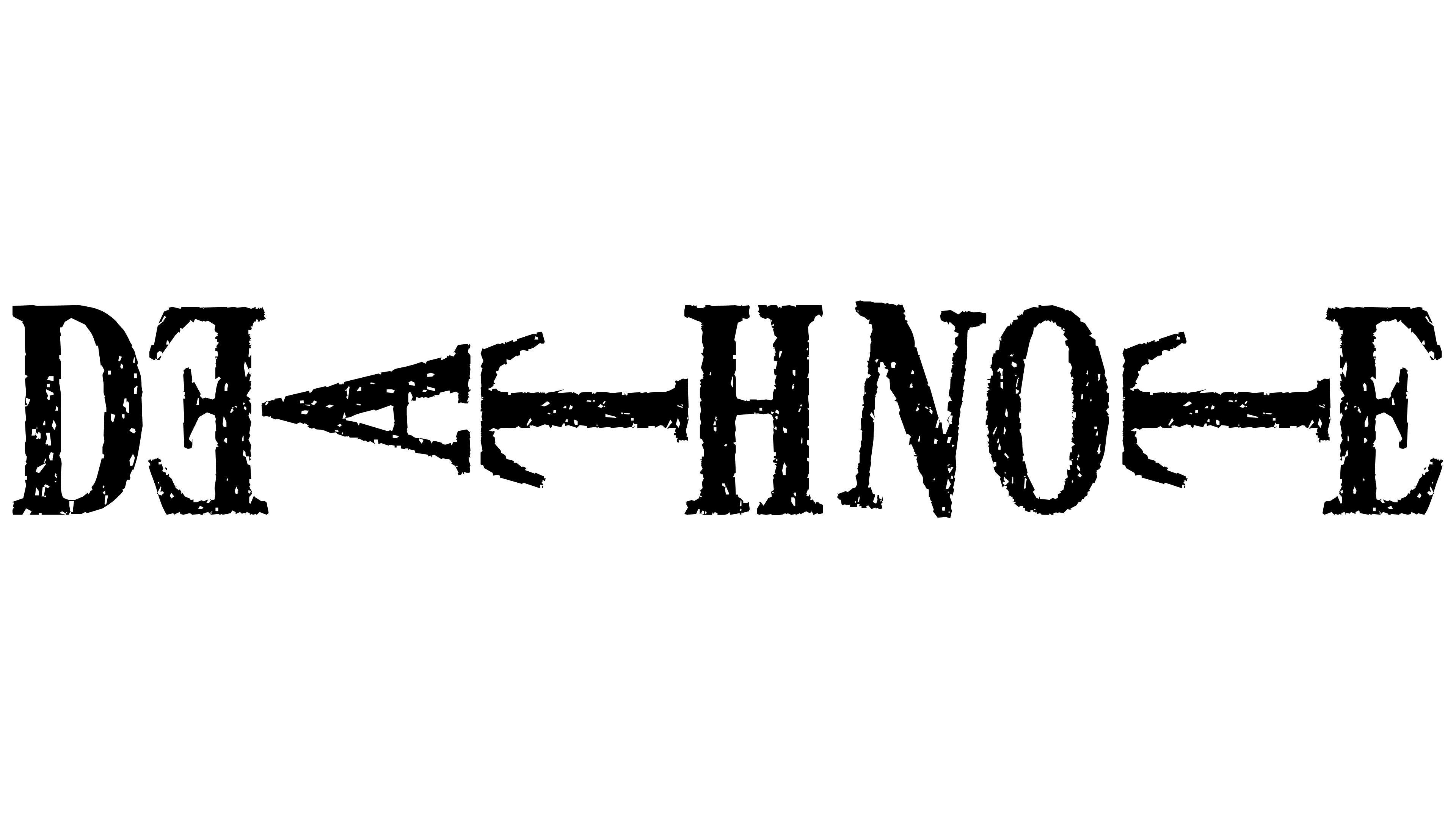
The Death Note logo features text in an unusual arrangement: the letters are not aligned straight but are placed sideways. They seem to levitate in the air, taking a horizontal position between vertical glyphs. This represents the teen’s irreconcilability, going against society, and the one who opposes him, trying to prevent another death. “DE,” “H NO,” and “E” stand upright, while “AT” and “T” are laid flat between them, acting as separators. Moreover, “N” is slightly shifted from “H,” indicating that they belong to different words.
The font used for the inscription is uppercase, bold, and antique, with a slight patina in a shabby-chic style to emphasize the notebook’s antiquity. The aged effect makes it even more mystical and mysterious. Below is a center-aligned highlighting stripe with both ends sharpened, and Japanese characters are distinctly visible on a black background.
Font and Colors
The typeface used for the Death Note title is individualistic. It was specially designed for the project and bears the same name, which emerged later when the complete font set was released. The palette, befitting the theme, is dark, contrasting, and oppressive. It includes just two colors, white and black, often symbolizing death.