


![]() Death Stranding Logo PNG
Death Stranding Logo PNG
The Death Stranding logo is quite original and a bit creepy. Behind it lies the idea of risk, struggle, danger, and death. The emblem evokes a sense of night, a downpour, and streams of mud because, having embarked on the path of war, no one can leave clean.
Death Stranding grew out of Hideo Kojima’s break with Konami, where he had spent nearly three decades and created Metal Gear. In 2005, Konami formally established Kojima Productions, whose staff grew to over 200 people during the development of Metal Gear Solid 4.
In 2015, the relationship collapsed. Kojima Productions closed in July and was revived as an independent studio in December. Konami also canceled Silent Hills, Kojima’s planned horror project with Guillermo del Toro and Norman Reedus.
The new Kojima Productions settled in Shinagawa, Tokyo, with a smaller team of about 100 employees. In January 2016, Kojima and Mark Cerny, lead architect of PlayStation 4, searched for an engine and chose Guerrilla Games’ Decima.
In February 2016, Kojima offered Norman Reedus the lead role. Death Stranding was revealed at Sony’s E3 2016 conference, and full production began in 2017 with Mads Mikkelsen, Léa Seydoux, and del Toro joining the cast.
Development ended on September 26, 2019, and the game launched for PS4 on November 8, 2019. Critics split over its pacing, story, and gameplay, while its art direction, performances, and soundtrack drew praise.
The Windows version, published by 505 Games, arrived on July 14, 2020. By March 2021, PS4 and PC sales had surpassed 5 million units.
Director’s Cut was released on PlayStation 5 in 2021 and on PC in 2022. In 2024, the game reached macOS, iOS, Xbox Series X/S, and Amazon Luna after Kojima Productions regained the IP rights from Sony. A24 began work on a film adaptation, and Death Stranding 2: On the Beach followed in 2025.
Meaning and History
![]()
Hideo Kojima is the scriptwriter, producer, game designer, and project manager. The idea to create Death Stranding came to him after re-reading the novel “Rope,” written by his favorite author, Kōbō Abe. Kojima Productions’ owner read this piece while still in school, but remembered the basic plot idea, which was built on the “philosophy” of ropes and sticks. It said that primitive man used a stick for protection and a rope to hold important and useful things.
The gameplay of Death Stranding is tied to the same principle: the main character must navigate a path full of obstacles, driving away the bad with a conventional “stick” and pulling the good with a “rope.” Its goal is to deliver the cargo from point A to point B. The post-apocalyptic universe is made up of isolated settlements, and the only connection between them is such couriers.
What is Death Stranding?
Death Stranding is a computer game set in a post-apocalyptic world. The protagonist is Sam Porter Bridges, a courier forced to traverse dangerous terrain to deliver cargo to survivors. Along the way, he encounters various supernatural creatures and natural catastrophes. The action game was released in 2019 and was initially available only on PlayStation 4. Kojima Productions created it.
The video game’s name has a non-obvious meaning. On the one hand, it can be understood as “beaching.” The teaser, for example, clearly reveals the topic of throwing marine life on a sandbank. Alternatively, the word “strand” can denote attachments and connections, as it is used in psychology. This interpretation explains why long black cables or umbilical cords were drawn from the creatures’ bodies in the trailer.
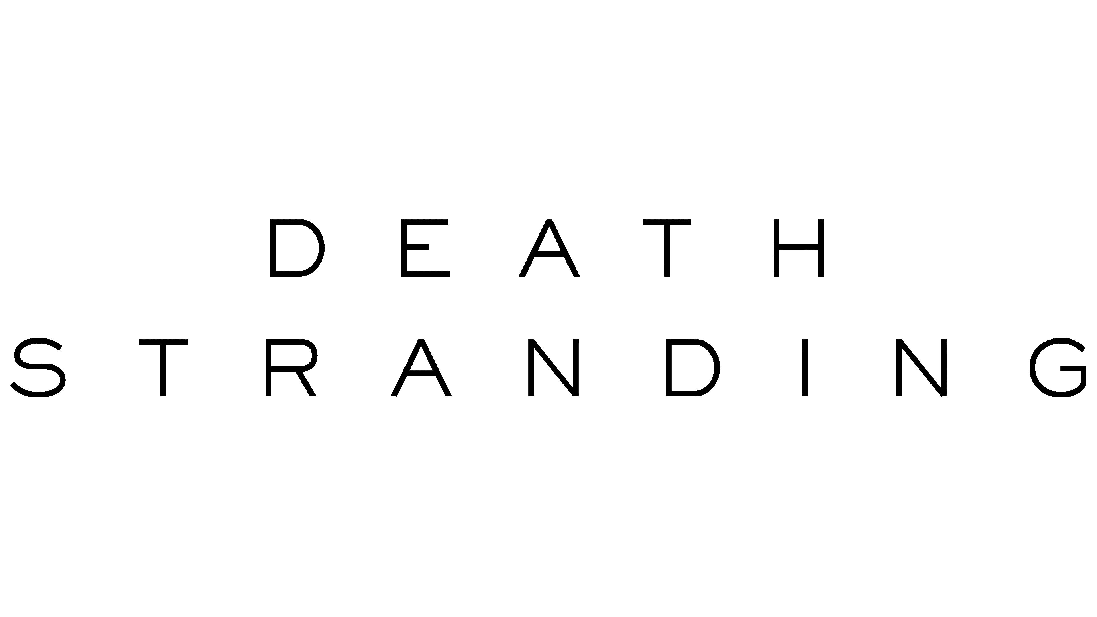
By the way, the same “ropes” are on the Death Stranding logo: they hang from the letters, getting lost in space. The lack of tension indicates that the threads are broken. This is also symbolic, as the main character will have to restore connections among post-apocalyptic cities.
The game was announced at the 2016 Electronic Entertainment Expo. Especially for this event, the developer prepared a teaser in which attentive viewers noticed the project’s logo: the inscription “DEATH STRANDING” with black vertical lines. The wordmark looks unusual: the designers made it minimalist and emphasized a sense of doom.
The stripes going from “E”, “A”, “T”, “S”, “T”, “I”, “N”, “G” have a philosophical meaning. As mentioned, this is an allusion to the tie ropes from the novel Kōbō Abe. But one fan saw a deeper meaning in them. He counted the total number of threads (8) and letters (11) and decided that this was a hint of the game’s release date: November 8th. The theory is hardly true, although, from Hideo Kojima, a big fan of ciphers and riddles, you can expect anything.
Font and Colors
The logo uses the same font as the other labels in the trailer. It is similar to both Calder LC and Brocha Light simultaneously. The first grotesque was designed by Mariya V. Pigoulevskaya and released in 2016 by The Northern Block. The second typeface is Latinotype. This is a creation by typographer Jorge Cisterna, inspired by the pre-Columbian art of Easter Island. The final version of Brocha Light appeared in 2015.

Both fonts combine thin, authentic letters with clear lines. The lettering looks good in black, with the designers choosing the darkest shade (# 000000). The blank white background helped the developers focus on the main thing: the symbolic name, Death Stranding.