Decathlon, a major sports goods retailer since 1976, has launched a new brand identity with a fresh logo and a custom typeface. This change is driven by a commitment to staying relevant in a rapidly evolving retail landscape and a desire to better connect with the diverse global customer base. As the third largest sports retailer worldwide, Decathlon operates over 1,700 stores in 72 countries and offers over 80 sports products. The company develops its brands and manages everything from research to distribution.
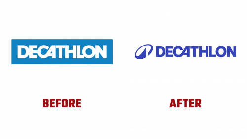
The updated Decathlon logo is a testament to the brand’s evolution, maintaining its familiar elements while embracing a cleaner design. The logo’s readability has been enhanced through adjusted spacing and open areas within the letters. Notable changes include a redrawn “CA” connection, contributing to a smoother and more balanced appearance. In collaboration with Grilli Type, Decathlon has introduced a new typeface, a modern adaptation of a basic sans serif, reflecting the style of the new logo and adding a contemporary touch to the brand.
Additionally, Decathlon introduced a new icon that looks like an abstract “D” and suggests a mountain shape. This icon represents Decathlon’s outdoor gear and apparel, symbolizing its commitment to providing high-quality products for outdoor enthusiasts. The sharp and balanced design fits well with digital and social media’s need for clear, recognizable images.
This branding update is part of Decathlon’s modernizing efforts, focusing on sustainability and efficient management. The new look keeps the essence of Decathlon’s heritage but adds a modern touch that fits the company’s forward-looking goals.
With its new brand identity, this change is timely as Decathlon aims to grow its global reach and improve its offerings at all levels of sports practice, from amateur to professional. The updated Decathlon logo symbolizes ongoing innovation and unwavering commitment to leading the sports goods industry.


