Listen to music, enjoy, and dance – this is the main motto of the emblem. The Deezer logo promises access to your favorite songs and new tracks you’ll love. The portal takes into account the tastes of the user and will always offer music according to the mood.
Deezer: Brand overview
Private company Deezer offers a new experience for listening to music. It provides instant access to one of the largest streaming catalogs with over 56 million licensed tracks. The online service is based on the unique Flow personalization algorithm, which combines favorite and recommended songs in one list. Other supported content are videos and podcasts.
Meaning and History
French platform Deezer has fewer active users than Apple Music and Spotify, but it is not afraid of pressure from competitors. Even the recent rebranding was not done to bypass successful streaming services but for the sake of listeners. According to Austrian entrepreneur Stefan Günther Tweraser, one of the project leaders, the new design is comfortable, human, and attractive.
This approach is explained by the fact that Deezer employees are partly music lovers themselves. At a young age, Daniel Marhely, co-founder of the company, wanted to listen to any music freely without worrying about copyrights. To do this, in 2006, he teamed up with entrepreneur Jonathan Benassaya and, together with him, created the Blogmusik web platform, which allowed users to share pirated tracks.
In 2007, the site was shut down as illegal, but that didn’t stop Daniel. He decided to negotiate with distributors and music creators so as not to break the laws. This is how Blogmusik became Deezer and continued to operate as a legal streaming service, sharing ad revenue with all stakeholders. At first, the catalog was limited because the company did not manage to sign contracts with major labels immediately. But over time, the repertoire expanded, and Deezer made it to the top 10 Google searches.
In the wake of the success, the owners have changed the design of PC and mobile device applications. The update affected the interface and the logo, which had to match the brand’s identity. The redesign cannot be called global because the developers have retained the old structure, leaving the inscription and equalizer in their places.
What is Deezer?
Deezer is a streaming multimedia service for listening to music. It has a vast library of tracks in various genres, including jazz, electro, classical, rock, and pop. Radio stations and podcasts are also available. One of the advantages of the online service is its personalized recommendations, which create individual playlists based on the user’s listening history. The brand was launched in 2007 in France and gradually expanded worldwide.
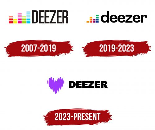
2007 – 2019
When Blogmusik was relaunched as Deezer, it introduced an equalizer logo. This equipment is used for tone and pitch control and is directly related to the music industry. The designers depicted five multi-colored frequency bands: red, green, orange, light green, and blue. They differed in the number of constituent elements (rectangles) and, accordingly, had different heights.
On the right side was the big black word “DEEZER.” It was in bold and consisted of only uppercase letters stretched vertically. The lack of serifs, right angles, and the same line thickness made the inscription unified.
2019 – 2023
In early May 2019, the service updated the app interface to make navigation easier. As a result, the text has become much smaller, and the number of visual effects, on the contrary, has increased. Specialists of the Base Design agency worked on the design. They wanted to create a consistent brand that can be easily adapted to users’ culture in 180 countries. But they needed to leave Deezer recognizable – the way music lovers used to see it. Therefore, the logo has hardly changed.
The iconic equalizer now contains only four frequency bands. There is no usual division into colors: the rectangles are haphazardly painted in several shades. A gradient from orange to blue runs through them, and the two quads on top are completely green. The service name is written in lowercase black letters. The font is more round compared to the past. There are still no serifs. The letter spacing, as before, is very narrow.
The new icon follows the app’s design. It looks simple and modern, takes up little space, and consists of simple geometric shapes. In the context of Deezer, the equalizer symbolizes the digital age, and in the world of music, it is one of the main tools for sound correction. Neither professional nor household audio equipment can do without it.
The color scheme conveys a personal touch. It combines a palette of shades, including yellow, orange, pink, purple, blue, and green. In contrast, the rainbow EQ is aligned with the black lettering.
2023 – today
The new heart-shaped logo symbolizes the company’s shift in focus to creating a more immersive and emotionally rich music experience. The rebranding is part of the company’s efforts to become more than just a music service provider. Instead, the company aims to become a platform that fosters relationships and artistic expression for artists, their fans, and collaborators.
The updated corporate identity, designed by renowned design agency Koto, exudes energy and enthusiasm. It reflects a deep passion for music and a sense of community among those who love it. One of the most distinctive aspects of this rebranding is the introduction of a new color, dubbed “Deezer Purple.” The company hopes that this unique hue will become recognizable and set it apart in a crowded market, similar to Netflix’s iconic red or Spotify’s signature green.
Central to the new branding is the heart-shaped logo. It features a dynamic design, changing shape and mimicking the pulse and rhythm of music. The logo symbolizes two key themes:
- The human factor
- Representing the beating of the heart and the musical factor
- Representing the rhythm and flow of music
This innovative design is intended to reflect the transformative power of music and its ability to touch human emotions.
Deezer: Interesting Facts
Deezer is a well-known music streaming service with many cool features and a huge library of songs.
- Starting: Launched in Paris in 2007, Deezer got ahead early by teaming up with big record labels, quickly making a name for itself in Europe before going global.
- Worldwide but Local: Available in over 180 countries, Deezer isn’t just about being everywhere; it’s also focused on offering music that matches local tastes through specific playlists and tracks.
- Massive Library: With over 73 million tracks, including podcasts and radio stations, Deezer has a vast selection that caters to various musical preferences.
- Sound Quality: Deezer takes audio quality seriously, being the first to offer FLAC streaming with its HiFi tier for those who love crystal-clear sound.
- Cool Features: Features like Flow, which creates a personal mix of favorites and new finds, and SongCatcher, which identifies songs playing nearby, set Deezer apart.
- Partnerships: Deezer teams up with artists and brands for exclusive content and app versions, adding to its appeal with special releases and live sessions.
- User-Friendly Design: The app is easy and fun to use, and Deezer constantly updates it based on user feedback to ensure that it stays that way.
- Device Compatibility: You can use Deezer on almost anything, from phones to smart TVs, making it easy to keep the music going no matter what you’re using.
- Fair Pay for Artists: Deezer promotes a “User-Centric Payment System,” which means your subscription money goes to the artists you listen to, aiming for a fairer pay model.
- More Than Music: In addition to tunes, Deezer offers podcasts, live radio, and original content, aiming to be your go-to for all things audio.
Deezer stands out in the music streaming by offering great music choices, top-notch sound quality, unique features, and efforts to improve the artist and listener experience.
Font and Colors
The first logo’s typography used capital letters from the Gotham Narrow Book font, which Hoefler Frere Jones designed. Since 2019, the word mark looks new. The designers converted the lettering to lowercase and chose the Mabry Pro typeface. It appeared in 2018 based on the NG Grotesque font, created specifically for the American retailer Nasty Gal. It is a hybrid of two varieties of grotesque. According to Deezer executives, it looks friendly and matches the service’s friendly interface.
The popular music brand has introduced a new font style to match its new look. This font is part of a larger change in the brand’s visual identity, which includes the launch of a new color called “Deezer Purple.” The goal is to make this color as synonymous with the brand as Netflix’s red or Spotify’s green.
The new font style is bold and modern, blending perfectly with the rejuvenated and dynamic brand image. The font is an integral part of the brand’s refreshed identity, reflecting its ambition to be more than just a music service. It aims to be a place where music, experiences, and emotional connections come together.
Deezer color codes
| Black | Hex color: | #000000 |
|---|---|---|
| RGB: | 0 0 0 | |
| CMYK: | 0 0 0 100 | |
| Pantone: | PMS Process Black C |
