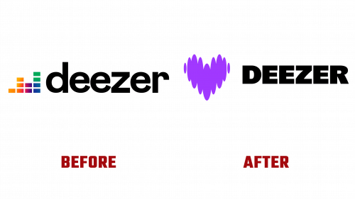
Deezer, a well-known music streaming service, recently unveiled a new look, including an updated logo. The change is part of Deezer’s efforts to remain competitive in the music streaming industry. The company, founded in Paris in 2007, has grown tremendously. By December last year, it had 9.4 million subscribers and operated in 180 countries. Deezer recently began trading on the Euronext stock exchange in Paris.
The company’s old logo had an equalizer symbol and simple lettering. Even after an attempt to update it in 2019, it still looked somewhat old-fashioned. The unique “e” and “r” in the wordmark didn’t make it stand out enough. But the new logo is a big change. It’s shaped like a heart that looks like it’s made up of sound waves of music. This new design isn’t just a cool picture. It fits well with how music can make us feel a variety of emotions.
The new logo Deezer has changed the letters used in the Deezer name. They are now all written in upper case and have a brightly colored look. The letters “Z” and “R” have special curves that make them stand out. These curves may seem a little odd at first, but they actually help make the whole brand more appealing, especially when you see them along with the heart icon.
Deezer didn’t limit themselves to the new logo. They came up with a lot of moving graphics and animations based on the heart icon. This makes the brand look more lively and goes well with different types of music. The colors used in the logo are simple, yet the design looks neat and thoughtful.

A new set of letter styles has been designed for Deezer. They can be wide or narrow, giving the brand plenty of opportunities to express itself. The narrow style, in particular, gives Deezer a unique identity.
One of Deezer’s most interesting decisions was the new design of the playback bar, which is often found in music apps. They made it consistent with their brand, which will probably make it as famous as the logo itself someday.
Deezer’s new look is a big step forward. The work of design company Koto has made the brand look more modern and interesting. This update should help Deezer better engage with the people using their app and maintain their position in the world of music streaming.


