


![]() Demon Slayer Logo PNG
Demon Slayer Logo PNG
The Demon Slayer logo is reminiscent of scary, bloodthirsty monsters that come out to hunt at night. The emblem evokes horror, and emotional responses indicate a need to come together and fight back against the monsters.
Demon Slayer began as a manga project that Shueisha did not treat as a guaranteed hit. Koyoharu Gotouge, a private author using a pen name, had published short works in Weekly Shōnen Jump, including Haeniwa no Zigzag in 2015. The first version of Demon Slayer, titled Kisatsu no Nagare, was rejected for being too dark and heavy. Editor Tatsuhiko Katayama pushed Gotouge to keep the samurai-and-demon setting but add a warmer lead character.
The revised series, Kimetsu no Yaiba, launched in Weekly Shōnen Jump in February 2016, the same magazine that carried Naruto, Bleach, and One Piece. For its first two years, sales were modest. The turning point came in 2019, when Ufotable adapted it into a 26-episode anime. Episode 19, “Hinokami,” drew major attention for its animation and music by Yoshiyuki Hirai, pushing the manga into a new commercial tier.
In 2020, Demon Slayer overtook One Piece in monthly Japanese sales and became the country’s best-selling manga of the year with 82 million copies sold. Gotouge ended the story in May 2020 with chapter 205.
Aniplex announced a film following the first-season finale. Demon Slayer: Mugen Train opened in Japan on October 16, 2020, backed by Aniplex, Shueisha, and Ufotable. It stayed in Japan’s top 10 for 33 weeks, passed Spirited Away, earned over 40 billion yen domestically, and reached more than $512 million worldwide. Later seasons covered the Entertainment District in 2021-2022 and Swordsmith Village in 2023. By December 2025, manga sales had passed 150 million copies, with Infinity Castle beginning the final film trilogy.
Meaning and History
![]()
The plot is based on the adventures of a teenager named Tanjiro Kamado. His parents have been destroyed, and his sister has become a demon. And now they are searching together for a remedy to help the girl become human again. In the course of his quest, his brother finds himself in the Demon Slayer Corps, a secret society that fights demons, former humans who exchanged their humanity for demonic essence for total power.
The negative characters feed on humans and are elusive because they possess superpowers. These include superpowers, regeneration, and magic. Special weapons only kill them: swords made of solar steel with wisteria-venom mixed in, or those exposed to ultraviolet rays. Demon slayers are ordinary people who, to counteract evil, practice special breathing exercises that endow them with an increased capacity for resistance and inhuman strength.
After his father’s sudden death, Tanjiro Kamado becomes the sole breadwinner for his family. One day, after returning from work, he discovers that a demon has attacked the house and killed all of his family. Only his sister, Nezuko Kamado, survived, but the girl turned into a demon. Then the teenager decides to save her and starts searching for a way to prevent reincarnation. He meets Giyū Tomioka, who leads him to the Demon Slayer Corps, where he hones his fighting skills and becomes a demon fighter.
It is now a widely known media franchise that includes manga, light novels (ranobe), an animated series, a TV movie, a print sequel, a video game, and a compilation of episodes for theatrical release. The title and logo are retained.
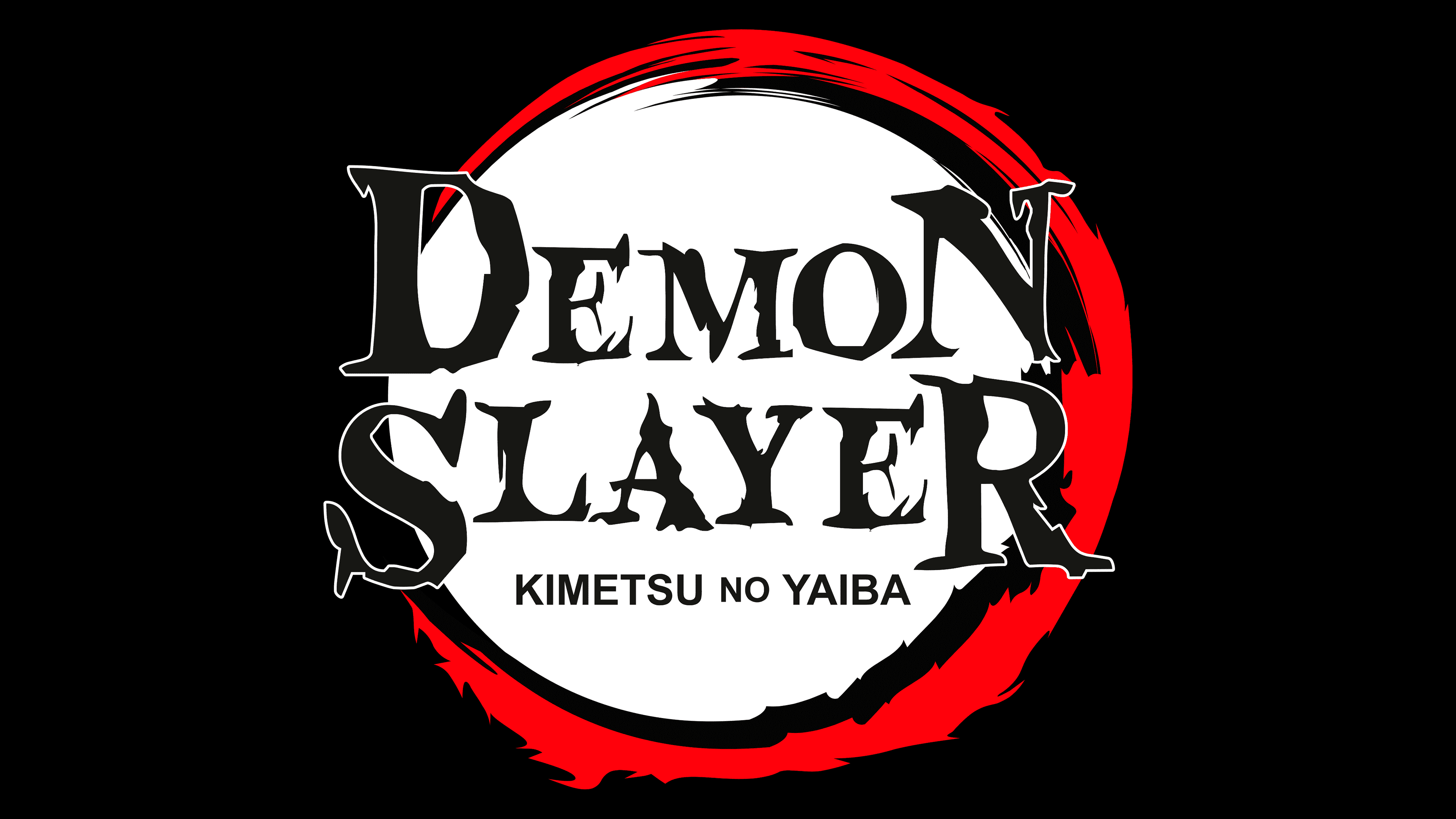
The visual identity mark is shaped like an unfinished circle, resembling the letter “C” written backward. It symbolizes several concepts at once: the first is the circular sweep in combat; the second is a protective ring against dark forces; the third is a magic ball; and the fourth is flame. The line is uneven: narrow at the ends and wide in the middle.
The two colors of the ring (red and black) run parallel. Sometimes they are swept into each other as small flecks, but they are not completely absorbed, remaining as small foreign strokes. In the beginning, the streaks are fragmentary, as if applied with a brush. Further on, they take on the distinct shape of tongues of flame along the edge. The protrusions are sharp, spike-like.
In the center is the franchise name, split across two lines. The word “Demon Slayer” is also done in an intimidating style, with an irregularly barbed edge. The right leg of the “A” has a wave-like shape – as if it were a body shiver of terror and fear. The inscription is typed in capital letters, with the first and last characters in each word highlighted and much larger than the rest. Below is the second fragment of the title of the first manga, “Kimetsu no Yaiba.” The letters in it are thin, straight, and chopped.
Font and Colors
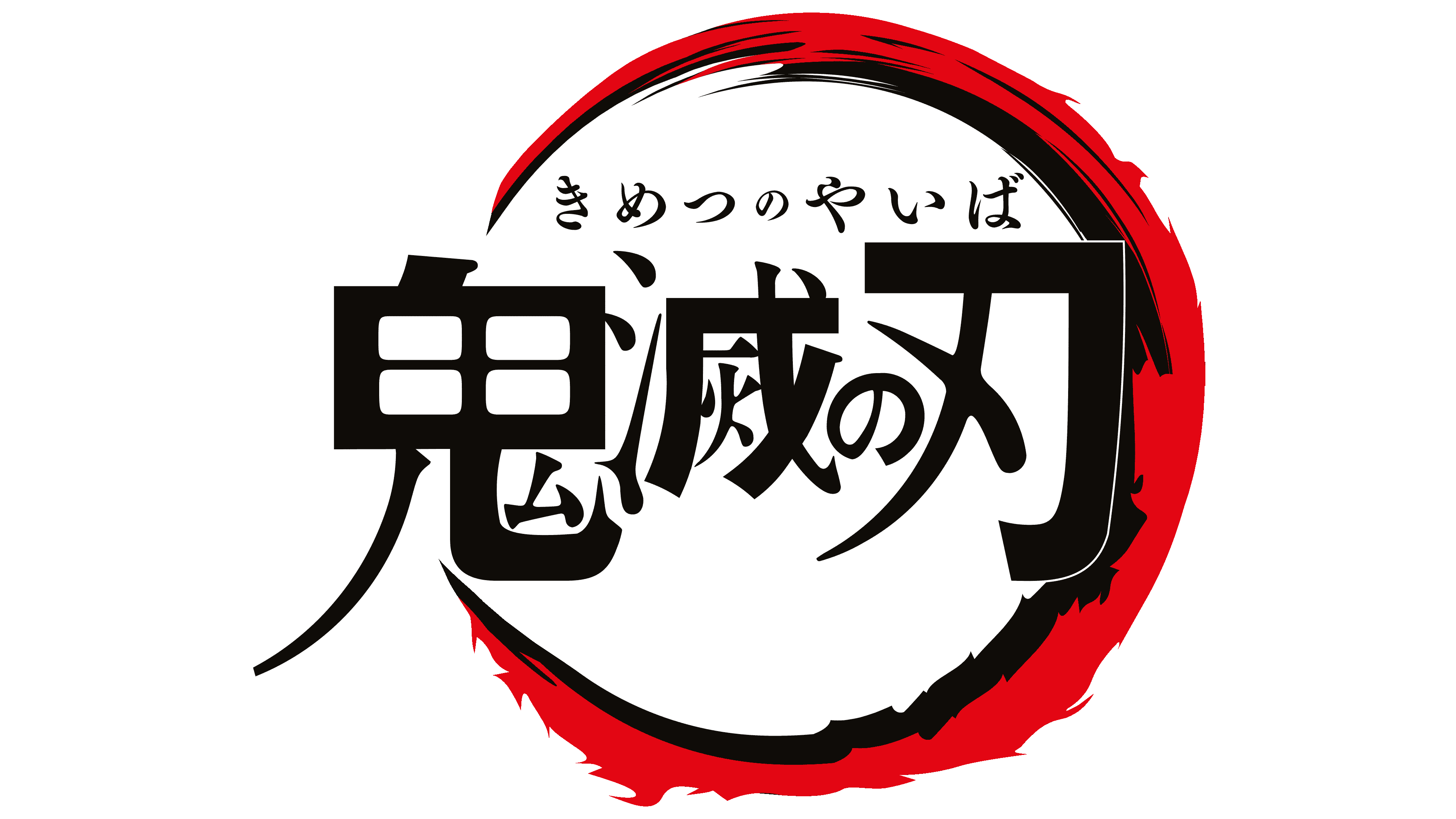
The Demon Slayer emblem uses a clean version of the Blood Crow Condensed typeface. It is a narrow-application design font, characterized by angularity, spikes, and non-standard serifs.
The official palette is fatal. It features the classic black-and-red combination, which conveys an atmosphere of fear, psychological tension, and danger. The background color is white.