The use of the name and symbolism of a diabolical organization by athletes of the Roman Catholic University is symbolic. The DePaul Blue Demons logo, which distinguishes fifteen teams, features a clever and powerful mascot. A play on words led to the emergence of a mascot whose cunning and strength became the characteristic traits of the players.
DePaul Blue Demons: Brand overview
| Founded: | 1978 |
| Headquarters: | Chicago, Illinois, U.S. |
| Website: | depaulbluedemons.com |
Meaning and History
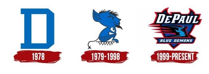
The logo used until 1979 contains the traditional letter “D.” The symbol is simple and unremarkable. The designers chose a rectangular font without rounded details and made the background white. Then, the emblem featured a small blue devil with a tail, beard, and horns. This is one of the graphic versions of the mascot Demon In a Blue Suit, more commonly known as DIBS. It was the distinctive symbol of the sports department from 1979 to 1998.
In 1999, artists modernized the logo. They depicted a heraldic shield with blue horns in the background. On the front side is the inscription “DePaul,” a ribbon with the team name (“Blue Demons”), and a stylized head of a devil turned-in profile. The developers also played with the font of the first word, adding sharp serifs in the form of horns.
What is DePaul Blue Demons?
DePaul Blue Demons is a participant in the intercollegiate program, uniting 15 student teams from DePaul University, located in Chicago, Illinois. The sports faculty is a member of the Big East conference and competes in NCAA Division I.
1978
1979 – 1998
1999 – today
DePaul Blue Demons Basketball
The DePaul University basketball players have been coached by Dave Leitao since 2015. But their fame came much earlier when Ray Meyer was in charge. During that era, the team reached the final NCAA Division I tournaments several times, although they lost to opponents in the final four. Until 2017, the athletes’ stadium was Allstate Arena. Now, home games are held at Wintrust Arena.
DePaul Blue Demons Softball
The women’s softball team, “Demons,” participated four times in the Women’s College World Series. After the 2006-2007 season, it ranked sixth in the USA Today/NFCA poll, topping the survey.
DePaul Blue Demons: Interesting Facts
The DePaul Blue Demons are a sports team from DePaul University in Chicago. They’re pretty awesome at a bunch of sports.
- Basketball Heroes: In 1945, the men’s basketball team won a big NIT tournament. Winning the NIT was a huge deal before everyone started paying attention to the NCAA Tournament. So, that’s a big part of DePaul’s basketball story.
- Women’s Basketball Rocks: The women’s basketball team is also amazing. They play fast and score a lot, making their games fun. They’ve been doing great in the 2000s and 2010s, getting into the NCAA tournament a lot.
- A Famous Coach: Ray Meyer coached men’s basketball from 1942 to 1984. He’s a big deal in basketball history because he led DePaul to major wins and coached a star player named George Mikan.
- George Mikan, Basketball Star: Speaking of George Mikan, he was known as “Mr. Basketball.” He was good and helped change how basketball is played. He was a star at DePaul before becoming a legend in professional basketball.
- Soccer Success: Both the men’s and women’s soccer teams have done well, especially the women’s. They’ve been to the NCAA tournament multiple times, showing DePaul is good at more than just basketball.
- Track and Field Talents: DePaul has a strong track and field history, with many athletes competing in major competitions and Olympic trials. This shows that they care about a variety of sports.
- Helping the Community: DePaul’s Blue Demons team does a lot of community service. Helping others and doing well in school is part of their beliefs.
- Big City Benefits: Being in Chicago allows the DePaul teams to connect with the city in special ways, which is great for the athletes and the community.
So, the DePaul Blue Demons are not just good at sports; they also help their community and are part of a big city’s life.
Font and Colors
DePaul Blue Demons color codes
| Polynesian Blue | Hex color: | #054696 |
|---|---|---|
| RGB: | 5 70 150 | |
| CMYK: | 97 53 0 41 | |
| Pantone: | PMS 7687 C |
| Rich Electric Blue | Hex color: | #0093d7 |
|---|---|---|
| RGB: | 0 147 215 | |
| CMYK: | 100 32 0 16 | |
| Pantone: | PMS Process Blue C |
| Red | Hex color: | #e4002b |
|---|---|---|
| RGB: | 228 0 43 | |
| CMYK: | 0 100 81 11 | |
| Pantone: | PMS Bright Red C |
| Black | Hex color: | #000000 |
|---|---|---|
| RGB: | 0 0 0 | |
| CMYK: | 0 0 0 100 | |
| Pantone: | PMS Process Black C |
