The Der Spiegel logo is strict and impressive. It demonstrates the scale of the publication and the importance of the news it covers. The sign hints at the considerable experience and elegant style.
Der Spiegel: Brand overview
| Founded: | 25 October 1994 |
| Founder: | DER SPIEGEL GmbH & Co. KG |
| Headquarters: | Hamburg, Germany |
| Website: | spiegel.de |
Der Spiegel is an online portal for a weekly German informational-political publication. The editorial staff includes 150 people. It belongs to Spiegel-Verlag through Der Spiegel GmbH & Co. The portal is read by 77 million people monthly. The headquarters is in Hamburg.
Meaning and History
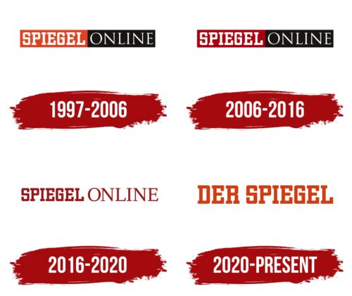
The online version of the newspaper appeared in 1994 under the name Spiegel Online, but the publication received a separate logo in 1997. Initially, it was a service without its domain, registered in 1995. The online version published separate articles from the printed newspaper. And only in 1996 did the publication begin to exist independently with its editorial office and its news. After that, the logo was born. The sign has changed several times but has consistently combined a double indication: belonging to the magazine and the computer world.
What is Der Spiegel?
A news web portal that covers the activity of the German government, parties, and corporations. It ranks 8th in the country among news portals. Since 2020, it has had a joint editorial office with the print edition. It contains separate journalists in New York, Washington, London, Moscow, Istanbul, and New Delhi.
1997 – 2006
The first emblem consisted of the logo of the print newspaper: a white inscription “Spiegel” on a red background. And the addition of “Online” in a completely different font on a black background.
This technique made it clear that the portal is a continuation of the magazine, but it has its “face” and presents its materials.
The word Spiegel translates from German as a mirror and indicates that the publication reflects the visible world as it is. It describes real events and takes interviews with significant people of our time.
2006 – 2016
The main print publication’s logo changed. The red background became a darker cherry to emphasize the newspaper’s age, which celebrated its 60th anniversary at the second birth (1947) and its 100th anniversary at the first (early 20th century). Cherry is also the color of the elite and shows that Der Spiegel covers the issues of the most influential and strong people in Germany, famous and worthy, holding high positions.
Due to this innovation, the color of the substrate in the logo of the web version also changed. The black part remained the same.
2016 – 2020
In 2016, a woman Barbara Hans became the chief editor. The change of editor led to a rebranding. The substrates were removed from the inscription to show that the portal does not water down but writes only the most important and substantial. Since internet publications are read by busy people who want to get the main news quickly, it’s important for the portal to meet this requirement. And this technique in the sign emphasized this conformity.
The letters of “Spiegel” took on a cherry hue, keeping the previous font associated with the print newspaper. The addition of “Online” also became a cherry but with its font. The red color represented the main news, the freshest and hottest. The difference in fonts highlighted the distinction between print and virtual publications.
2020 – today
Throughout its existence, the portal adhered to a strict economic regime and even had its rates for journalists. However, in 2019 its editorial board was nonetheless combined with the print edition. The portal was renamed Der Spiegel, and the logo was changed to resemble the newspaper’s emblem – square capital letters. The main difference lay in color. The newspaper had white letters on a red background, while the portal was vice versa. This approach suggested that the online version contained only the most interesting, compelling news and hot data.
Font and Colors
- The primary colors of the logo are red, white, and black. The shades create contrast and opposition to highlight the portal’s specificity.
- Red – sensations, controversies, fresh data.
- White – news, truthful coverage of events.
- Black – politics, major players, the most-read publication with a broad user reach.
The inscription’s font is Yearbook Std Solid with faceted letters, demonstrating the multifaceted nature of the publication.
Der Spiegel color codes
| Sinopia | Hex color: | #d03d12 |
|---|---|---|
| RGB: | 208 61 18 | |
| CMYK: | 0 71 91 18 | |
| Pantone: | PMS 172 C |
