


![]() Detroit Lions Logo PNG
Detroit Lions Logo PNG
Since 1929, the Detroit Lions have served as a sports team for several cities where they have played throughout their existence. The team’s name and success are reflected in the Detroit Lions logo, which symbolizes the aggressive side of the game, strength, and determination to defeat opponents.
The Detroit Lions are a professional football team competing in the Northern Division of the National Football Conference. The team has been a member of the NFL since 1930. It was founded in 1929 in Portsmouth, Ohio. Initially, the team was named “Portsmouth Spartans.” It officially joined the National Football League on July 12, 1930. Despite apparent success in the NFL, the Portsmouth Spartans could not survive during the Great Depression, a period that had the most devastating effects on small towns like Portsmouth.
Low revenue and other financial difficulties forced the owners to sell the franchise to a group of investors led by George A. Richards, the executive director of a Detroit radio station. They paid $795,208 to cover the team’s debts and $15,000 for the NFL franchise. After purchasing the team in 1934, George A. Richards moved it to Detroit, Michigan. The team finished its first season in second place in the Western Division. In 1940, the franchise was sold to Fred Mandel, a director of a Chicago department store, for $225,000. Eight years later, in 1958, the club passed to Edwin J. Anderson and Lyle Fife, who owned it until 1964. In late November 1963, William Clay Ford Jr., the former vice-chairman of Ford Motor Company, became the sole owner of the “Lions,” buying a controlling share of the team for $4.5 million. In 2014, the controlling share of the “Detroit Lions” passed to Martha Firestone Ford.
The team’s name history is quite interesting, as a few NFL players have changed their names. Initially, the team was called the Portsmouth Spartans, honoring its hometown. After moving to Detroit, George A. Richards renamed the team to the Detroit Lions, after the baseball team, the Detroit Tigers. The new owner explained that the club would become the king of the league, just as the lion is the king of the jungle. The “Lions” fulfilled this promise by winning their first NFL championship in 1935.
Meaning and History
![]()
The Detroit Lions are one of many NFL teams that have a common name, mascot, and central logo. This was not always the case: for some time, it was called the Portsmouth Spartans. But even then, the emblem fully reflected the club’s nickname, as it included a corresponding inscription, set in bold type with rectangular serifs. Then, the team was renamed the Detroit Lions, after which it got a whole series of thematic logos with lions:
- Colorful and cartoonish, the second white with a blue outline, and all subsequent ones blue. All Detroit Lions logos feature an image of a lion, which has dual meaning.
- It is a kind of compliment to the Detroit Tigers, a baseball team.
- The club’s owners hope that the monarch of the jungle will become the king on the NFL playing fields.
What is Detroit Lions?
The Detroit Lions were formerly the Portsmouth Spartans, which started playing in the NFL in 1930. Four years after its debut, the team moved to another city and then received a new name. It has won several league championships but has not yet captured the Super Bowl.
1929 – 1933
![]()
Since the team’s original name was the Portsmouth Spartans, the logo featured two words. The top part of the logo featured a beige inscription, “PORTSMOUTH,” in capital letters, framed by a black border. Below was the word “SPARTANS” in black with a goldish-beige edge. It was also written in capital letters but slightly expanded to acquire an exact rectangular shape.
1952 – 1960
![]()
The first Lion logo included, of course, a lion and a football player holding a ball. Both demonstrated determination, ambition, and immediate readiness for action. The beast opened its mouth for a roar. Its belly was pressed to the ground as if it were preparing to jump. The football player also leaned forward, waiting for the signal to make a move. He was dressed in a red shirt, blue pants, and a helmet. Both figures were outlined in black.
1961 – 1969
![]()
In 1961, the logo became much simpler, both in design and color scheme. The new logo featured a minimalistic white lion with a thin blue outline and two wide stripes (blue and gray) in the background. The color palette of this logo underwent a radical change, transitioning to a white-blue spectrum. The lion’s belly was still pressed to the ground. Such a pose symbolized its determination and readiness for an energy surge. In addition, the wild beast was drawn slim and toned to illustrate the players’ ideal physique. The lion was depicted at full height with a tail bent forward, which also serves as an allegory for its goal-oriented nature.
1970 – 2002
![]()
The emblem of this era was unique, as the iconic leaping lion first appeared on the team’s logo in 1970. The creative team radically reworked the previous logo. The beast was depicted mid-jump: its hind legs were on the ground, while its front legs were in the air. Its pose produced a dynamic impression. At the same time, the lion had no facial features, only a muzzle without eyes, a mouth, or a nose, which were depicted schematically. The figure had a white outline and another blue contour around it.
2003 – 2008
![]()
In 2003, this logo underwent minor changes. It still featured a fierce leaping lion with a lush mane. As before, the beast’s face didn’t have clear outlines; only a schematic mouth and nose were visible, making it hard to guess. The lion’s pose emphasizes the aggressive side of the game, its strength, and the desire to offend. The beast very much resembled a heraldic, fierce lion depicted in profile, standing straight with its front paws raised. The only difference from the previous version was a thick black contour instead of blue.
2009 – 2016
![]()
In 2009, the leaping blue lion acquired more defined contours. Now, the paws, mane, face, and body were visible. Designers tried to give it a more realistic look. In addition, the lion got fangs, which seemed like an extremely effective tool for intimidating enemies. Also, elements of the eyes, mane, and tail were drawn. The fierce character was outlined in white, then black.
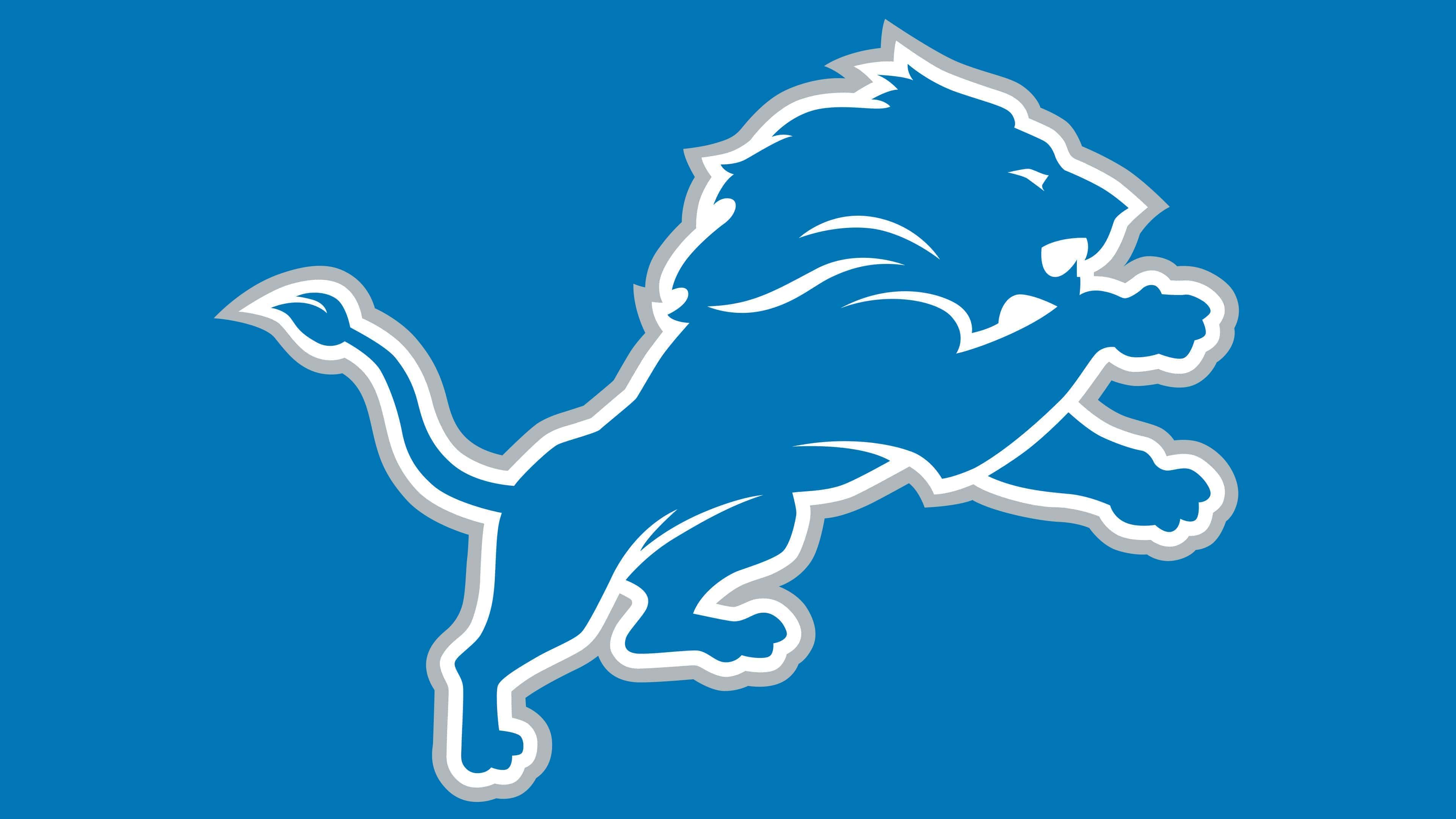
2017 – today
![]()
After several attempts to perfect the logo, designers finally achieved the desired result. The current version, adopted in 2017, has come a long way. Since 1970, it has changed several times. Artists experimented with the color of the strokes, the shape of the lion, and the placement of internal paths. Eventually, they presented the final version, which fully satisfied the club’s executives. The Detroit Lions logo, compared to the previous one, appears clearer. Strands in the falling mane and the animal’s eyes are noticeable. The hind legs are smaller than the front ones, which remain massive. This is the perfect allegory for the king of the jungle, agile, fierce, and strong. The black contour is toned down to light gray.
Font and Colors
The official graphics of the Detroit Lions feature a silhouette of a blue lion, outlined by two stripes, white and light gray. The animal stands on its hind legs, with its front legs raised. There is a reference to traditional heraldic lions, which adorn the coats of arms of many states and cities in the USA. Artists depicted the mane schematically but quite recognizably. They also slightly detailed the legs and head, as much as the chosen style allows.
As there are no inscriptions, there is no issue with the font: the logo’s creators focused on the drawing. Over the past 50 years, it has hardly changed at all, except for slightly transformed contours and an updated color palette. The lion’s silhouette has always been blue, but initially, a darker shade was used. Now, the blue color is closer to light blue. The color of the contour has also changed: in the current version, it’s light gray, almost silver.