


 Detroit Titans Logo PNG
The commitment to ancient Greek heroes, their strength, courage, and resilience, is symbolized by the logo of the Detroit Titans team, the athletes of the University of Detroit Mercy. The depiction of ancient military regalia conveys a shared spirit and combative mood akin to that of ancient Greek warriors.
The University of Detroit athletic program began in the early 20th century, when teams were known as the Tigers before adopting the name Titans around 1919–1924. Basketball became the program’s main focus and shaped its identity.
In the early 1960s, Dave DeBusschere set lasting records with 24.8 points per game and 1552 rebounds. In 1962, he was drafted first overall by the Detroit Pistons, signed with the Chicago White Sox, and later entered the Basketball Hall of Fame.
In 1968–69, Spencer Haywood played one season, averaging 32.1 points and 21.2 rebounds. After winning Olympic gold in 1968, he challenged NBA eligibility rules, and a 1971 Supreme Court decision allowed early entry into professional basketball.
Coach Dick Vitale arrived in 1973 and introduced a fast-paced system. In 1976–77, the team went 25–4, defeated Marquette, reached the NCAA Tournament, and lost to Michigan. Vitale later worked with the Detroit Pistons and was inducted into the Hall of Fame.
In the late 1990s, under Perry Watson, the team reached the NCAA Tournament in 1998 and 1999, defeating St. John’s and UCLA. In 1990, the university merged with Mercy College to become the University of Detroit, Mercy.
Rivalry with the Oakland Golden Grizzlies developed in the Horizon League. In 2021, women’s lacrosse joined the Mid-American Conference during its first season.
Meaning and History
What is Detroit Titans?
The Detroit Titans (formerly Detroit Mercy Titans) are a sports department affiliated with the University of Detroit Mercy in Michigan. The program includes 17 student teams that compete in NCAA Division I. Athletes also compete in the Horizon League, ASUN Conference, and Mid-American Conference (joined in 2021).
1965 – 1989

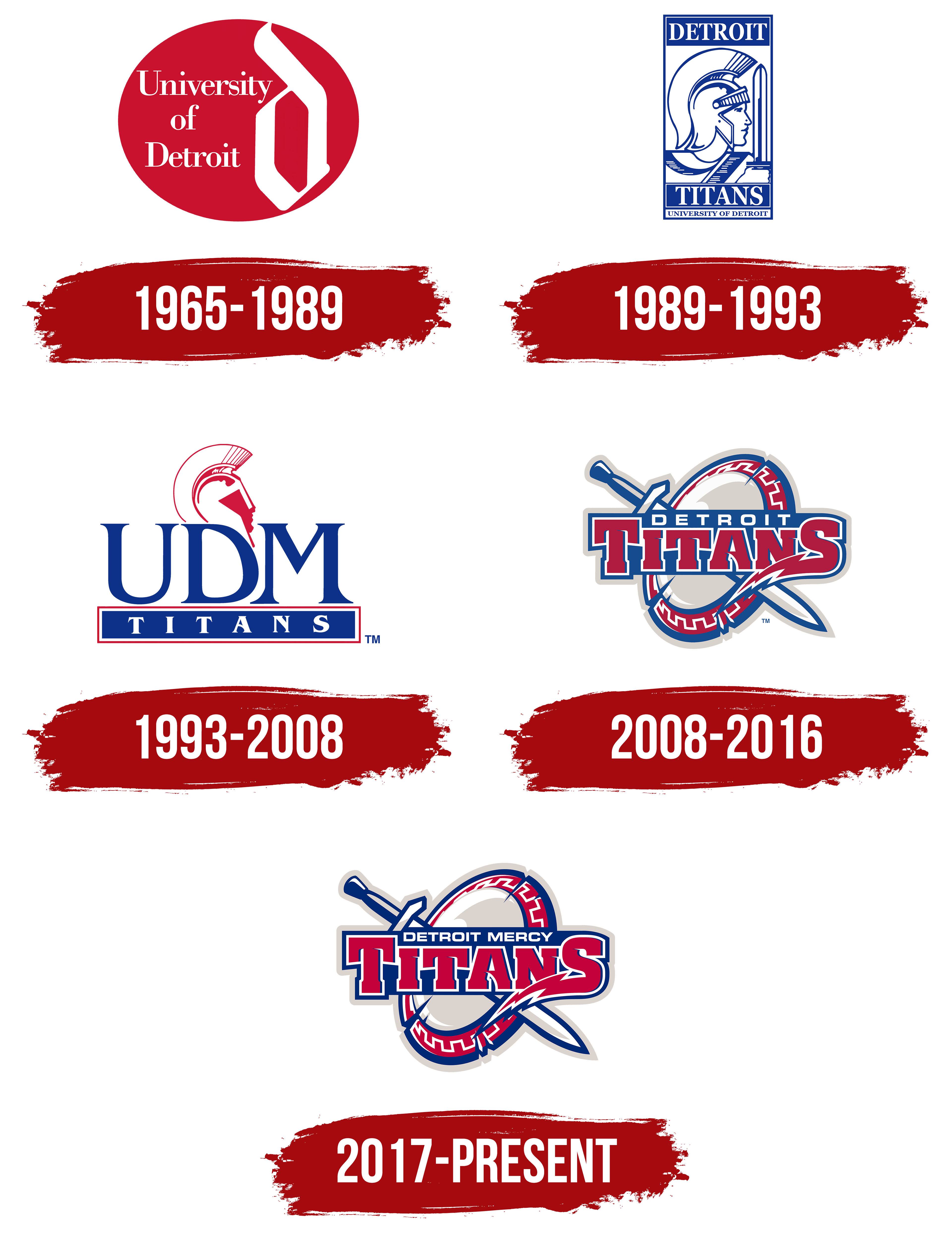
The early University of Detroit emblem represented the institution through its name and a decorative letter. A red oval contained two treatments of the name. On the left, white serif lettering spelled University of Detroit across three lines. A tall white lowercase “d” in an Old English style occupied the right half.
The angular letter reached the oval’s edge with its upper stroke and closed into a pointed loop at the bottom. The contrast between the typeset name and the large decorative “d” shaped the emblem. The university name stood alone, without an athlete, weapon, or mythological figure.
Today, the Detroit Mercy Titans represent the University of Detroit Mercy, a name preserving the history of two institutions. The Jesuits founded Detroit College in 1877, and it later became the University of Detroit. The Sisters of Mercy opened Mercy College of Detroit in 1941. Their 1990 merger created the University of Detroit Mercy. Detroit identifies the city, while Mercy preserves the college’s name and its connection to the religious community.
The Titans nickname predates the merger. The teams were originally called the Tigers, leading to confusion with the Detroit Tigers professional baseball club. In the fall of 1919, Stanley Brink, a Detroit Free Press reporter covering university football, suggested Titans. The players’ imposing builds inspired the comparison to figures from Greek mythology, conveying their physical power.
In the spring of 1924, the university’s athletic board adopted Titans as the official nickname. A preliminary review had confirmed its uniqueness among the nation’s major colleges and universities. The board associated the name with courage and bravery, replacing the Tigers with an image drawn from mythology.
1989 – 1993

In the next Detroit Titans emblem, the team nickname received its own line, and an armed Titan appeared beside the lettering. An elongated rectangular frame and a blue-and-white treatment replaced the red oval. DETROIT occupied the upper blue panel, with TITANS in the lower panel. Both used white uppercase serif letters. Small UNIVERSITY OF DETROIT lettering appeared beneath the lower panel.
Inside the frame, a warrior faced right. A tall crest rose above his helmet, and a vertical sword blade stood in front of his face. An arm and part of the armor were visible below. Fine lines depicted the helmet’s construction, facial profile, and clothing folds.
A costumed mascot also portrayed the ancient warrior. The first Tommy Titan appeared before fans on February 12, 1977, at Calihan Hall before a basketball game against Wayne State. Student Tom Cieszkowski wore the costume. By signing autographs as Tommy Titan, he gave the mascot its name.
Alumnus Ken Thelen assembled the costume from theatrical armor pieces purchased from Tobins Lake Studios. He fashioned a breastplate, back armor, greaves, and a helmet with alternating red-and-white feathers. His wife, Nancy, sewed a white tunic with red trim, and his father made a wooden spear.
1993 – 2008

In 1993, the initials UDM became the foundation of the Detroit Mercy Titans emblem, reflecting the merged university’s name. Large blue serif letters filled most of the design. Beneath them, a horizontal blue panel carried white TITANS lettering with increased letter spacing and a red-and-white border.
A red-and-white Titan head in profile rose above the initials. It partly occupied the space above the “D,” so the letter’s contours were adjusted to accommodate the helmet. The face and crested helmet remained from the earlier detailed figure. The sword, arm, clothing, and tall frame were removed, pairing the abbreviated university name with the portrait. The version remained in use until the 2008 update.
2008 – 2016
A new set of Detroit Titans marks, introduced in 2008, accompanied the expansion of the athletic program and preparations for a major university event. Athletic director Keri Gaither tied the update to new basketball coaches, the addition of three sports, and the university’s preparations to host the 2009 NCAA Final Four. The goal was to bring consistency to the athletic department’s emblems while retaining their connection to Detroit.
Detroit firm Starr Constand developed the project. Athletes, coaches, staff, alumni, and university leaders participated in the discussions. The marks debuted in August 2008 at Calihan Hall before students, athletes, staff, alumni, and journalists. During the 2008–2009 academic year, they were introduced on uniforms and the arena’s refinished basketball court. The university retained The Licensing Resource Group to handle rights to the emblems and wordmarks.
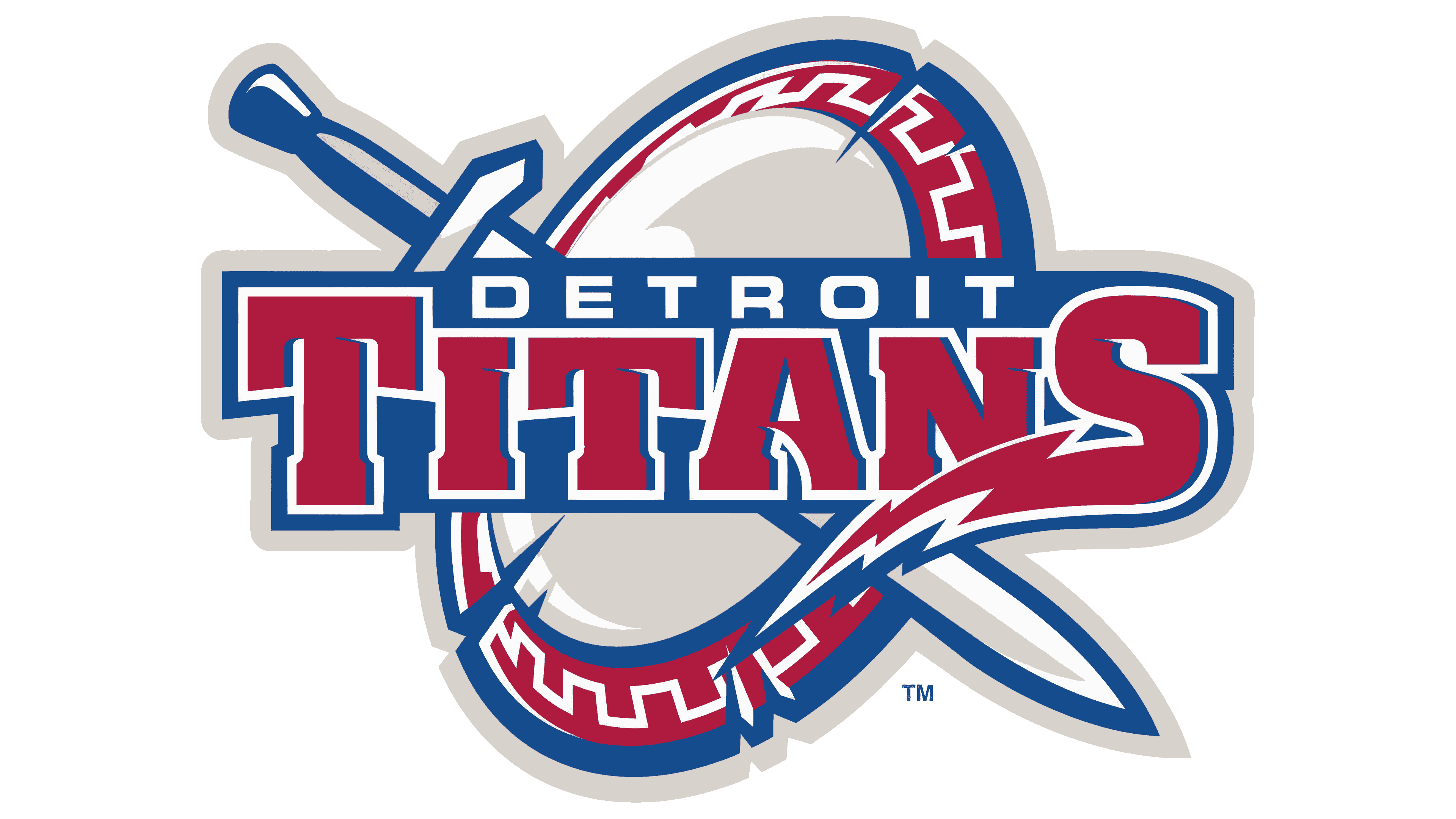
In the primary version, a shield and sword replaced the helmeted head. The oval shield is tilted, with a sword running diagonally behind it from the hilt at the upper left to the tip at the lower right. A red rim decorated with an angular white pattern surrounds a gray field. Notches along the edges and white areas resembling reflections on metal give the shield the appearance of battle gear.
DETROIT TITANS crosses the shield in two lines. Small white sans-serif letters spell DETROIT on a blue band. Beneath it, large red TITANS lettering has white and blue outlines. The lower stroke of the “S” extends to the left in a jagged, lightning-shaped flourish. Multiple outlines join the lettering, shield, and sword.
Red, white, and blue remained, with gray added as a supporting color. Secondary emblems paired the sword with silhouettes of Detroit buildings, continuing the city theme. Separate wordmarks were prepared for teams and departments.
In August 2014, the athletic department approved two primary emblems. The Titan Shield retained the sword and Detroit Titans name. A red “D” with blue and gray outlines became the second option. Reproduction standards specified PMS 187 red, PMS 288 blue, and PMS Cool Gray 3. Adobe Eurostile and Detroit Titans™ became the official typefaces for the athletic identity.
2017 – today
In 2016, Detroit Mercy became the shared name for university and athletic branding. President Antoine Garibaldi explained the change as an effort to unite alumni of the University of Detroit, Mercy College of Detroit, and the institution formed by their merger under one name. Pittsburgh agency BD&E, which led the university-wide update, recommended the shortened name Detroit Mercy after interviews, surveys, and focus groups.
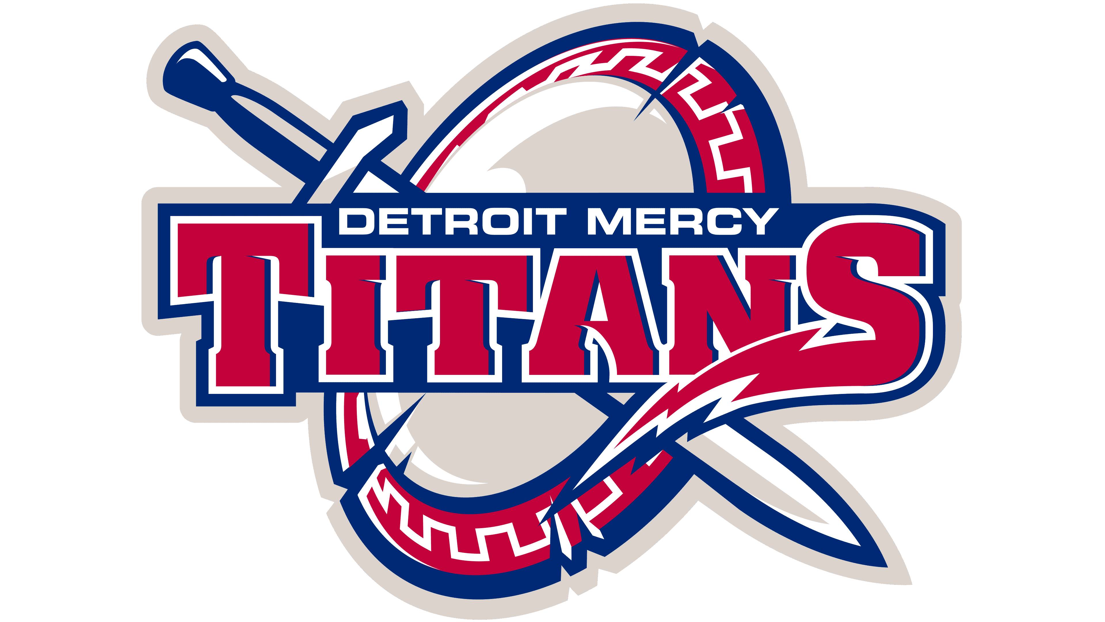
The new logos were unveiled on September 15 at the university’s Celebrate Spirit gathering. In the athletic shield, DETROIT MERCY replaced DETROIT, with both words fitting into the existing band. A quarter century after the merger, Mercy became a permanent part of the emblem. The 2016 standards discontinued the earlier shortened forms Detroit and UDM.
The rest of the shield remained intact. The sword, decorative pattern, large TITANS lettering, and jagged flourish extending from the “S” preserved the familiar silhouette. The revised wording connected the athletic emblem to the university’s combined name while retaining the arrangement of its main components.
In the secondary set, a DM monogram replaced the standalone “D.” An Old English “M” was incorporated into a red “D.” The interwoven initials of Detroit and Mercy represented the university’s Jesuit and Sisters of Mercy traditions.
PMS 1945 red, PMS 288 blue, and PMS Warm Gray 1 were approved for the Titans emblem. Blue retained its designation from the 2014 standards, while red and gray received new codes. Printing versions with a limited number of inks accompanied the full-color shield.