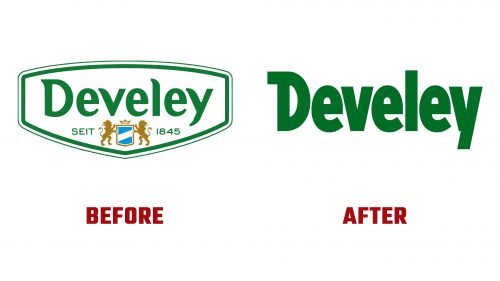
Develey, a well-known mustard and sauce brand, has introduced a new logo and packaging design. This is the first significant update since 2014, marking a fresh look for the brand.
Develey was founded in 1845 by Johann Conrad Develey as a small mustard manufacturing operation in Munich. Today, it operates in Germany, Austria, Switzerland, and other countries, distributing products to retail food outlets, system gastronomy, and wholesale markets. In 2021, the company reported revenue of 627 million euros. Michael Durach has been the managing director since 1999.
The new logo is more centrally placed on the packaging. The wordmark is based on the longstanding logo but with a unique twist: the final “e” in Develey is stylized to appear as a smiling face. This design choice adds a friendly and approachable element to the brand.
Photographic images of food items, such as meat skewers, now occupy more space on the packaging. This shift emphasizes the product’s use and appeal, giving consumers a clear visual cue about how the sauces can enhance their meals.
The plastic bottle has been redesigned. The new form features a triple-waved body that expands towards the top, and the overall height of the bottle has been reduced. Despite these changes, the bottle’s capacity remains at 250 ml, avoiding “shrinkflation.”
Consumers will begin to see Develey sauces in their new look on supermarket shelves, with the old and new designs displayed side by side during the transition. Other product categories will follow suit by mid-year, and the digital brand presence will be updated to reflect the new identity.
The new packaging design incorporates vibrant colors that reflect the freshness and quality of the ingredients. Rich reds, greens, and yellows create an eye-catching and appealing look. These colors resonate with consumers, evoking the natural and high-quality ingredients used in Develey’s products.
The new logo’s modern and clean typography, with a sans-serif font that enhances readability. The spacing between the letters ensures clarity, making it easy for consumers to recognize the brand. The smiling “e” adds a playful element and subtly communicates the brand’s dedication to customer satisfaction.
Graphic elements on the new packaging include detailed images of the sauces in use, paired with background textures that add depth and context. These design choices create an engaging visual experience for consumers, helping them envision how the sauces can be incorporated into their meals.
The new packaging incorporates practical features to enhance the user experience. The ergonomic shape of the bottle makes it easier to handle and pour, while the redesigned cap ensures a secure seal to maintain freshness. These improvements reflect Develey’s commitment to quality and customer convenience.
The rebranding effort reinforces Develey’s position in the market as a leader in quality and innovation. The updated identity is designed to appeal to a broader audience, including younger consumers who appreciate modern packaging. Develey aims to strengthen its brand loyalty and attract new customers by staying true to its heritage while embracing contemporary design trends.


