The site lifts the veil over a large layer of the world of creativity. The DeviantArt logo says that only a part of the works of talented artists can be seen on the portal. The emblem states that in order to choose the best and understand the essence of the works, you will have to go deep and flip through the pages.
DeviantArt: Brand overview
| Founded: | August 7, 2000 |
| Founder: | Scott Jarkoff, Matthew Stephens, Angelo Sotira |
| Headquarters: | United States |
| Website: | deviantart.com |
Meaning and History
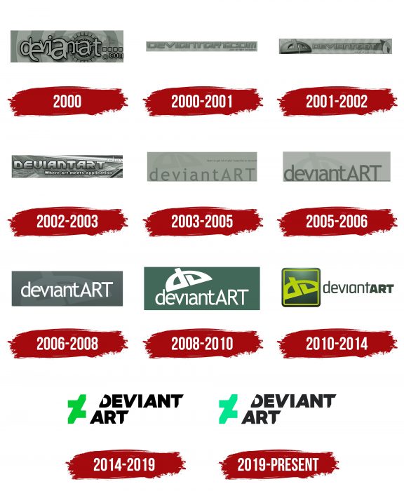
It was a service within a service because the launching pad was a network of music-oriented web resources called Dmusic Network. Therefore, the year of DeviantArt origin is considered to be 2000, and the date of official registration is 2001. In addition to the logo (and there are eleven of them), he also had his mascot – a robot imp nicknamed Fella. He was his main character until 2014.
What is DeviantArt?
DeviantArt is a gallery-like social network for artists, graphic artists, and designers. It provides an opportunity to publish your creative work – photos, drawings, posters, illustrations, and much more. The platform was launched in 2000. Although it is American, it is now owned by the Israeli company Wix.com. The authors of the idea are a group of individuals led by Angelo Sotira.
the 2000 year
The rectangular emblem contains a fragment of a striped target. In the center is the letter “a” from the last syllable “Deviantart,” which is part of the “.com” domain. All characters are different in height, format, style, and size, but they can be successfully added to the service’s name. With this, the founders emphasized the community members’ individuality who can create something personal but harmonious.
2000 – 2001
In parallel, there was another sign – in the same dark-dusty scale, but narrower, with a single inscription. Thanks to the unique lettering design, he made the resource recognizable. The symbols were “robotic,” geometric, angular, which, paradoxically, gave them originality. The website’s slogan “Where art meets application” was also featured on the thin strip.
2001 – 2002
In mid-2001, the abbreviation “da” was added to the existing version of the logo – an abbreviation for the full name “DeviantArt.” The letters were presented as a graphic sign. They are executed in one line, curved in the form of two connected symbols.
2002 – 2003
During this period, the name of the web resource, written in the same style as the web resource, came to the fore. The designers enlarged the brand name, discolored it, made it translucent, and shifted it to the upper right corner.
2003 – 2005
Due to the community’s expansion, he redesigned the logo, using a more understandable font for the logo. Thin elongated letters are set completely differently than before: the first part (deviant) is lowercase, the second (ART) is uppercase. The dusty gray color palette is preserved.
2005 – 2006
The resource received a corrected logo with an enlarged name. There is almost no intercharacter space, so they merge. The original “da” symbol serves as a semi-transparent background.
2006 – 2008
In 2006, the administration adopted another version of the simple gray emblem. She emphasized the text by placing the word “DeviantArt” right in the center. And so that it immediately catches the eye repainted it white.
2008 – 2010
To the existing elements, designers have added a visible graphic sign “da,” which appeared for the first time in 2001. The unique element is made in one unbreakable stroke and is located diagonally, at an angle of approximately 45 degrees. Its main color is white, to match the inscription underneath.
2010 – 2014
This version of the logo can be considered revolutionary because it completely changed the style. The “da” icon is a self-contained square-shaped icon with a neon green border. To the right of it is the name of the web community, made up of different types of fonts: the first part of the word “Deviantart” comprises thin and narrow letters; the second is made up of squat and thick letters.
2014 – 2019
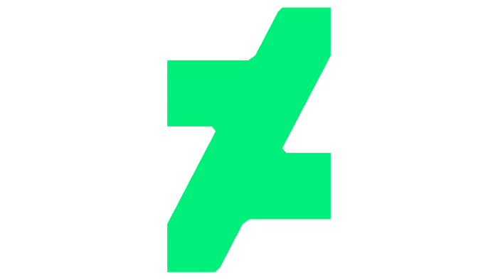
In December 2014, the Moving Brands studio proposed an emblem with a radically new design. She removed the 13-year-old badge and replaced it with an abstract symbol consisting of two contiguous sevens, one inverted. The inscription is made in the same beveled style. The developers rearranged it into two lines and made letters of the same width. At “D” and “T,” they cut off the sides at an angle.
2019 – today
The current logo is identical to the previous one, except for the graphic sign: instead of aquamarine.
DeviantArt: Interesting Facts
DeviantArt, launched in August 2000, has become a major online community for artists, offering a space to display, promote, and discuss art.
- Beginnings: Started by Angelo Sotira, Scott Jarkoff, and Matthew Stephens, it quickly grew from a small site to a vast platform with millions of members and various artwork.
- Diverse Art Forms: It embraces all art forms, from traditional and digital art to photography and literature, welcoming amateur and professional artists.
- Core Membership: This subscription service offers benefits like ad-free browsing, detailed stats on artwork, and enhanced profile customization.
- DeviantMeets: These community meetups allow members to meet, collaborate, and share their love for art in various global locations.
- Daily Deviations: A feature highlighting selected artworks on the homepage for a day, giving artists significant exposure.
- Innovative Tools: The platform has introduced features like the Muro drawing tool, enabling artists to create and share digital drawings on the site.
- Acquisition by Wix: In 2017, Wix.com acquired DeviantArt, planning to combine community resources with Wix’s web development tools to help artists showcase their work.
- Eclipse Update: A major site redesign in 2020 introduced a modern interface and new features, though it received mixed feedback from users.
- Artist Support: DeviantArt helps artists monetize their work through print and digital sales and hosts contests with prizes to encourage creativity.
- Cultural Impact: It has significantly influenced art trends, fostered collaborations, and supported the careers of numerous artists. It’s also a hub for fan communities, offering a space for fan art and fiction.
DeviantArt is a key digital platform for the art community, promoting collaboration, creativity, and artist visibility in the digital era.
Font and Colors
Until 2010, the corporate identity was a gray rectangle. Then he changed the configuration, and in 2014 he got a completely different style. The monogram “da” disappeared, and an abstract icon appeared in its place.
After years of transformation, the word “Deviantart” is written in a modified version of the Caliber typeface from Klim Type Foundry. The letters are partially cut off – exactly at an angle of 62 degrees. The corporate color of the emblem is a combination of black and green (aquamarine).
FAQ
What is the DeviantArt mascot?
DeviantArt’s official mascot is Fella, a robot character representing the community. Fella symbolizes creativity, innovation, and the artistic spirit. Designed to be approachable and friendly, Fella reflects the welcoming nature of the DeviantArt platform, a space for artists to share their work, collaborate, and connect.
The latest version of DeviantArt’s top navigation includes the familiar arcing “dA” logo and Fella. This combination emphasizes the platform’s identity and community.
The mascot represents the brand at events, promotions, and within the site, reinforcing the sense of community and shared passion for art that defines DeviantArt.
When did DeviantArt change its logo?
On December 4, 2014, DeviantArt introduced a new logo and launched an official mobile app for both iOS and Android on December 10, 2014.
The redesigned logo had a modern, abstract design that was simpler and more recognizable across various platforms and devices.
A major event in DeviantArt’s history happened on February 23, 2017, when Wix.com, Inc. acquired the platform for $36 million. This acquisition aimed to enhance the platform’s capabilities and integrate it more deeply with Wix’s website development tools, supporting the artistic community.
These changes show DeviantArt’s dedication to evolving and improving the user experience, keeping the platform a leading space for artists to share and discover creative work.
What does the DeviantArt logo mean?
The logo shows a new way of looking at fine art. It represents seeing art from a different angle. The logo design makes this clear. The “A” in “Art” is vertically cut and flipped, showing the brand’s creative approach. The diagonal angles on the letters highlight this unique view.
The new logo reflects the brand’s commitment to creativity. It encourages artists to find new ways to express their vision. The modern, abstract design is easy to recognize and fits the platform’s goal of inspiring and supporting artists.
What is the DeviantArt logo?
The current logo has the name with the letters “D” and “T” cut at an angle. The letters “A” and “V” next to them have a natural diagonal slope, making the tilt less noticeable.
An icon next to the name features a vertically cut and inverted “A,” resembling two 7s placed together. The logo reflects the brand’s innovative spirit and commitment to offering artists a unique space. The logo’s visual elements symbolize a fresh and unconventional perspective on art, reinforcing the brand’s dedication to creativity and originality.
What is the font of the DeviantArt logo?
The updated logo uses a font based on Caliber that is customized for the brand. Klim Type Foundry created this unique font. The letters have a cutting angle and leg inclination of 62 degrees.
This custom font gives the brand a distinctive and recognizable identity. The angles and slopes add to the logo’s modern and abstract look.
