Scale and breadth are embedded in the Dia logo. The symbols of the emblem tell about a large international network where it is profitable to make purchases. The owners are passionate about what they do, guaranteeing delicious and fresh products on the shelves.
Dia: Brand overview
| Founded: | 24 July 1966 |
| Headquarters: | Las Rozas, Spain |
| Website: | diacorporate.com |
Meaning and History
The Dia chain consists of several supermarkets, including the 24-hour DIA & Go the huge DIA Maxi with parking, and the standard DIA Market, which sells perishable products. Regardless of the format, their overall concept is to maximize savings that keep prices down. To cut costs, the company relies on bulk purchasing, doesn’t spend money on unnecessary finishes and furniture, simplifies logistics, saves on advertising, and chooses to sell a limited range of brands from Europe.
In such circumstances, its logo is one of the key marketing tools because it alone, in fact, should attract the attention of customers. The bright red sign above the store entrances is associated with the range chosen according to the principles of quality and safety. Its design has changed several times, but we cannot say that these changes were drastic.
What is Dia?
Dia is a large-scale supermarket chain that distributes food, personal care, and household products. It is a Spanish company, but many are located outside of Spain among the 6,000 stores it owns: in Argentina, Brazil, and Portugal. Among them, more than 2,500 outlets are franchised.
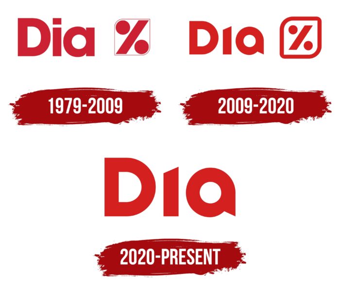
1979 – 2009
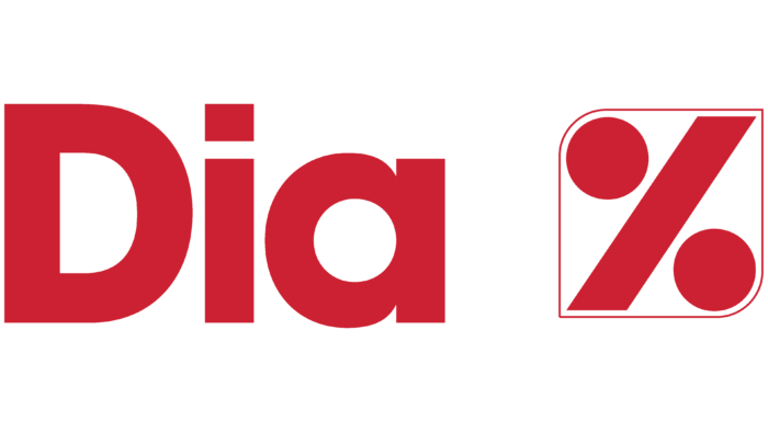
In 1979 the first discount store opened in Spain, giving rise to an entire retail chain. But the corporate image was finally formed by 1984 when the first goods under the own brand Dia went on sale. The company logo contained its name, consisting of three letters. The first “D” was a lowercase letter, while the “i” and “a” were in lowercase. The font used for the lettering was bold sans serif font similar to Avalon Bold by FontSite Inc. or Galano Grotesque Bold Demo by Rene Bieder.
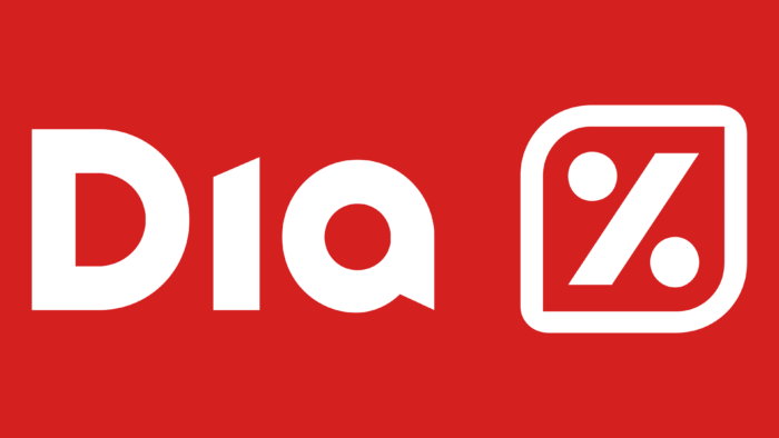
The main discount symbol, the percent sign, was to the right of the word. It contained a diagonally elongated parallelogram with two circles above and below. The designers placed it in a thin red frame, which had the shape of a square with two rounded corners (opposite the circles).
2009 – 2020
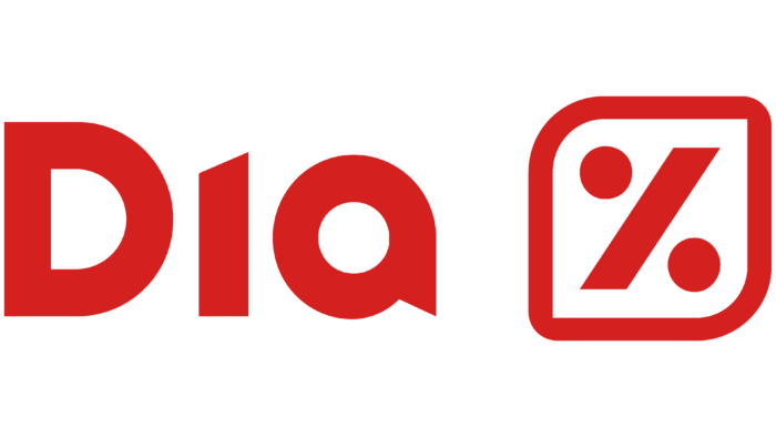
By the end of the 2000s, the retail chain had expanded beyond Spain and introduced innovative store formats. Therefore, it needed a new, more modern logo so that customers could see its growth. But the company did not want to experiment with style: it was completely satisfied with the previous concept. So the red lettering was kept – the developers only slightly changed the font, giving the “a” a round ring shape with a triangular ledge at the bottom and removing the square dot above the “i.” In doing so, they cut off the top corner of the vertical “i” stroke, reduced the percent sign, and made its border bold.
2020 – today
In 2019, LetterOne became the majority shareholder of DIA Group. It gained full control of the chain by buying 69.76% of the shares. Under her leadership, the stores have a new logo, a simplified version of the previous one. The designers merely removed the percentage sign in the frame, leaving the brand’s name unchanged. The hint of discounting is gone, as it was assumed that customers already know the benefits of discount supermarkets.
Font and Colors
Although the current Dia trademark contains only an inscription, it can be considered symbolic from a linguistic point of view. The company name is an acronym formed from the phrase Distribuidora Internacional de Alimentación and a metaphor because the word “dia” translates from Spanish as “day.” It alludes to the daily (and in some cases, 24-hour) availability of stores. Moreover, a day is associated with the beginning of something new, with prospects and the possibility of development.
The designers used a set of individual glyphs instead of the standard font to make the logo original. Only the uppercase “D” looks like a bold, sans serif letter, and it hasn’t been changed since 1979. Its analogs can be found in many typefaces: e.g., Strenuous Heavy from Typodermic Fonts Inc., SF Espresso Shack Bold from ShyFoundry, Noyh Geometric Black from Typesketchbook, Vedo Extra Bold from Wiescher-Design or Adequate Black from K-Type. The lettering color has always remained red, although the developers have experimented with shades. Now the basis of the palette is Fiery Red (#d51a19).
Dia color codes
| Maximum Red | Hex color: | #d4201f |
|---|---|---|
| RGB: | 212 32 31 | |
| CMYK: | 0 85 85 17 | |
| Pantone: | PMS Bright Red C |
