


![]() Dick’s Sporting Goods Logo PNG
Dick’s Sporting Goods Logo PNG
“Everything you need for outdoor recreation and sports activities, you can buy in the company’s stores,” – demonstrates Dick’s Sporting Goods logo. The emblem calls for you to care for your health and to actively spend your free time.
Dick’s Sporting Goods began in 1948 in Binghamton, New York, when 18-year-old Richard “Dick” Stack opened a small fishing tackle shop. His grandmother gave him $300 from a cookie tin after his idea to sell fishing gear was rejected by the owner of the army store where he worked. By 1958, customer demand had prompted the shop to expand into a broader sporting goods business called Dick’s Clothing and Sporting Goods.
In 1984, Dick stepped back and handed the company to his son Edward Stack. At that point, the business had two stores in New York. Edward shifted it toward large-format sporting superstores. Expansion followed in 1992 with stores in Syracuse, Rochester, and the Buffalo area. In 1994, the headquarters moved to Pittsburgh. By the end of that year, the chain had 22 stores in four states, and by 1996, it had more than 50. Its stores averaged about $10 million in annual sales, ahead of The Sports Authority’s average of about $7.7 million.
In 1999, the brand became Dick’s Sporting Goods. Revenue had passed $728 million, and in 2002, the company listed on the New York Stock Exchange under the ticker DKS as sales crossed $1 billion. Major acquisitions followed, including Galyan’s for $362 million in 2004, Golf Galaxy for $225 million in 2006, parts of Golfsmith in 2016, and the sports-statistics app GameChanger.
In 2018, after the Parkland school shooting, Dick’s stopped selling assault-style rifles and high-capacity magazines. They raised the age to buy a firearm to 21, including at Field & Stream. In February 2021, Edward Stack passed the CEO role to Lauren Hobart. That year, the company opened its first House of Sport stores in Victor, New York, and Knoxville, Tennessee.
Meaning and History
![]()
Dick’s Sporting Goods opened its first store in Binghamton, New York, in 1948. However, several decades passed before it happened, as the second location did not appear until 1984. That year, the brand’s founder, Richard Stack, retired, and his son Evard took over the family company. The new owner decided that one supermarket was insufficient and began expanding the business.
Thus, Dick’s Sporting Goods has hundreds of locations, many of which are interactive: in addition to sporting goods, they offer indoor training fields, simulators, climbing walls, and more. Customers can shoot guns at a shooting range, test the comfort of sneakers on a treadmill, or test a golf club on the lawn designed for it.
The retailer’s logo is as elaborate as its concept. However, it was known only on the East Coast of the United States for a long time, as the company did not begin expanding westward until 2009. The basis of the modern logo is an emerald-colored rectangle, with the brand’s name written with balls instead of an apostrophe. Before that, Dick’s Sporting Goods had several other design versions.
What is Dick’s Sporting Goods?
The name Dick’s Sporting Goods speaks for itself. It’s a chain of stores that carries a full line of sporting goods, including shoes, apparel, and outdoor gear. It is a Fortune 500 company because it is the largest retailer in the U.S. sports market.
1948 – 1958
![]()
In 1948, 18-year-old Richard Stack, nicknamed Dick, opened his own business to sell fishing tackle. The idea came to him by chance while working at an army store selling military gear. The boss asked the young employee to add fishing products to the range, and the employee spent several nights creating a detailed merchandising plan. His boss harshly criticized his concept, leaving Richard very upset and leading him to quit. His grandmother helped him come to his senses: she advised him to open his store and financed it by lending him $300, which he kept in a cookie jar in the kitchen.
Had it not been for those events, the world would never have seen the first Dick’s Sporting Goods logo. At the time, the company was called Dick’s Army & Navy but sold mostly fishing tackle and bait, so under the main sign was a white fish silhouette with the black word “TACKLE.” This element occupied the space below the quadrangular figures with lettering. Above all, there was a vertical rectangle aligned with the left edge. It contained the letters “D,” “I,” “C,” “K,” and “S” lined up one below the other.
The upper quadrilateral adjoined the lower one, which read “ARMY & NAVY.” They formed a right angle, with two white stripes (vertical and horizontal) and the phrase “LIVE BRIT” placed there.
1958 – 1980s
![]()
Ten years after its opening, the small fishing store expanded its assortment. Sporting goods and equipment were added to its shelves, and the store was renamed Dick’s Clothing and Sporting Goods accordingly. The bulky sign above the entrance turned into elegant red lettering. On the left was the diagonal word “Dick’s,” raised at about a 45-degree angle. To its right was the second part of the name: “clothing & sporting goods” in lowercase. The logo creators split the text into two lines and aligned them on the right for visual balance.
1980s – 1999
![]()
In 1984, Richard Stack’s children bought their father’s store and turned it into a massive chain. Edward W. Stack became CEO. At about the same time, the company changed its identity: the designers created a graphic sign unlike any previous one. It was a turquoise rectangle with white lettering inside. Most of the space was occupied by the word “DICK’S,” which consisted of bold, angular letters without rounding. Dark lines stretched along the edges of the strokes, and uneven shadows created a sense of volume.
Instead of an apostrophe, five balls of different sizes were lined up one after the other. Three-speed lines next to a small ball emphasized the energy of movement. But the phrase “Clothing & Sporting Goods” at the bottom of the logo looked unremarkable. The developers made it white and wrote it in a standard grotesque with many analogs. Similar fonts include Yoxall Regular by Roger White, Mytupi Regular by Álvaro Thomáz, Protestant by DGL Regular by Digital Graphic Labs, Nimbus Sans L Regular by URW++, and FreeSans Medium by GNU FreeFont.
1999 – today
![]()
The 1999 rebranding was associated with the company’s renaming. The chain shortened its name to Dick’s Sporting Goods and displayed it on the logo: only the last two words remained at the bottom, and the designers used the same bold, angular font for them as for the top “DICK’S.” Not only has the inscription changed, but some minor details have as well. For example, the background rectangle has a darker border and a lighter gradient. The ball-shaped replacement for the apostrophe now extends slightly beyond the base.
Font and Colors
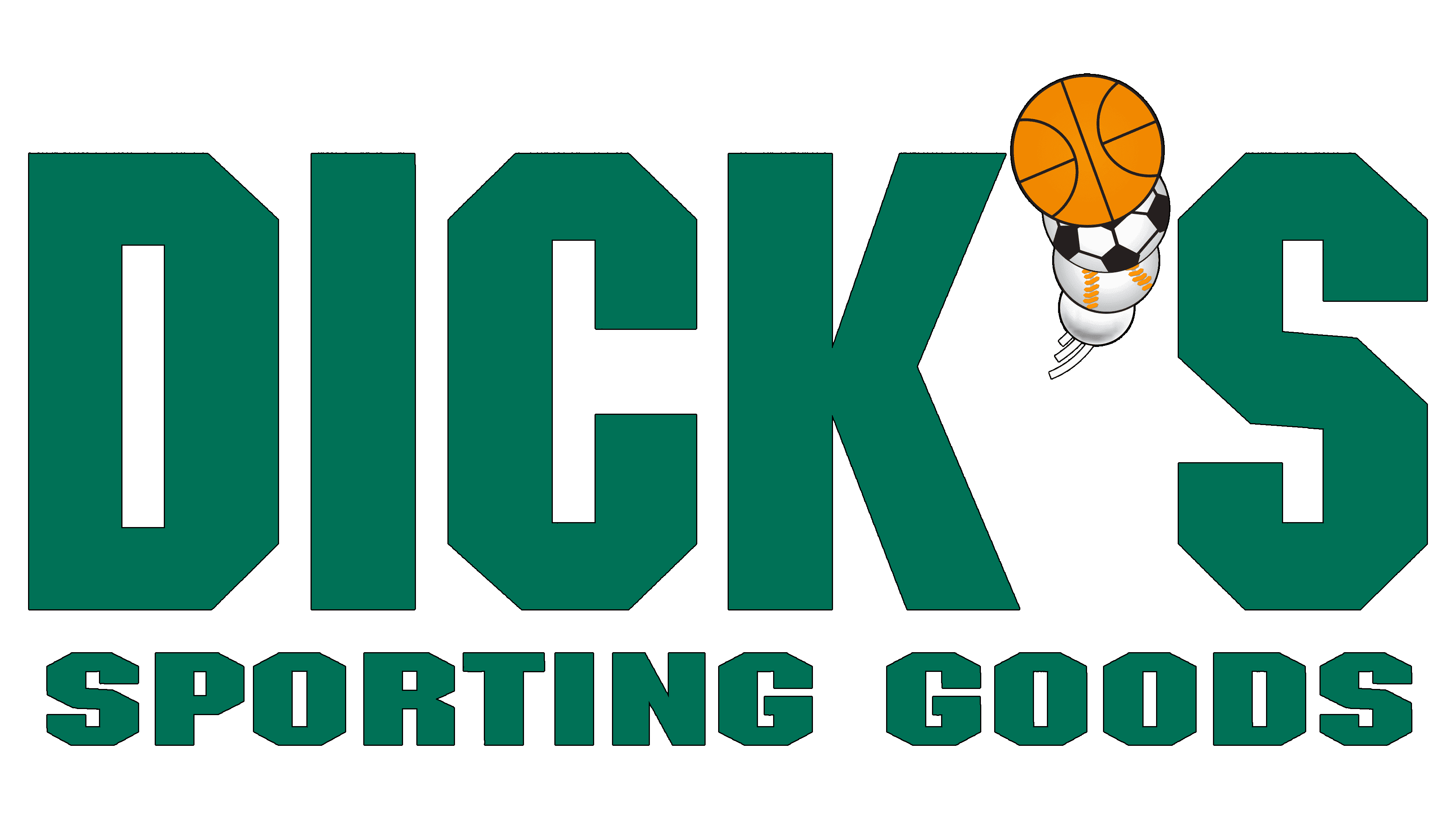
The most iconic element of the Dick’s Sporting Goods logo is the stylized apostrophe. It consists of four balls: basketball, soccer, baseball, and golf. Three short stripes at the bottom of this design evoke dynamism: the balls are not just painted; they are flying forward, one after another.
The lettering font is roughly similar to Machine Medium, created by designers Tom Carnase and Ronne Bonder. Its free counterpart is called the NFL Dolphins. But judging by the general shape of the letters, they most closely resemble the Blunt Regular typeface from the Miller Type Foundry. The only difference is that Blunt Regular has no cut edges.
The logo’s authors used an unusual color combination, combining several green tones in a gradient: Green Sheen (#74B096), Bangladesh Green (#006150), and Myrtle Green (#2E7E6A). The largest ball is orange, Deep Saffron (#F89B34). The inscription is entirely white, and black is present in limited quantities.