The DiGiorno logo embodies the unmatched quality of frozen pizza and the expert craftsmanship behind this popular American product. The emblem’s symbols evoke the sensation of a hot, crispy crust and delicate dough.
DiGiorno: Brand overview
The company’s history officially began when Kraft Foods launched the DiGiorno frozen pizza brand onto the American market in 1991. This product was created as a high-end substitute for frozen and delivered pizza options. The main invention of the brand was the adoption of rising crust technology, which allowed the pizza to “rise” during baking and produce a crispier, fluffier crust that resembled freshly cooked pizza.
The brand was named “DiGiorno” to give it a genuine Italian-sounding name linked to high-quality pizza. The corporation used the tagline “It’s not delivery. It’s DiGiorno,” which rose to prominence in the American food market.
In the early years following its inception, consumers immediately liked the product. Its success was a result of a successful marketing plan and high-quality goods. The central claim of the advertising efforts was that their frozen pizza was so delicious that it could pass for freshly made pizza.
By the late 1990s, the brand had surpassed numerous well-known competitors to become the market leader in frozen pizzas in the US. Because of its popularity, the company decided to add more flavors and toppings to its lineup.
The producer kept coming out with new products in the 2000s. The increased demand for thin-crust pizza led to the introduction of Thin Crispy Crust Pizza in 2003. This variation was a lighter option to the classic rising crust pizza.
DiGiorno Ultimate, a premium pizza line with more creative and gourmet toppings, debuted in 2006. This line catered to those looking for more upscale frozen pizza selections.
In 2010, the brand introduced Pizza & Cookies, a novel product combining pizza and cookies for dessert. The purpose of this product was to provide customers with a whole meal in a single box.
The brand reached a major milestone in 2012 when Nestlé purchased Kraft Foods’ frozen food division, which included this pizza line. Nestlé oversaw the brand’s ongoing expansion and innovation.
The company introduced the Design a Pizza Kit in 2014, allowing customers to personalize their pizza by adding different toppings to their preferences. This invention was a reaction to the expanding demand for customized cuisine.
Crispy Pan Pizza, which provides the experience of pan pizza at home, was introduced in 2016. This invention aimed to replicate the flavor and feel of pizza from a pizzeria.
Following 2016, the brand kept evolving according to new consumer tastes and developments in the food business.
The producer debuted a line of pizzas with stuffed crusts in 2017. In response to the expanding stuffed crust pizza fad, this invention gave customers an even more flavorful experience. The cheese-filled crust pizzas quickly gained popularity among pizza lovers who preferred ostentatious frozen options.
The wider release of Crispy Pan Pizza took place in 2018. After its first release in 2016, this line was expanded to include new tastes and made accessible in more places. Crispy Pan Pizza lets customers enjoy pan pizza with a crispy crust and juicy toppings.
2019 saw the introduction of pizza produced from handmade wheat flour, a big step towards healthier eating. This brand was created in response to consumer demand for less processed, more natural products. The pizza made using handmade flour had a more genuine dough flavor and used fewer artificial chemicals.
The producer saw a lot of innovation in plant-based product development in 2020. The firm released its first plant-based pizza in response to the growing popularity of plant-based “meat” substitutes. This pizza was created to appeal to meat eaters who want to cut back on their intake of animal products, as well as vegetarians.
In 2021, the company introduced a range of low-carb pizzas to cater to health-conscious customers. These pizzas offered a low-carb substitute for regular pizza with crusts made from cauliflower and other vegetables.
A brand-new product range under the moniker “Fully Stuffed Crust” debuted in 2022. This invention broadened the idea of stuffed crust pizza and further enhanced the flavor profile. This line produced an even cheesier and juicier pizza edge since the cheese was spread throughout the dough’s thickness and inside it.
The business added new toppings and tastes to its lineup of low-carb products. In response to the increased demand for healthier pizza alternatives, the company kept experimenting with different dough bases, such as veggie and protein variants.
When the brand announced in 2023 that it would convert all of its product packaging to completely recyclable materials by 2025, the company took a big step toward sustainability. The company started progressively offering innovative packaging options that used less plastic and more recyclable materials. This choice fits into a larger Nestlé plan to lessen its influence on the environment.
Additionally, the brand unveiled a new advertising campaign that centers on the idea of a “pizzeria experience at home.” Several ads and online videos were produced for this campaign to demonstrate how the product can replicate the feel of an authentic pizza in the comfort of one’s own home. The campaign featured interactive components to boost consumer involvement, including online competitions and augmented reality (AR) filters for social media.
The company debuted a limited line of pizzas that year, modeled after regional pizza varieties nationwide. This selection featured pizzas in the Detroit-style square, Chicago deep dish, and New York-style thin crust styles. With this invention, the brand hopes to draw in customers curious about different cuisines and want a more genuine pizza experience.
Meaning and History
What is DiGiorno?
It is a frozen pizza brand in the United States owned by Nestlé. The brand is best known for its slogan, “It’s not delivery, it’s DiGiorno,” which shows the quality and flavor of frozen pizza comparable to fresh pizza delivered to your home. The company offers a wide range of pizzas in various flavors, including traditional options like pepperoni and cheese and more refined varieties with premium toppings and crust types. The brand’s pizzas are designed to be baked at home, allowing consumers to enjoy fresh food from the oven. The company has expanded its product lineup to include topped, rising crust pizzas and even pizza and breadstick combinations. Known for its quality ingredients and innovative frozen pizza technology, the company has become a leader in the frozen pizza market.
1991 – 1996
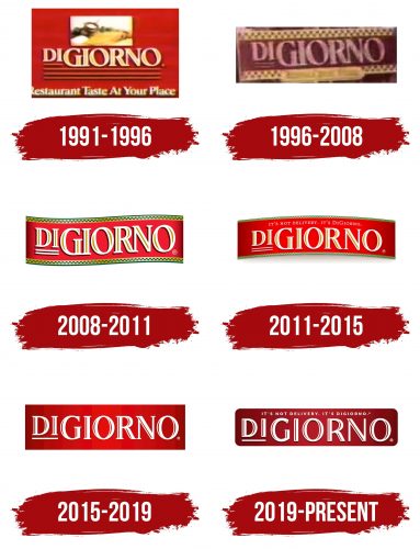
The first emblem focuses on the brand’s key feature: offering frozen dishes that match restaurant quality and taste. The company started with pasta and sauce production, and this focus is reflected in the logo.
The emblem is designed as a bright red rectangle that immediately draws attention. The red color symbolizes both the high baking temperature and the rich flavor of the tomato sauce used for the pasta. At the top of the logo, ingredients from traditional recipes are depicted, emphasizing the product’s authenticity and building trust in its quality.
The logo’s yellow lettering resembles the color of cooked pasta. The company name is DiGiorno, which translates to “morning,” in Italian. This highlights the producers’ hard work and suggests the product’s freshness as if it were made that morning. The name is placed on horizontal lines, symbolizing the grill in an oven or microwave, where the product is cooked at home.
At the bottom of the logo, the company’s slogan is bold: “Restaurant Taste At Your Place,” reinforcing the brand’s core message of delivering restaurant-quality food at home.
1996 – 2008
In 1995, DiGiorno shifted its focus to pizza production and developed an original crispy crust that made the product especially similar to freshly baked pizza. This innovation was reflected in the updated logo. A yellow border with a black zigzag pattern surrounded the company’s name. The yellow stripes symbolize the dough and the toasted edges of the pizza. The ornament on the border resembled the design of American taxis, hinting at food delivery. The main message was that DiGiorno frozen pizza is indistinguishable from pizza ordered for delivery from a café.
2008 – 2011
In 2008, the company expanded its product line by launching Flatbread Melts. The emblem from this period resembles a ribbon used to seal a delivery box. The core message and design of the emblem remained the same: black and yellow “checkers” along the edges and the brand name inside. However, the black squares were replaced with green, emphasizing:
- The natural ingredients used in the flatbreads.
- The ease and convenience of enjoying the company’s products, such as grabbing a pizza from the freezer, is the quickest and most hassle-free “delivery.”
The letters in the logo were neatly highlighted with a black shadow, adding emphasis and creating the impression of fluffy, airy dough. The yellow highlights on the white letters evoked the image of melted cheese in the filling.
2011 – 2015
After Nestlé acquired the brand, the DiGiorno logo changed, though not drastically. The ribbon with the traditional pattern was elevated into a rainbow shape, symbolizing the company’s market leadership. Light reflections emphasized the name, giving the impression that the text was highlighted on a red carpet. A new slogan appeared at the top of the logo: “It’s Not Delivery, It’s DiGiorno.” This slogan emphasized the pizza’s restaurant-quality taste and hinted at a certain level of superiority.
2015 – 2019
To reignite sales growth, the brand shifted its positioning, which led to a logo update. Amid global interest in natural and healthy food, the company embraced a concept of more “hands-on” production. DiGiorno introduced customizable pizza kits, providing ingredients in separate packets, allowing customers to choose their toppings and bake their pizza. The toppings included natural and wholesome products: meat, vegetables, and shredded cheese.
The new logo was designed in a minimalist style—a red background with white lettering. It avoided any references to fried or greasy fillings. Instead of the previous yellow stripes on the letters, cutouts symbolized a minimal calorie count. The emblem appeared as a base, a blank canvas, leaving room for the customer to decide how to fill the space.
2019 – today
During the period when the DiGiorno brand expanded its range to more than 80 types of pizza, there arose a need to create a logo that would reflect the diversity of the products and the high level of craftsmanship. The designers working on this project aimed to create an image that would inspire confidence that every DiGiorno pizza would offer a true culinary delight.
The modern version of the DiGiorno logo embodies elegance and high quality, which aligns with the brand’s reputation. The logo is designed as a rectangle with rounded corners, featuring a rich red gradient along the edges. This gradient evokes the image of a luxurious red carpet, which is associated with sophistication and festivity. This design element symbolizes the product’s high quality and attention to detail, which is integral to the brand’s philosophy.
The emblem’s central element is the name “DiGiorno,” rendered in white, contrasting with the red background, making the text clear and easy to read. The white color represents the purity and freshness of the product, emphasizing its naturalness and high production standards. The red accents within the letters hint at the signature tomato sauce, a key component of any DiGiorno pizza.
The font combines strictness and grace, reflecting the brand’s commitment to creating a product that is easy to prepare but matches the taste and quality of restaurant pizza. Unlike earlier versions of the emblem, which focused on the toppings, the new logo emphasizes the overall brand experience, presenting the pizza as a culinary masterpiece.
