Since 1994, the time of the appearance of the DIRECTV brand (although still under a different name – AT & Ttv), the company is constantly on the move and strives for improvement. They are a dynamic team that optimizes their products, advancing the know-how over time, offering high-quality content and service to users. It is the undisputed leader in the video industry, if only because it also cares for fans of NFL games. Almost anywhere, wherever the user is, his favorite videos in high quality and format are available; he can be sure that the broadcast will not be interrupted or some technical failure will occur. DIRECTV has everything under control, and, therefore, everything is under the control of the user: he wanted – watched a TV show, wanted – watched a movie on any available device.
A service like DIRECTV STREAM delights streaming fans. The service is being used successfully by entire families looking to get the best live streaming on demand. Also connected to this is access to 7000 applications on Google Play, which speaks of a powerful system of work of the company.
Now is the time to throw off the “old skin” and update the identity. The agency N / A was involved in this process, which coped with the creative task without any problems.
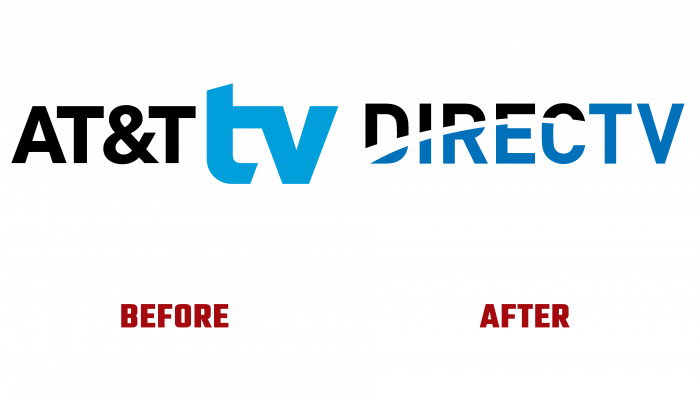
Before the new logo came out, black letters were dominant “AT&T” on a white background with a blue “tv” prefix. Why is that? It was the former name because AT&T and TPG Capital, two investment platforms that deal with alternative assets, entered into a deal to form DIRECTV. She will now manage all the video services and other brand products previously owned by AT&T.
The new company logo looks like a wordmark, divided in half by a strip, like a trace from a satellite. There are only two colors in the logo – white and blue. DIRECTV capital letters look monotonous, and usually, the font is simple, not fancy. Only the skylight of the letters adds color to creativity. The logo is pretty common for a mid-range company but not bright enough for such a powerful leader in the video industry with over 15 million users. There is no product association. Cutting the letters and separating them into colors looks clumsy.
However, the company is not loved for its appearance, but the high quality of its products and services. It seems from the outside that this is not the last version of the logo because, as already mentioned, the company is directly striving for success, which means that no one will be able to stop or pause it, like a video recording.


