The DirecTV logo demonstrates how the transformation of space technology can create a strong and large television and radio company. The emblem carries the idea of flight, the dissemination of information using waves and wires.
DirecTV: Brand overview
| Founded: | June 17, 1994 |
| Founder: | AT&T, TPG Inc. |
| Headquarters: | El Segundo, California, US |
| Website: | directv.com |
Meaning and History
The firm that became the basis for the satellite service was manufacturing rockets, airplanes, and helicopters. What’s left of Hughes Electronics now represents the broadcasting industry and competes with cable TV providers.
Naturally, the sharp change in priorities and many rebrandings affected the visual identity. Another factor that influenced the identity was DirecTV’s transfer to the international conglomerate AT&T in mid-2015.
What is DirecTV?
This is a company that provides satellite broadcasting services in the United States and other countries in America. It was launched under its current name in mid-1994. Its predecessor is the Hughes Electronics Corporation.
1985 – 1990
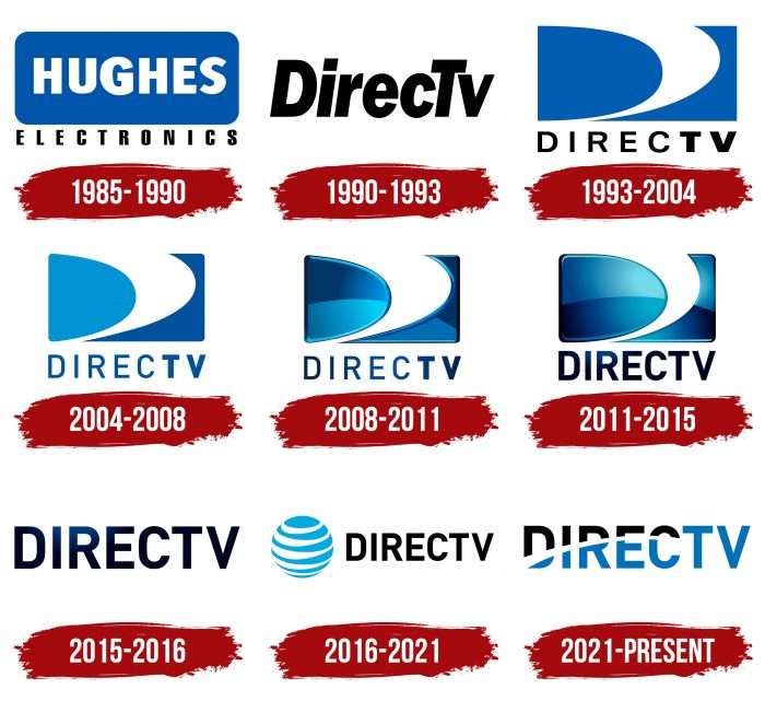
The first predecessor of DirecTV is considered to be the Hughes Electronics division, which was created in 1985 based on General Motors. Its logo was much like that of its parent company: a blue rectangle with white lettering inside. Only the subsidiary brand used a rounded rectangle, complemented by a gray bar at the bottom. The word “HUGHES” was written in white letters on a blue background, and “ELECTRONICS” in black on gray.
1990 – 1993
Hughes Electronics launched satellite broadcasting services under the DirecTV brand in the early 1990s. Initially, the channel had a simple black-and-white logo consisting of one lettering. The typeface was nothing remarkable: the usual oblique sans serif with small letter spacing.
1993 – 2004
In 1993, the first version of the famous swirl emblem appeared, which looked like the letter “D.” The designers combined a blue rectangle, borrowed from Hughes Electronics, and a curved white line that widens the top in the shape of a funnel. The image was followed by a black sans serif, “DIRECTV.”
2004 – 2008
News Corporation carried out the next rebranding. It bought out the remnants of Hughes Electronics with the DirecTV brand and named them DirecTV Group. But this almost did not affect the logo: the new owner only rounded the rectangle’s sides, repainted the left part of the figure in blue, and made the inscription blue. The font changes were minor and only concerned letter heights.
2008 – 2011
When Photoshop effects arose, the designers added shadows, highlights, and gradients to the emblem. Because of this, the image has acquired a three-dimensional appearance. The inscription also had color transitions, but it remained flat because the letters did not have well-defined edges.
2011 – 2015
In 2011, another transformation took place, changing the shape of the D-shaped vortex inside the rectangle. The logo became more voluminous because the developers experimented a little with the arrangement of colors, darkened the edges, and increased the gradient.
2015 – 2016
In mid-2015, telecommunications conglomerate AT&T acquired DirecTV from its former owner to expand its content range. In terms of identity, it was a transition period between the classic blue and white letter “D” and the new design that appeared in 2016. The brand used the inscription from the old logo, abandoning the classic swirl in the rectangle.
2016 – 2021
A few months after the purchase, AT&T donated its globe-shaped brand name to DirecTV. The changes came into effect on January 1, 2016. The striped globe symbolizes the broadcasting corporation’s global nature. It is located to the caption’s left, which remains unchanged except for the gradient’s disappearance. Now, the word is completely black.
The classic DirecTV emblem resembles the letter “D” but is a mini-tornado. Perhaps the designers wanted the drawing to symbolize expansion, or it happened by accident due to the similarity to “D.” Be that as it may, the iconic icon ceased to exist – an equally abstract globe replaced it. A white ribbon wraps around the globe, representing worldwide telecommunications. The same element, unofficially named “Death Star,” is depicted on the AT&T logo. It was invented by the artist Soul Bass in 1982.
The inscription is based on the DIN Pro Bold font, developed by the typographer Albert-Jan Pool in 2005 and owned by FontShop International GmbH. Its characteristic features are bold lettering, uniform line thickness, no serifs, and many corners. This typeface was chosen for its crispness and legibility.
Next to the black inscription is a white and blue globe. Blue is the main color, and white only complements it. DirecTV’s current parent company, AT&T, uses the same palette.
2021 – today
Following the completion of the contract, the broadcaster redesigned the visual identity mark. She removed the AT&T globe from the logo and enlarged the text portion. The developers kept the same font but stylized the inscription. Now, the name “DIRECTV” is color-separated: the abbreviation “TV” is completely colored blue, and the word “DIREC” is colored blue and black. This effect was formed due to the transfer of the line from the globe, previously present on the emblem: it had similar tapering stripes. The update has made the logo simple and easy.
DirecTV: Interesting Facts
DirecTV, known for its satellite TV services, has greatly changed how we watch TV.
- Launch in 1994: 1994 DirecTV brought digital satellite TV to homes across the U.S., changing how we access and watch TV.
- Early HDTV Provider: In 1998, DirecTV was among the first to offer high-definition TV, improving picture quality for viewers.
- First with 4K Content: Continuing to lead in technology, DirecTV started offering 4K content in 2014, providing even clearer and more detailed images.
- NFL Sunday Ticket: DirecTV has exclusive rights to the NFL Sunday Ticket, letting subscribers watch every live out-of-market NFL game, a major plus for football fans.
- International Expansion: In addition to the U.S., DirecTV operates in several countries across the Americas, bringing its services to an international audience.
- Huge Subscriber Base: At its height, DirecTV had millions of subscribers, making it one of the biggest satellite TV services globally, thanks to its vast channel selection and exclusive content.
- Viewing Innovations: Over the years, DirecTV introduced DVR services, multi-room viewing, and a mobile app for streaming live and recorded content.
- Acquired by AT&T: 2015 AT&T bought DirecTV, expanding its reach in the TV and entertainment sector and opening up new opportunities for service bundles and content distribution.
- Space Technology Contributions: DirecTV’s satellite launches use advanced space technology and satellite communications, essential for delivering a wide range of channels and high-definition content.
- Philanthropy: Besides its tech and service contributions, DirecTV supports disaster relief and education initiatives, showing its dedication to community support.
DirecTV’s journey showcases its innovation, quality service, and influence on TV technology, significantly impacting how viewers worldwide enjoy content.
Font and Colors
The emblem’s redesign did not affect the typeface; it remained the same. The only thing that has changed is the appearance of the inscription, which received a curved line resembling a semi-arch in shape. A narrowing white stripe divides the letters into blue (bottom) and black (top).
FAQ
What is the direct TV symbol?
The symbol is a “D” logo introduced in 1993. This emblem, used in various forms until 2015, became iconic. The brand launched its satellite television service on June 17, 1994, quickly becoming well-known.
The “D” logo represents DirecTV’s commitment to delivering high-quality satellite television. It has been updated several times to stay modern and relevant, reflecting brand strategy changes and visual uniqueness. The simple and elegant “D” design helps it stand out in a competitive market, becoming familiar to millions of viewers.
Does DirecTV have a logo?
The company introduced its “D” logo in 1993. This symbol quickly became a key part of the brand’s identity and was used in various forms until 2015, reflecting changes in its branding strategy.
The “D” logo represents the brand’s commitment to delivering high-quality satellite television service. Over the years, it has been updated to stay modern and relevant.
Its simple and elegant design helps it stand out in a competitive market and become familiar to millions of viewers. The logo’s different forms over the years show the brand’s adaptability and efforts to evolve.
Does AT&T own DirecTV?
Yes, AT&T bought a majority stake in DirecTV in 2015. AT&T now owns 70% of the shares. Since 2021, the investment company TPG Capital holds the remaining 30%.
This acquisition helped AT&T expand its portfolio and integrate DirecTV’s satellite television services. The partnership with TPG Capital brings extra resources and expertise to manage and grow the brand.
Is DirecTV and AT&T TV the same?
No, they are not the same. DirecTV is a satellite TV brand that operates under its original name. AT&T TV, now rebranded as DIRECTV STREAM, is a streaming service.
DirecTV provides satellite television services with a wide range of channels and packages installed at customers’ locations via satellite dishes. This is ideal for those who prefer traditional satellite TV or live in areas where streaming is unreliable.
DIRECTV STREAM offers live TV and on-demand content over the internet. Users can stream channels and shows without needing a satellite dish. This service is perfect for those who prefer the flexibility of streaming and want to access content on various devices.
Who started DirecTV?
Eddy W. Hartenstein, a businessman with a strong background in the media industry, founded the brand. He aimed to create a service that delivered a wide range of TV programming via satellite, providing an alternative to cable TV. Hartenstein played a key role in developing and launching the brand, establishing it as a major player in the television industry.
With his engineering and business expertise, Hartenstein navigated the technical and commercial challenges of starting a satellite TV company. He ensured the company offered high-quality service and a broad selection of channels, quickly attracting many customers.
