The focus of the company is the whole Earth, says the Discovery logo. The channel monitors the planet’s movement and reflects changes in the natural world, animals, and people. Confidence, constancy, and an unbiased, honest approach are read in symbols.
Discovery: Brand overview
| Founded: | June 17, 1985 |
| Founder: | Warner Bros. Discovery |
| Headquarters: | Silver Spring, Maryland, United States |
| Website: | discovery.com |
Meaning and History
The first company responsible for developing the channel was Cable Educational Network Inc. She immediately identified the key direction of Discovery, limiting it to showing educational programs. Films about history, science, flora, and fauna were first available only to US residents. International broadcasting began in 1989. It expanded quickly because no one had seen such educational and entertainment programs before.
Discovery Channel content was unique. It was different from everything that was shown on TV, so it found a huge demand among viewers from different countries. In the new millennium, the owners decided to change the concept slightly. They increased the volume of programs related to modern realities and focused on the popular science genre. This allowed them to expand their fan base further. The main topics of the programs are nature, technology, history, survival, gold mining, disasters, travel, and much more.
Given the incredible popularity of the Discovery Channel, its logo is familiar to many people. It changed several times as the brand updated its image to attract viewers. But the overall structure has always remained the same: the globe combined with the channel’s name (or integrated into a single “D”). The current emblem is also in line with this concept. It combines the black word “Discovery” and the small globe inside the “D.”
1985 – 1987
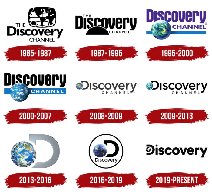
The first logo was an exception to the rule because instead of a planet, it depicted a world map – more precisely, a fragment with two American continents, Greenland, Africa, and Western Europe. It had the shape of a rectangle with rounded sides, which strongly resembled a TV screen. The drawn parallels and meridians hinted at the fact that this is still a map.
To the left of the picture was the article “THE,” and below were the words “Discovery” and “CHANNEL” (in a column). The designers used two versions of the Gill Sans MT font for the lettering: Regular and Extra Bold. The color scheme included only black and white.
1987 – 1995
After the redesign, all attention was focused on the channel’s name. He was given a central place, with the word “Discovery” written in the center of the font Aurora Bold Condensed. “THE” and “CHANNEL” were lost against its background because they consisted of thin Futura capital letters of small size.
The world map has been removed. But at the bottom, there was another hint of the planet – a small black semicircle, which partially covered the “sco” from the “Discovery” inscription. It could be the rising sun because it lacked continents and oceans. According to another version, it was the upper part of the legendary image of Homo vitruvianus, created by the Italian scientist, artist, and inventor Leonardo da Vinci.
1995 – 2000
In 1995, the article “The” disappeared from the channel’s name, so it needed a new logo. The developers kept the Aurora Bold Condensed and Futura fonts but made the second word more visible by making it bigger and bolder. In addition to the typography, the color scheme has changed: the lettering has become purple for the first time.
Thanks to computer graphics, a globe appeared in the lower-left corner, which looked very realistic. The designers did not detail the relief but depicted white clouds blocking the view of the surface. The colorful planet was lit from the left side, so a gradient shadow fell on the right side. A similar hue transition effect was used for the blue horizontal line drawn below the lettering.
2000 – 2007
The word “Discovery” has gone black again in the new millennium. “CHANNEL,” in turn, was recolored white and moved to the blue rectangle at the bottom. A more even and symmetrical Helvetica font was chosen for it. The globe remained in its place, but the designers made it a little lighter.
2008 – 2009
In 2007, Boston-based firm Viewpoint Creative made significant changes to the channel’s logo. Bold Gotham has replaced the classic Aurora Bold Condensed font with narrow letter spacing. And for the second word, a thin sans-serif typeface was used, with spaces between characters disproportionately wide. The lettering is completely black. The blue bar at the bottom has disappeared, so the globe has moved to the bottom left corner of “D.”
2009 – 2013
The previous graphic sign only lasted two years. Then Studio Royale made several changes to the logo as part of a comprehensive brand redesign. She improved the typography by balancing letter size and letter spacing. In addition, the specialists redesigned the globe so that it is lighter and does not merge with the “D.” As a result, a clear separation of water and land appeared on the globe’s surface.
2013 – 2016
While the Discovery Channel emblem has evolved, only the “D” with the planet has survived from it. Thanks to the gradient, the letter was silver and had a thin outline that seemed three-dimensional. And the Earth became so detailed that continents, islands, green areas of forests, white clouds, and blue expanses of water were visible on it.
2016 – 2019
The artists focused on America and blurred the upper borders of the globe. Beneath the two-dimensional black “D” was the same word “Discovery,” written in Gotham font. All elements were circled with a large black ring.
2019 – today
In 2019, Roger developed a new static channel sign. She retained only the black “Discovery” inscription, choosing the Circular font for it, and a separate character in the form of a capital “D” was eliminated. The globe is now integrated into the word’s first letter and replaces the vertical stroke. The designers experimented with abstract and classic globes before reaching the final design. They placed a traditional map in a circle, depicting the continents using negative space.
Discovery: Interesting Facts
Discovery, Inc. has significantly influenced global entertainment and information, growing from a single channel to a media giant.
- Start: John Hendricks launched the Discovery Channel in 1985, focusing on documentaries about science, technology, nature, and history. Its goal was to show the world’s wonders and complexities.
- Growing Network: Discovery now includes TLC, Animal Planet, the Science Channel, and ID (Investigation Discovery), among others. It covers a variety of interests, from wildlife to science and mysteries.
- Worldwide Presence: Discovery broadcasts in over 220 countries and territories in nearly 50 languages, making it one of the most widespread networks globally.
- Eurosport Acquisition: In 2014, Discovery acquired Eurosport, stepping into sports broadcasting and securing rights to events like the Olympic Games in some regions.
- Reality TV Pioneer: Discovery was an early player in reality TV, producing hits like “Survivor,” “Deadliest Catch,” and “Gold Rush,” blending documentary and reality TV elements.
- Innovative Shows: It’s known for Shark Week, a week-long shark-focused series since 1988, becoming a cultural event and one of TV’s longest-running series.
- Streaming Service: Discovery launched Discovery+ in 2021, offering a wide range of content from its networks, including exclusive shows, catering to the digital audience.
- Conservation Efforts: The company supports sustainability, like Project C.A.T. with the World Wildlife Fund, focusing on tiger habitat conservation.
- WarnerMedia Merger: In 2021, Discovery announced a merger with WarnerMedia, creating a new company set to be a significant force in the streaming market.
- Educational Content: Discovery Education offers digital resources for K–12 classrooms, emphasizing the role of media in education and discovery.
Discovery, Inc.’s evolution from a single channel to a leading media powerhouse shows its adaptability and influence in the entertainment and educational sectors.
Font and Colors
The invariable symbol of the Discovery Channel is the projection of the globe. It reflects the global nature of the channel, which is broadcast in different parts of the world. And it’s also a hint at the thematic focus of content dedicated to wildlife, history, science, and everything surrounding people.
The Discovery brand has always been recognizable by its sans-serif font. Roger agency employees did not change traditions: they used a geometric grotesque from the LL Circular family for the logo, created by typographer Laurenz Brunner in 2008. The color scheme also remained classic because the combination of black and white has been characteristic of the channel’s identity since 1985.
Discovery color codes
| Black | Hex color: | #000000 |
|---|---|---|
| RGB: | 0 0 0 | |
| CMYK: | 0 0 0 100 | |
| Pantone: | PMS Process Black C |


