


![]() Docker Logo PNG
Docker Logo PNG
The emblem demonstrates openness and orderliness. The Docker logo symbolizes software that organizes a large amount of information, hinting at convenience and ease of use.
The story of Docker began with Solomon Hykes, who began working on containerization concepts around 2007. His idea was to package applications with their full environment so they could run identically across Linux systems, addressing long-standing deployment inconsistencies.
In 2008, Hykes, Kamel Founadi, and Sébastien Pahl founded dotCloud in Paris. The company moved to the US in 2010 after joining Y Combinator. It launched as a multi-language PaaS platform competing with Heroku, supported by funding from Trinity Ventures and Benchmark Capital.
By 2012, the PaaS model faced low margins and pressure from Amazon Web Services. In early 2013, the team shifted focus and released its internal container tool as open source. Docker was introduced at PyCon in March 2013 and quickly gained traction, with companies such as Red Hat, IBM, and Google adopting it.
On October 29, 2013, dotCloud rebranded as Docker, Inc., with Ben Golub becoming CEO and Hykes moving to CTO. In April 2015, Docker raised $95 million, reaching a valuation above $1 billion. As container orchestration evolved, Kubernetes gained wider adoption than Docker Swarm. By 2018, Docker had added support for Kubernetes. In 2019, Docker sold its enterprise division to Mirantis and focused on developer tools such as Docker Desktop and Docker Hub. Hykes had left the company in 2018. In 2022, Docker raised $105 million at a valuation of $2.1 billion.
Meaning and History
![]()
Although the application’s official release date is 2013, its foundation was laid much earlier. In 2008, Solomon Hykes in France began developing a public PaaS platform that supports several programming languages. Moreover, the startup began within the author’s dotCloud company.
Hykes worked with Hykes on the initial project, along with his firm’s employees, Andrea Luzzardi and François-Xavier Bourlet. The progressive platform was renamed Docker in the second half of 2013 to align with the latest technology. However, the PaaS site’s old name has been retained. A logo redesign accompanied each milestone to accurately convey the essence of the progressive implementations. In total, three logos were used.
What is Docker?
It is a software corporation. Its predecessor is dotCloud, Inc.
2013 – 2015
![]()
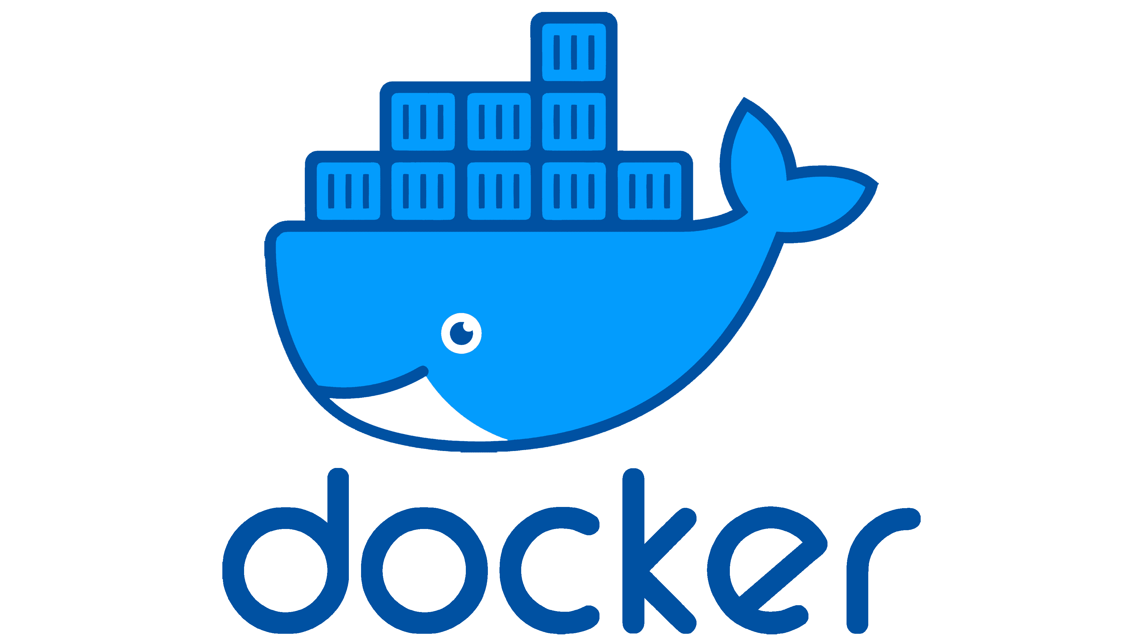
The developer of the debut symbol is the freelance studio 99designs. She provided the company with 84 logo prototypes, of which Docker preferred a drawing by Ricky Asamanis of Indonesia. It depicts a huge blue whale with a flat back, where containers are stacked in three rows. The lower part of the animal is immersed in impromptu water, with uniform, dark, jagged waves. Keith smiles good-naturedly and wags his tail, which confirms the software’s friendliness. Below is the text part. A round font has been chosen as close as possible to a whale’s shape.
2015 – 2017
![]()
In this version, all elements of the previous logo are preserved. The changes affected only their grouping. The designers moved the word “Docker” to the right, behind the whale icon, which is loaded with containers. The color was also left old blue in several variations.
2017 – today
![]()
The current logo is a schematic reworking of the debut version. The authors abandoned the details of the containers and the whale, focusing on the silhouettes. This indicates the application’s seriousness, which has improved significantly and become much more convenient to use. The elements now look more like geometric shapes. “Boxes” are made in cubes, separated by white lines, and the whale is recognizable only by its body shape. Some letters have also been corrected: for “c,” the ends are lengthened; for “k,” the location of the right leg is rearranged; “r” is supplemented with an upper stroke; and for “e,” the centerline is aligned horizontally.
Font and Colors
The program and website identity evolved in parallel. However, the resource also considered the colorfulness and perspective to preserve the overall style of the logo and pages. The application’s label was flat; however, it changed with software improvements, moving from a friendly style to a professional one. Therefore, schematic contours, clear lines, and images without unnecessary details prevail. Simultaneously, several options are in use, including the inscription’s horizontal and vertical positions.
In the first two periods, they used a text emblem with a modified Animo Medium typeface. It has rounded ends, and the center bar “e” is raised diagonally. The modern logo uses Comfortaa Bold by Johan Aakerlund.
The palette’s shades changed from faded to bright. In the first versions of the logo, the blue was in three pastel shades (#008bb8, #039bc6, and #24b8eb); now there is only one bright shade: #0091e2. Moreover, the company uses many blue-and-white combinations: versions of the blue whale on a white background and on a blue background are equally in demand.
FAQ
What is the meaning of the docker logo?
The logo, created by graphic designer Ricky Asamanis, features a whale carrying a stack of containers. The whale symbolizes strength and reliability, showing the robustness of Docker’s platform. The containers on the whale’s back represent Docker’s main function: managing and automating containerized applications.
These containers highlight encapsulation, the brand’s ability to package software and its dependencies into a single unit. This ensures consistency across different environments, making it easier for developers to manage applications.
Simplification is another core value shown in the logo. The company simplifies the development process by providing a streamlined way to build, ship, and run applications, making it easy to use even for those new to containerization.
What is the color of the docker logo?
The logo uses specific colors from the brand’s primary palette: Moby Blue, Light Blue, Dark Blue, Black, and White. Each color helps maintain the brand’s visual identity.
Moby Blue is the main color, making the logo stand out and easy to recognize. Light and Dark Blues add depth and appeal. Off-black provides contrast, keeping the logo clear and readable. White highlights details, making elements pop.
Together, these colors create a strong and cohesive look. They ensure the logo is recognizable on different platforms.
Why is the Docker logo a whale?
The logo features a whale because it won a 99Designs design competition when the company was called dotCloud, Inc. The logo was created by Ricky Asamanis, a graphic designer from Indonesia.
The whale represents strength and reliability, highlighting Docker’s robust platform. It suggests transporting heavy loads, which fits the brand’s role in managing and automating containerized application deployment. The whale-carrying containers reflect the brand’s mission to simplify and automate application deployment, making complex processes easier to manage.
What is a Docker official image?
An official Docker image is a template that contains an application and all the necessary components to run it. The brand curates and maintains these images to ensure quality, security, and performance.
Official images offer a reliable foundation for building and deploying applications. They include the application, its dependencies, libraries, and configurations. This ensures consistent performance across different environments, solving the “it works on my machine” problem.
These images are stored on Docker Hub, a cloud-based repository for finding, sharing, and managing container images. Docker’s official images undergo rigorous testing and are regularly updated to include security fixes and new features.
Official images cover a range of applications and services, including popular databases, web servers, programming languages, and development tools. This extensive library allows developers to find ready-to-use images for many common use cases, facilitating faster development and deployment cycles.
Can I use the Docker icon?
Using the icon or logo requires following specific rules set by Docker, Inc. The brand has strict guidelines to protect its image.
The logo can only be used with the brand’s explicit permission. This helps keep the brand’s image and integrity intact. When using the logo, you must follow the brand’s guidelines, which specify how it should appear, including size, color, and context.
Unauthorized use of the icon, suggesting endorsement or affiliation without permission, is strictly prohibited. This includes using the logo in marketing materials, websites, or products.