The DocuSign logo is an example of simplicity and accessibility. Everyone can use the service. Strict order, consistency, and following the laws are reflected in the emblem. The universality of the principles of operation makes the system easy to use for residents of different countries.
DocuSign: Brand overview
DocuSign is an American software company offering electronic signature services and digital transactions. It was formed in 2003 by three entrepreneurs – Eric Ranft, Tom Gonser, and Court Lorenzini. Today, the service covers over 500 thousand clients and hundreds of millions of users from more than 180 countries worldwide. Its headquarters are located in San Francisco, California.
During a business trip, Gonser urgently needed to sign a stack of documents, sparking the initial idea for DocuSign. Recognizing a gap in the market for a secure and convenient remote signing solution, the founders launched DocuSign, enabling electronic signatures via a cloud platform.
In the early stages, DocuSign concentrated on securing initial funding and refining its technology. A significant milestone was reached in 2006 when Accel Partners invested heavily in the company.
DocuSign quickly gained traction among businesses of all sizes, streamlining document processing and reducing associated costs. By 2010, the platform had grown to serve over 10 million users globally.
Over the following years, DocuSign expanded its offerings, adding features like workflow automation, agreement management, and support for digital workflows. These enhancements allowed the company to enter new markets and broaden its customer base.
In 2018, DocuSign went public with an IPO on Nasdaq, attracting substantial investments to fuel further growth and product development.
Today, DocuSign serves over 1 million customers worldwide, ranging from small businesses to large corporations. Its platform integrates with over 350 applications and is utilized across various industries.
Meaning and History
Tom Gonser came up with the concept of such a service when he ran his company, NetUpdate. In the process, the service bought several organizations and startups, including DocuTouch from Seattle. Timberline Venture Partners, Jeff Tung, and Bill Kallman funded it with $4 million. Timberline then contributed another million to merge with NetUpdate.
Only DocuTouch held patents for digital signatures. With support from Gonser, Court Lorenzini agreed to acquire some of DocuSign’s assets from NetUpdate. He then left the board and concentrated entirely on DocuSign. As a result, in 2010, the company added support for user verification on smartphones, iPods, and iPhones. By the end of that year, it served 73 percent of the e-signature market, contributing to widespread logo recognition.
The firm was noticed. After substantial monetary support from Scale Venture Partners, she established offices in London (UK) and San Francisco (USA), serving as its global headquarters. Two years later, the company agreed with PayPal, introducing DocuSign Payment, which collects signatures and payments in one transaction. Similar agreements have been approved with Google Drive and Salesforce.com.
This led to the fact that in 2016, the newcomer to the financial and analytical market occupied the third line of the Forbes Cloud 100 rating. Thus, the business-style emblem became even more widely known. In all, DocuSign has two—debut and present.
What is DocuSign?
It is a company that maintains business software. It helps manage digital transactions and offers modern solutions for electronic signatures.
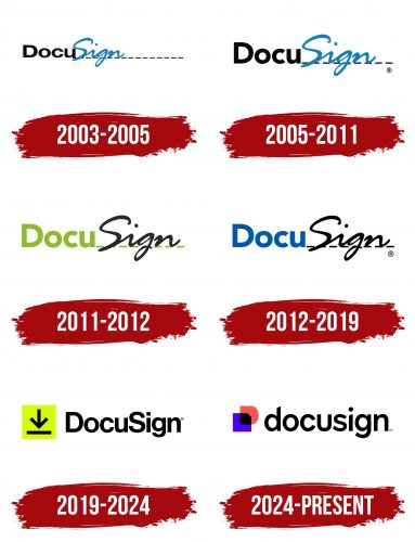
2003 – 2005
The company’s first logo shows its main business function. The bold black text “Docu” is an abbreviation for “document.” The sans-serif font gives a professional tone and makes business operations easy. This font choice shows the brand’s commitment to simplicity in document handling.
The word “Sign” means “signature.” It is written in a cursive style that looks like handwriting. A dotted line extends from the text, similar to official documents requiring signatures. This design element enhances the logo’s authenticity and professionalism.
The image looks like a part of a document with a user’s signature. This visual cue communicates the brand’s seamless electronic document management service. The emblem is a practical solution for digital paperwork, appealing to users with its clear and straightforward interface.
By combining professional typography with the appearance of a signature, the logo shows the company’s dedication to simplifying electronic documentation. The design instills confidence in users, assuring them of the brand’s reliability and effectiveness in managing electronic documents. The emblem reflects the company’s focus and highlights its user-friendly approach, making handling digital documents intuitive and secure.
2005 – 2011
When the active work began, the logo was refined. The dotted line was shortened since it originally extended too far beyond the design. The “Sign” part was moved away from the first part of the word, removing the overlap of the letters. These updates improved the harmony of the emblem, highlighting the clarity and speed of operations.
These improvements made the logo look professional and suitable for legal proceedings and real estate transactions. The refined design ensured that the logo conveyed reliability and efficiency, essential for important and formal uses. The changes enhanced the aesthetic appeal and reinforced the brand’s functionality and practicality in various official capacities.
2011 – 2012
The change in CEO and the move to a new headquarters prompted a rebranding. The modifications were minor, but the logo took on a refreshed look, showing a modern approach to business.
The first part of the name and the dotted line changed to light green. This color symbolizes renewal, growth, and flourishing. The shade highlighted the project’s expansion, including opening new offices in England and San Francisco.
The “Sign” text was rendered in black, emphasizing a professional style. The software was widely used for signing business documents. Eighty million signatures were processed through its servers, showing the platform’s reliability and efficiency in handling large electronic transactions.
The rebranding reflected the company’s evolution and demonstrated its commitment to maintaining a high standard of service. With its blend of green and black, the updated logo perfectly captured the balance between innovation and professionalism, aligning with the company’s expanding global presence and its role in facilitating business operations worldwide.
2012 – 2019
The logo of this financial institution was businesslike from the beginning and spoke directly about its occupation. This is because the brand name is built on the name of the service and consists of two elements. The first is “Docu,” in printed type, which denotes the concept of “document.” The second is “Sign,” handwritten in italics and associated with the word “signature.”
The company name is an abbreviation for the key concept of “document signature.” Moreover, the right side of the name is not only “handwritten” but also located on the dotted line, which usually denotes where you need to put your signature. The color palette is discreet and consists of blue, black, and gray.
2019 – 2024
In 2019, the logo was completely transformed following the acquisition of SpringCM. The new light green icon, designed as a square with an arrow, symbolizes the upload process. This image emphasizes SpringCM’s capabilities in uploading, storing, and transmitting documents in a cloud-based format.
The square represents a secure and reliable platform, and the arrow signifies the seamless movement and accessibility of documents. This change highlighted the integration of SpringCM’s advanced functionalities into the company’s offerings, reflecting a commitment to modernizing and streamlining document management solutions.
The text part of the logo is made in a classic font, where all the letters are printed since the designers replaced the handwritten style with a clerical one. Now, the name is made with a traditional typeface and is not divided into two parts. The fact that it is two-part is evidenced only by the capital letters “D” and “S.” Otherwise, the right and left sides are identical: the symbols are smooth and grotesque, with minimal distance from each other.
The updated logo showcased a fresh visual identity and communicated the enhanced technological capabilities brought by the acquisition.
2024 – today
The image of a floppy disk set against the backdrop of the capital letter “D,” the first letter in the company’s name, became the hallmark of DocuSign in 2024. The overlapping shapes create the impression of a second floppy disk, evoking associations with digital technologies and information storage solutions.
This new logo represents the company’s expanded potential, showcasing its offerings beyond digital signatures to include comprehensive document and agreement management software packages. The incorporation of AI into document processing is reflected in the emblem’s purple and magenta hues, symbolizing advanced technology and innovation.
The simple black text in lowercase letters balances the symbol’s abstract, colorful shapes, emphasizing the synergy between cutting-edge advancements and familiar software solutions. This design highlights DocuSign’s commitment to progress while maintaining its traditional offerings’ reliable and user-friendly nature.
The reimagined logo represents the company’s evolution and communicates its dedication to integrating modern technology into its services.
DocuSign: Interesting Facts
DocuSign, based in San Francisco and started in 2003, changed how we sign documents and manage agreements online. It’s now a top name in electronic signature technology, making online transactions easier and more secure worldwide.
- Origin: Tom Gonser founded DocuSign because he was tired of the slow, paper-based way of signing documents. He wanted to make things faster and easier with digital solutions.
- Growth: The company has grown significantly since its start. It now offers a full set of services called Agreement Cloud, including contract management and analytics, showing its dedication to smoother agreement processes.
- Global Service: People in over 180 countries use DocuSign, showing a worldwide demand for digital transaction solutions.
- Innovation: DocuSign leads in digital transaction technology and has several patents. This shows its commitment to staying ahead in the industry.
- Environmentally Friendly: DocuSign uses digital documents to help save trees and reduce carbon emissions. Its “DocuSign for Forests” initiative focuses on environmental conservation.
- Public Offering: DocuSign went public in April 2018, proving the market’s interest in digital solutions and highlighting its significant role in modern business.
- Boost from COVID-19: The pandemic made remote work common, speeding up the use of digital document solutions. DocuSign became crucial for businesses to keep going while keeping their distance.
- Wide Customer Base: With customers in healthcare, real estate, finance, and government, DocuSign shows that its technology meets many needs and regulations.
- Security and Trust: The company takes security seriously, using strong measures to protect documents. This trust is vital for its use in industries with strict rules, such as finance and healthcare.
DocuSign’s rise from a startup aimed at eliminating paper to a leading force in digital transactions shows how innovative tech can make businesses more efficient and environmentally friendly.
Font and Colors
Like all logos for the new millennium, this visual identity has been given a simple style. The lack of additional details emphasizes laconicism, so clients’ attention is maximally focused on the services. Moreover, such an emblem is convenient because it is visible on the displays of any device.
The debut logo uses a typeface reminiscent of Wordshape’s Okojo Pro Stack Face. For the current emblem, the font Mytupi Bold has been chosen in a slightly modified version because the letters are flattened in the original. The color palette is scarce. At first, it included gray, black, and blue, and now only black.
The new DocuSign logo 2024 year is a prime modern, effective design example. The custom sans-serif typeface used in the logo is sleek and contemporary, characterized by its rounded, smooth curves and consistent thickness. Using bold, lowercase letters enhances the brand’s approachable and friendly demeanor. This design choice ensures the logo is visually appealing, highly readable, and memorable.
The choice of black for the word “DocuSign” speaks volumes about the brand’s commitment to professionalism, authority, and reliability. Black is a color often associated with strength and seriousness, perfectly aligning with the company’s values.
Adding to the visual appeal, the logo features a dynamic icon on the left. This icon, which has red and blue elements, is crucial to the overall design. The red component infuses the logo with energy and dynamism, immediately capturing attention and providing a striking visual balance. Meanwhile, the blue segment symbolizes trust, security, and stability—essential for a company specializing in electronic signatures and document management.
The icon comprises overlapping shapes: a red square and a blue square, which combine to create a layered effect. This design element beautifully represents the seamless integration of documents and signatures, highlighting the efficiency and cohesion that DocuSign brings to its users.
FAQ
Did DocuSign change their logo?
Yes, the brand has updated its logo. This rebrand includes a new logo and wordmark reflecting the company’s evolving identity and services.
The new logo, “The Nexus,” symbolizes the connectivity and interaction central to the company’s services. The new wordmark uses a special font called “DocuSign Indigo.” This font gives the brand a distinct look, conveying its modern and dynamic character. The rebranding aims to reflect the essence of the company’s services in digital transaction management.
What color is the DocuSign logo?
The new logo uses black and white versions, providing versatility and clarity on various backgrounds. The black logo is intended for a light background. It stands out clearly and is easy to recognize. The black color contrasts well with light shades, making the logo visible and readable. This version works well on white paper, light-colored websites, and digital documents with light backgrounds. The white logo is intended for a dark background. It remains visible and easy to read against dark background colors. White provides:
- A striking contrast.
- Ideal for dark digital interfaces.
- Suitable for promotional materials.
- Effective for printed materials with dark backgrounds.
How do I add my logo to DocuSign?
To add your logo, follow these simple steps to make your documents and email notifications look more professional.
- Log in to your DocuSign account and go to the Administrator section of your dashboard.
- In the Admin section, find the Branding or Signature Settings option.
- Find the “Upload Signature Logo” button, click it, and select the logo image file on your computer (PNG or JPEG). The optimal size is 296×76 pixels. This previews how the logo will look during the signing process. Edit as necessary for clarity and quality.
- Find the “Upload Logo by Email” button in the same Administration or Branding section. Click on it and select the logo image file on your computer (296×76 pixels). Upload an image and check its appearance in your email notifications. Make sure it fits well and is clear.
What is a DocuSign brand?
The brand allows users to customize the look and feel of their transactions to match their organization’s identity. This helps signers recognize and trust that documents belong to a specific organization.
Users can upload their organization’s logos in various interface parts, including signature screens and email notifications. They can choose colors to match their brand’s color scheme and create custom email templates that reflect the organization’s style and tone. This includes custom headers, footers, and body text. By using logos, colors, and custom email templates, organizations can create a consistent and professional experience for recipients.
Is DocuSign in the cloud?
Yes, DocuSign is a cloud-based service, meaning you can access it over the Internet without installing software on your device. It allows users to manage documents and signatures anywhere using desktops, laptops, tablets, or smartphones.
Documents and signatures are stored securely in the cloud, and sensitive information is protected by encryption and security measures. Cloud storage provides backup and redundancy, protecting data from loss and allowing you to restore it if necessary. The company handles all updates and maintenance, ensuring access to the latest features and security improvements. This reduces the burden on IT departments and keeps the platform secure and efficient.


