Founded in 2003, Docusign is a leading electronic signature company based in San Francisco, CA, with international offices in 13 countries and around 7,000 employees. Known for its dominance in the digital signature market, Docusign controls a 56.33% market share in a 7.4 billion-dollar industry. Recently, Docusign announced a new AI-powered Intelligent Agreement Management (IAM) platform and introduced a revamped brand identity that was designed in-house.
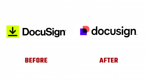
The previous logo, introduced in 2019, featured a yellow arrow-to-line icon, symbolizing the action of signing documents. The wordmark in Helvetica and CamelCase emphasized a practical, no-nonsense approach.
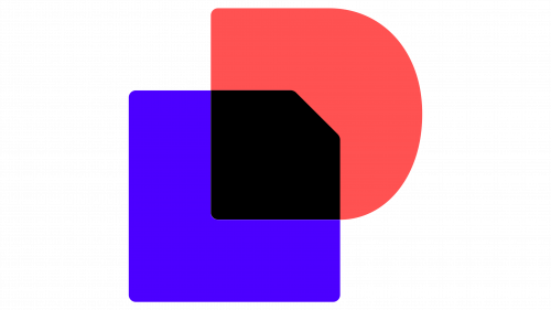
The new Docusign logo has a fresh, dynamic look while retaining the brand’s professional essence. The logomark is more sophisticated, with two overlapping shapes: a bluish-purple square resembling a page and a pinkish-red square forming the letter “D.” These elements intersect in solid black, representing transparency in agreements. This design is clear and symbolic, emphasizing Docusign’s commitment to clarity and reliability.
The wordmark has undergone significant changes. The CamelCase has been replaced with a streamlined lowercase format. Notches in the “d” and “i” reflect the logomark’s page fold design, adding a subtle yet distinct touch.
The custom typeface, DS Indigo, is a sans-serif font created in-house. It is clean and professional, fitting perfectly with Docusign’s business-centric focus. The weights are well-defined, ensuring readability and smooth visual flow.
The new color palette balances business professionalism with a modern aesthetic. The primary colors include Poppy red and Cobalt blue, with various shades of purple. These vibrant yet refined colors convey a sense of trust and innovation.
Overall, the new logo and identity signal a significant shift for Docusign. With its dual symbolic meaning, the layered logomark provides a fresh visual representation of the brand’s values. The simplified wordmark and custom typeface enhance the brand’s contemporary look while maintaining professional integrity.


