![]() Doli Armaanon Ki Logo PNG
Doli Armaanon Ki Logo PNG
The logo for Doli Armaanon Ki captures the charm of the dramatic Indian television series. It embodies national motifs, heartfelt warmth, boundless cordiality, and openness to the world. A few simple strokes convey the poignant depth of women’s experiences.
Doli Armaanon Ki premiered on Zee TV on December 2, 2013, as a daily Indian television drama from Zee Entertainment Enterprises. Spellbound Productions produced the series with Ideaz Pictures Pvt Ltd. Pearl Grey and Rajiv Singh served as producers. At the same time, Shanti Bhushan, Pearl Grey, and Monika Shukla wrote the story. Filming took place in Jhansi and Mumbai.
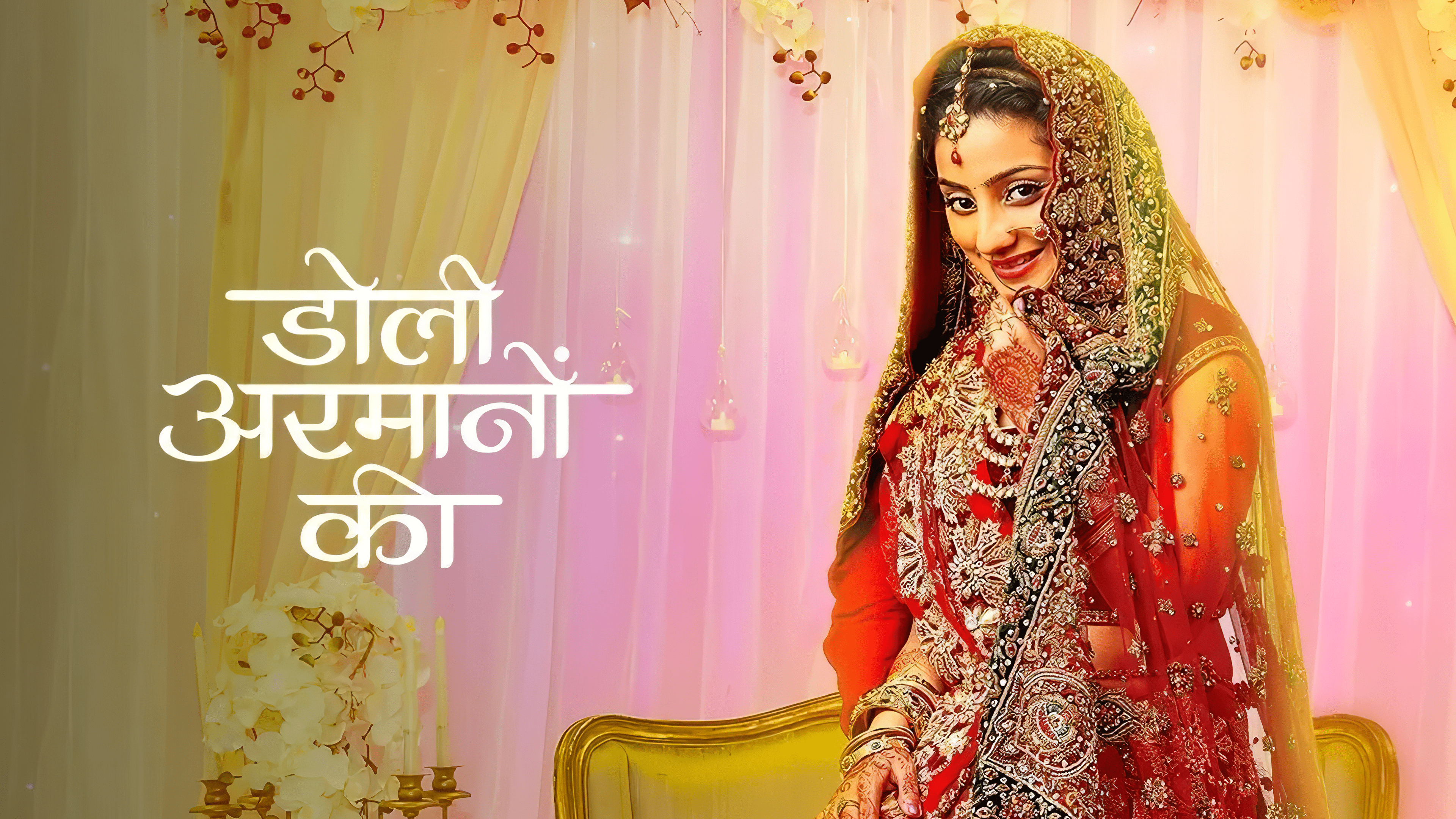
The plot centered on Urmi, a young woman from Jhansi who marries wealthy businessman Samrat Singh Rathore, expecting a stable family life. After marriage, she faces domestic violence, and the story shifts toward her attempt to escape that relationship with her son Shaurya. Samrat is later convicted and sentenced to six years in prison. Urmi rebuilds her life, opens a restaurant, and receives support from Ishaan Sinha, a family friend who later falls in love with her.
The production went through casting changes. Rahil Azam was first considered for Samrat, but Mohit Malik later accepted the role after initially turning it down. His portrayal of the antagonist won him the Indian Television Academy Award for Best Actor in a Negative Role in 2015. Vibhaav Roy also left the show after refusing to play the father of an adult son, which forced the writers to adjust the storyline.
The series aired Monday to Friday and ended on September 25, 2015, after 482 episodes. Internationally, it was distributed as Lies of the Heart. Zee TV positioned the drama against similar family serials on Star Plus and Colors TV, and later made all episodes available on ZEE5.
Meaning and History
![]()
The series tells the story of the dramatic yet touching relationship between the two main characters, played by Neha Marda and Mohit Malik. Each day, for 25 minutes, viewers held their breath, following the development of events and rooting for their favorites. The series’s start was signaled not only by melodic music but also by the familiar logo used as the film’s opening title. It was as complex as the characters’ interrelations, yet perfectly encapsulated the essence of a touching story from the most vulnerable time in a woman’s life. Thus, the emblem is painted in the colors of fervent passion: yellow and red.
What is Doli Armaanon Ki?
Doli Armaanon Ki (international title Lies of the Heart) is an Indian drama series produced by Spellbound Productions in Jhansi and Mumbai. The first episode appeared in 2013, and the last was released in 2015. The show aired weekly on ZEE TV and totaled 482 episodes.
2013 – today
![]()
The original series was filmed in Hindi, so the logo features an inscription in this language. It occupies three levels, one word per row. This arrangement of the name favorably affects viewers, as it offers good readability despite the abundance of swirls. Overall, the division into three lines is related to maintaining optimal text perception, ensuring it is clearly visible and recognizable even as a monogram.
The emblem’s design is distinctly feminine, emotional, and touching, with hints of Asian style. Smooth curves, softness, sleekness, and roundness characterize the glyphs. However, there are also strict horizontal lines that unify all the letters into a cohesive whole. There are intricate eastern patterns with a bright sunbeam on the left of the first word and the right of the last. The lines are centered.
Font and Colors
The inscription in the Doli Armaanon Ki logo is made in Hindi, so the glyphs resemble an Eastern ornament: they are adorned with swirls of varying lengths and shapes. The palette is very colorful, consisting of striking shades of red and yellow. These are complemented by bright white highlights that lend an atmosphere of magic, passion, and femininity to the emblem.