A visit to the brand’s stores is a joyful event because you can always find the right things at an affordable price here. The Dollar General logo represents household goods, represents a family-oriented business.
Dollar General Corporation: Brand overview
| Founded: | June 1955 |
| Founder: | James Luther Turner, Cal Turner |
| Headquarters: | Goodlettsville, Tennessee, United States |
| Website: | dollargeneral.com |
Meaning and History
Although the history of Dollar General Corporation’s logos dates back to 1955, the company started much earlier: in 1939, when James Turner and his son Cal opened J.L. Turner and Son. They were engaged in wholesale trade, selling inexpensive haberdashery, but gradually switched to retailing. Experienced business people found out where farmers received checks and began to go there to attract new customers. James gave the farmers the left glove and offered to pick up the right one at the store.
A non-standard marketing approach proved to be effective, so, over time, the only location of J.L. Turner and Son expanded into a chain of department stores. But the biggest breakthrough in corporate history came in 1955 when one of the outlets in Springfield became Dollar General Corporation. She introduced the fashion for men’s pink corduroy pants because people didn’t care what to buy – most importantly, at a low price. And then, stores with the concept of “everything is less than $ 1” began to appear in different cities of the United States.
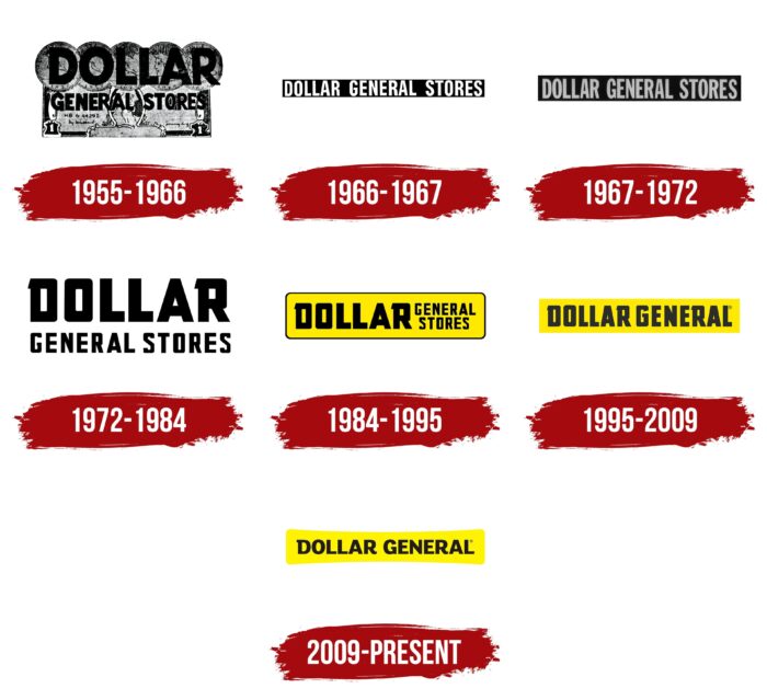
Their logos were often changed, but they were always simple lettering on a yellow, black, gray, or white base. The only exception is the first brand name, where the artists depicted a banknote and coins. The remaining versions are made in a minimalist style: their main element is the brand name, which has changed only once – in 1995.
What is Dollar General Corporation?
Dollar General is a chain of stores selling general goods. The basis of its concept is reduced prices, which, as a rule, do not exceed one dollar (for a quarter of the assortment). Recently, she owns from 17,000 to 18,000 locations in 46 US states: outlets appeared and disappeared.
1955 – 1966
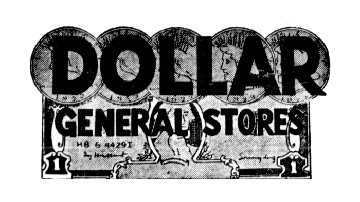
In the mid-1950s, the first Dollar General Corporation opened. His concept was reflected in the logo, which showed the face of the banknote with a portrait of George Washington in the center, two units in the lower corners, the serial number “H8 G 4429I,” and signatures. The top was covered with five coins arranged in a horizontal line. The word “DOLLAR” was written on them in large black letters, and the phrase “GENERAL STORES” was placed at the bottom (on the banknote). The company name used a bold sans-serif font with the same primary and secondary strokes thickness.
1966 – 1967
In 1966, two years after Cal Turner became the sole owner of the chain of stores, the logo was updated. Concept drawings are gone, replaced by a white wordmark inside a black box. The base was elongated horizontally. The inscription occupied one line, so the designers had to make narrow letter spacing. At the same time, the spaces between the words were wide enough not to impair the readability of the text. The font style has not changed much: the developers have kept the bold sans serif but made it more compact. It’s a cross between Neusa Bold by The Northern Block and Warsaw Gothic Woodtype by Cannot Into Space Fonts.
1967 – 1972
The year before Dollar General Corporation went public; it tweaked its logo again. The designers expanded the base and repainted the inscription in dark gray. They also updated the font a bit: flattening the bottom diagonal of the “R,” adding a vertical dash at the bottom of the “G,” and shortening the middle horizontal stroke of the “E.” The closest analog among modern sans serifs is Jeff Levine Fonts’ Strongbox JNL Regular, but it differs in the shape of some glyphs.
1972 – 1984
There was a period in the history of the chain of stores when the base of the logo disappeared, due to which the background turned white. This made it possible to make the letters black, increase the spacing between them, and split the inscription so that the word “DOLLAR” was in the first line. For it, a geometric font was used with quadrangular intra-letter gaps at “D,” “O,” and “R.” It was similar to the Pistoleer Condensed Condensed from Iconian Fonts, but not completely: there were triangular serifs in the upper right corner of the “D” and “R.” Moreover, the serif was the only element that made it possible to distinguish “D” from “O.” The phrase “GENERAL STORES,” located at the bottom, was also written in a grotesque. Still, the style of the letters was different.
1984 – 1995
In 1984, the designers regrouped parts of the logo. So the word “DOLLAR” was on the left, and the second half of the name was divided into two lines and shifted to the right. Moreover, the permutations did not affect either the font or the color of the inscription. But the brand name now has a base in the form of a yellow rectangle with rounded corners and a thin black outline.
1995 – 2009
In 1995, the company’s name was shortened to Dollar General Corporation, so the designers removed the word “STORES” from the logo. The remaining phrase took one line, which made the letters more compact. “GENERAL” used the same massive geometric font as “DOLLAR.” The yellow background has taken the form of a vertically elongated rectangle and has lost its black frame. This graphic mark can still be seen in some stores but is no longer considered official.
2009 – today
After two years as a private company, Dollar General Corporation went public again. The change in its legal structure was marked by a rebranding, and as a result, the corporation received a new logo. Its creators replaced the visually heavy sans serif with a more legible typeface but kept the serif in the upper left corner of the “D” and made it rectangular. The shape of the base has also changed: now, the yellow shape looks like a rectangle with rounded corners and a concave center. It resembles a bow tie.
Font and Colors
One of North America’s most profitable retail chains has been using wordmarks that are not supplemented by any symbols for many years. The industry leader flaunts its name, decorating all banners and signs. This unique aesthetic makes it identifiable, and the modern version features a memorable contrast: a yellow background with black lettering.
The simple, straight, and bold typeface of the Dollar General Corporation logo is called FS Lola Bold. It was created by typographer Philip Garnham, who chose to combine sharp edges and corners with soft curves. This typeface has a lot in common with the Indian Type Foundry’s Caravel Bold. The main differences are the rectangular serif at the “D” and the upturned leg of the “R.”
The black color of the lettering is not as pronounced as it seems: it has the shade of Eerie Black (#1C1B1B). But the base is bright enough to make it stand out because it uses a rich Yellow Rose (#FFF000).
Dollar General Corporation color codes
| Yellow Rose | Hex color: | #fff000 |
|---|---|---|
| RGB: | 255 240 0 | |
| CMYK: | 0 6 100 0 | |
| Pantone: | PMS 102 C |
| Eerie Black | Hex color: | #1c1b1b |
|---|---|---|
| RGB: | 28 27 27 | |
| CMYK: | 0 4 4 89 | |
| Pantone: | PMS Neutral Black C |
