No frills and a lot of pleasant emotions promise the Dollar General logo. After all, all goods cost no more than a dollar. The emblem is laconic and conveys the general mood when visiting retailers. Buy what you need without spending too much – that’s the sign’s motto.
Dollar General: Brand overview
| Founded: | June 1955 |
| Founder: | James Luther Turner, Cal Turner |
| Headquarters: | Goodlettsville, Tennessee, United States |
| Website: | dollargeneral.com |
Meaning and History
Dollar General got its name after a new concept that involved setting all prices at $1. The idea was inspired by Dollar Days, a popular marketing technique used by other department stores to attract customers.
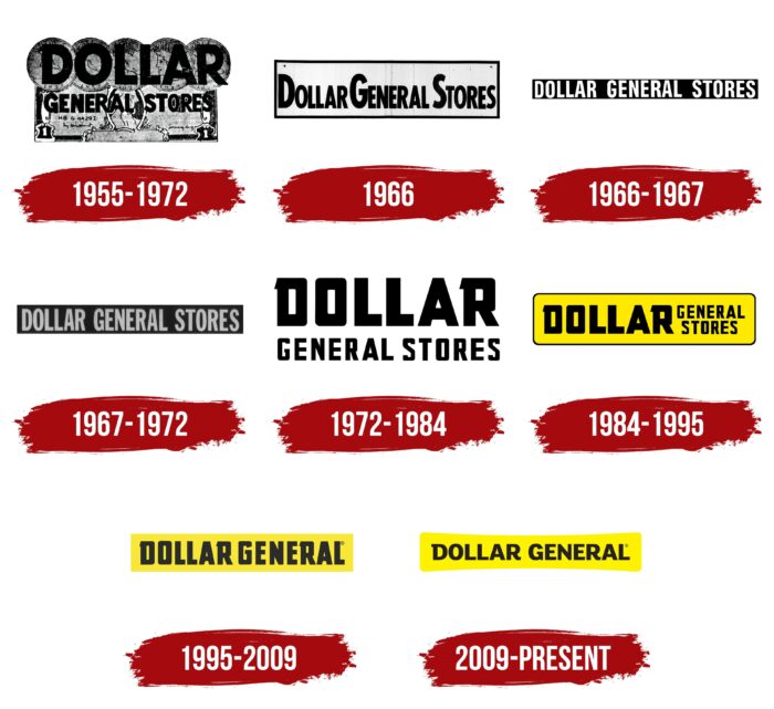
As for Dollar General itself remains recognizable thanks to an identity system that hasn’t changed much since 1984. All of its logos necessarily contain lettering made up of massive bold letters. The arrangement of the words and the background is variable. More recently, the text is inside a yellow rectangle, distinguishing the retail chain from its competitors.
1955 – 1972
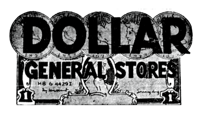
In 1955, the owners of JL Turner and Son renamed their family business Dollar General and finally established department stores as retailers. The emblem presented reflected the new concept because the artists depicted a dollar bill that could be identified by a portrait of George Washington and the numbers in the lower corners. The bill had a serial number and signature for realism. Across it was the word “GENERAL STORES” written in a geometric font without serifs. The word “DOLLAR” was on five coins with the corresponding denomination at the top.
1966
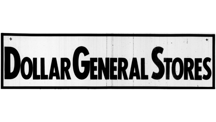
In 1966, another trademark appeared. It contained the inscription “DOLLAR GENERAL STORES” in the upper case. Although all the letters were capitalized, the first “D,” “G,” and “S” were almost half the size of the other characters. Black text occupied the space inside a gray rectangle with a border. There were small crosses in the two corners, making the logo look like a sign fixed around the edges.
1966 – 1967
The letters were aligned in height and repainted white in the same year. The background rectangle became black and very narrow so that there was no free space around the lettering.
1967 – 1972
The designers made the background a dark gray and the text a light gray. They also changed the typeface slightly, stretching the letters vertically and adding a “G” extra stroke at the bottom.
1972 – 1984
In 1972, the rectangle disappeared, so there was no need for a compact inscription. The word “DOLLAR” was enlarged and moved up, and the phrase “GENERAL STORES” took the second line. The letters “D” and “R” were decorated with small triangular serifs. The curves of both “S’s” on the right side formed a right angle.
1984 – 1995
Again, the retail name had a rectangular base with rounded corners, so the words were regrouped. “DOLLAR” was moved to the left, GENERAL and STORES to the right, one under the other to save space. The background became yellow with a thin black frame.
1995 – 2009
After a small rebranding, the logo was simplified. Gone are the words “STORES” allowing “DOLLAR GENERAL” to be on one line. The black color of the inscription turned gray. Seeking minimalism, the designers removed the dark outline and made the corners of the base straight.
2009 – today
In 2009 Dollar General entered a new era. It was marked by a redesign that gave the logo a modern look. First, it changed the font: the proportions of letters began to be symmetrical, which was lacking before. The designers kept the traditional “D” serif, though now it is rectangular instead of triangular. The yellow base is now uneven: it has rounded corners and a concave inside the middle.
Dollar General: Interesting Facts
Dollar General, a well-known American store chain, has made a big difference in US retail.
- Beginnings and Goals: In 1939, in Scottsville, Kentucky, J.L. Turner and his son, Cal Turner, Dollar General, set out with a clear idea: everything would be priced at one dollar. This approach aimed to make shopping easier and cheaper, especially for people living in less populated areas.
- Becoming Dollar General: The business, first named J.L. Turner and Son, Inc., opened its first store under the Dollar General banner in Springfield, Kentucky, in 1955. This step emphasized the unique pricing strategy.
- Growth: The store has expanded quickly, reaching over 16,000 locations in 44 states by April 2023. Dollar General serves cities and rural places where other stores might not go.
- DG Literacy Foundation: Founded in 1993, this foundation shows Dollar General’s dedication to helping people learn to read, prepare for high school equivalency tests, or learn English. It honors the company’s founder, J.L. Turner, who left school early to work but couldn’t read well.
- Focusing on Rural Communities: Dollar General often opens stores in rural areas that bigger stores ignore, offering affordable items and making shopping more convenient for these communities.
- Private Label Brands: The store offers its brands many products, from food to clothes, at lower prices than national brands without compromising quality.
- Eco-Friendly Actions: Dollar General strives to be more sustainable by designing energy-efficient stores, reducing carbon emissions, recycling, and improving the environmental efficiency of its supply chain.
- Using Technology: The store has introduced mobile apps, digital coupons, and self-checkout options to make shopping easier and faster for everyone.
- DGX Stores: These smaller city stores offer products tailored for urban shoppers. They offer quick food options and essentials in a convenient layout.
- Contribution to the Economy: Dollar General plays a crucial role by creating jobs in many communities and helping boost local economies.
Dollar General’s story is about smart growth, engaging with communities, and consistently delivering value to its customers. Starting from a single store, it has become a key retail player through its vision and focus on customer needs.
Font and Colors
Dollar General’s wordmark resembles a sign, so it’s perfect for a chain store. Over the years, it has evolved to eventually take an unusual shape that only remotely resembles the original rectangle. This was all done for marketing purposes because rounded corners evoke subconscious consumer confidence.
The font that is now used for the Dollar General logo is called FS Lola Bold. Its developer Phil Garnham tried to create a sans serif grotesque, but in the process, he realized that he was getting a kind of “semi-Antiqua” – letters with half-serifs. The typographer went even further and combined contrasting elements represented by soft roundings and angular edges.
The traditional color of the retail chain since 1984 is yellow. Dollar General’s corporate identity combines this bright hue with its gloomy antagonist, black, which is the color the company’s name is written in.
Dollar General color codes
| Neon Yellow | Hex color: | #fef200 |
|---|---|---|
| RGB: | 254 242 0 | |
| CMYK: | 0 5 100 0 | |
| Pantone: | PMS 3955 C |
| Raisin Black | Hex color: | #252120 |
|---|---|---|
| RGB: | 37 33 32 | |
| CMYK: | 0 11 14 85 | |
| Pantone: | PMS Neutral Black C |
