The emblem focuses on the network’s customers’ well-being and great purchasing power because only one dollar is spent on goods. The Dollar Tree logo promises a lot of inexpensive shopping and a large selection of necessary things.
Dollar Tree: Brand overview
| Founded: | April 17, 1986 |
| Headquarters: | Chesapeake, Virginia, U.S. |
| Website: | dollartree.com |
Dollar Tree is a chain of retail stores where items cost one dollar or less, so it used to be called Only $1.00. It is the largest retail structure, covering 48 states in North America and neighboring Canada. It has 15,115 stores called Dollar Tree and Dollar Bills. It also has more than 8,000 Family Dollar outlets located in the United States. Commercial Services mainly sells cookware, candy, educational supplies, baked goods, electronics, cleaning and cleaning products, pet supplies, decor, snacks, frozen foods, toys, stationery, beauty and health products, cars, books, milk, pizza, handicraft paraphernalia, household items and more. The company was founded in 1986 and is now a Fortune 500 company. Its headquarters are located in Chesapeake, Virginia.
The popular retail chain has several predecessor firms. The first is K&K 5&10, opened in 1953 by K. R. Perry in downtown Ben Franklin in Norfolk, Virginia. The second is K&K Toys, founded in 1970 by three entrepreneurs (K. R. Perry, Macon Brock, and Doug Perry). It has over 130 stores in the East Coast region. It was not until 1986 that the current version of the chain appeared. It was called Only $1.00 and consisted of five stores in Virginia, Tennessee, and Georgia. It was founded by Doug Perry, Ray Compton, and Macon Brock.
Earlier, the expansion of “dollar” stores was conducted in parallel with the chain of K&K Toys, which were located mainly in shopping centers. But in 1991, the company decided to focus solely on Only $1.00 and sold K&K to KB Toys. Two years later, the owners changed the name, using Dollar Tree Stores instead of the old version, to plan to open more stores with different pricing strategies going forward.
Meaning and History
The logo, which also served as signage, was chosen to match the dollar tree’s brand name. Until then, the neon signs above the entrances had hung “ONLY >>> $1.00.” After it was decided to switch to the newly formed chain, management improved only its logo.
The main visual symbol of the Dollar Tree in the early 1990s became a tree stylized as one dollar. Its crown is as round as a coin, and its trunk looks like a unit. This graphic sign was so successful that the company retained it in the 2006 logo. But the inscriptions that complemented the drawing often changed.
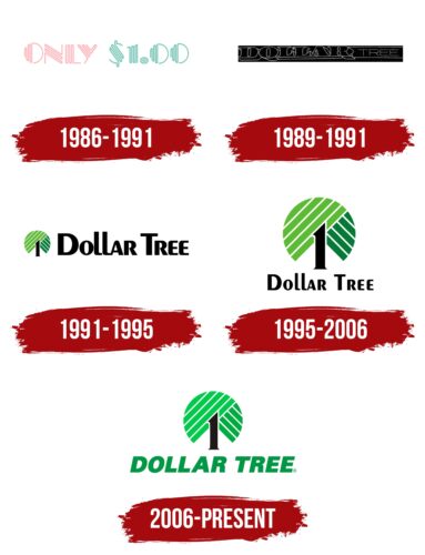
1986 – 1991
Initially, a logo based on the former store name was used. It consisted of the red word “Only” and the blue designation “$1.00”. In between were three short pointer arrows. All elements consisted of small vertical strokes running parallel. The shape of the letter “O” and the number “0” was identical, differing only in the color scheme.
1989 – 1991
The logo of the late 1980s contains the name of the chain of stores against a black rectangle. All letters in the word “DOLLAR” are also black, but they are outlined in thin white outlines. Moreover, the designers added extensions to make the inscription three-dimensional and massive. A contrasting bold font with long serifs is used for the same purpose. But the word “TREE” consists of the thinnest white letters with a clear shape. This part of the text is separated from above and below by long horizontal stripes reaching the right edge of the quadrangular base.
1991 – 1995
By renaming the chain Dollar Tree, the parent company has completely rebranded. It changed everything from the structure to the logo. Since then, a dollar tree has hung on the sign above the entrance of each chain store. The picture consists of a unit (number 1), which acts as the trunk. It is black. In contrast to it, at the top is a circular green crown of folded dollar bills.
The tree is branched and powerful, as evidenced by the “foliage” lowered almost to the ground. The left side of the “branches” is a flat semicircle placed slightly (diagonal). It has five light green stripes. To the right is a quarter of the circle, colored dark green. To the right is the new name of the stores, in Peignot font with soft, streamlined letters rounded on the corners.
1995 – 2006
Designers have refreshed the color palette, presenting green in lighter and more saturated shades. The shape of the crown elements has not changed; the sharp unit has also remained in its place. But the main graphic symbol of the Dollar Tree has become more visible because the logo developers have increased it several times compared to the version created in the early 1990s. Accordingly, the inscription was reduced and ended up at the bottom – like a pedestal for a symbolic drawing. Both words are the same black as in the original version. The font hasn’t changed much either, but the new layout of the text has made it possible to widen the letter spacing. This makes the brand name easier to read.
2006 – today
Currently, the logo is used with a redesigned name. It has been slanted to the right, reminiscent of a light italic style. The word combination is typed in a geometric upper case font with perfectly flat lines: the letter edges are clear and rounded corners. The exception is the “O” and the “R,” which are traditionally slanted. The other elements remain the same.
Dollar Tree: Interesting Facts
Dollar Tree, Inc., is a popular American discount store chain where everything costs $1 or less. Since its start in 1986, it has become a key player in the discount shopping scene.
- Beginnings: K.R. Perry, Macon Brock, and Doug Perry opened the first Dollar Tree store in Dalton, Georgia, in 1986, originally named “Only $1.00.”
- Growth: Today, Dollar Tree operates over 15,000 stores across the U.S. and Canada, making it one of North America’s biggest retailers with a single price point.
- Family Dollar Acquisition: In 2015, Dollar Tree expanded by buying Family Dollar, another discount retailer, for about $9.1 billion, growing its store count and product diversity.
- What It Sells: Despite its name, Dollar Tree offers a variety of items, including household goods, food, decorations, party and office supplies. Recently, it started offering items above $1 in Dollar Tree Plus! Sections, diversifying its price range.
- Fortune 500 Status: Dollar Tree’s significant role in the retail market has placed It on the Fortune 500 list, highlighting its success and influence.
- Sourcing Products: To keep prices low, Dollar Tree buys from a wide network of global suppliers and uses several distribution centers in the U.S. and Canada for efficient delivery to its stores.
- Going Green: The company is working on being more sustainable by improving energy use, reducing waste, and optimizing logistics to lessen its environmental footprint.
- Recession Proof: Dollar Tree is known for doing well in various economic conditions, attracting customers looking for deals, especially during tough times.
- Store Design: The stores are laid out to be simple and easy to shop, encouraging customers to browse the different products.
- Cultural Presence: Dollar Tree has become a part of the bargain-hunting culture, celebrated in media and by fans online who share tips, videos, and DIY ideas from their Dollar Tree finds.
Dollar Tree has established itself as a favorite among bargain shoppers in the U.S. and Canada, offering a wide range of affordable products and a consistent shopping experience.
Font and Colors
Since the name of the Dollar Tree retail chain is very marketing and attracts customers, the management decided to emphasize it. To do this, the designers took it as the basis for the visual identity mark and developed a corresponding logo. As a result, a symbol with a unit and a round coin (crown) made up of narrow strips (presumably from the ribs of dollar bills) was approved.
For the emblem, the typeface was chosen, close to the Chorus Bold with significant changes. Later it was replaced by Helvetica Neue Black Italic, which was developed by the Swedish designer Max Miedinger in collaboration with Eduard Hoffmann. It first appeared in 1957.
The color scheme is related to money themes: everywhere you can see green – the color of paper bills of American dollars. Black (number 1) and white (background) are also used.
Dollar Tree color codes
| Mantis | Hex color: | #6bc856 |
|---|---|---|
| RGB: | 107 200 86 | |
| CMYK: | 47 0 57 22 | |
| Pantone: | PMS 7481 C |
| Pigment Green | Hex color: | #0faa4c |
|---|---|---|
| RGB: | 15 170 76 | |
| CMYK: | 91 0 55 33 | |
| Pantone: | PMS 354 C |
| Spanish Green | Hex color: | #0a974b |
|---|---|---|
| RGB: | 10 151 75 | |
| CMYK: | 93 0 50 41 | |
| Pantone: | PMS 3405 C |
| Raisin Black | Hex color: | #231f20 |
|---|---|---|
| RGB: | 35 31 32 | |
| CMYK: | 0 11 9 86 | |
| Pantone: | PMS 2226 C |
