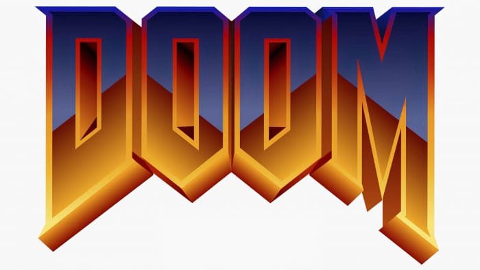
The Doom series of computer games, belonging to the first-person shooter genre, features a logo in the form of the game’s name, consistent with the game’s concept. The style and form of the Doom logo have remained unchanged over the years, reflecting the game’s tense atmosphere and essence. Each game in the series has its distinctive mark.
Doom: Brand overview
| Founded: | 1993 |
| Founder: | id Software |
| Headquarters: | U.S. |
Doom is a first-person shooter video game presented in a series format. Its first release dates back to 1993, with the latest in 2020. It was created by a group of like-minded programmers and is owned by ZeniMax Media. Among the developers are John Romero, John Carmack, Tom Hall, Kevin Cloud, and Adrian Carmack.
The main character is an unnamed space marine working for the Union Aerospace Corporation (UAC). He opposes hordes of demons and monsters to prevent Earth’s takeover. The events unfold on the planet Mars, its nearest satellites, and in two laboratories. The computer shooter has 3D graphics, a multiplayer mode, and support for individual modifications. It all began in 1992 when id Software released a game that brought substantial profit and recognition among gamers and critics alike. It was Wolfenstein 3D. After its release, programmer John Carmack became engrossed in studying progressive technologies. Meanwhile, the rest of the team was simultaneously working on another video game. As a result, he proposed a new engine. Kevin Cloud immediately appreciated the emerging advantages and wanted to combine them with fresh developments for the new game they were making. The team began implementing the idea immediately after launching Spear of Destiny.
But at the very beginning of implementation, the programmers and designers pondered a name that eventually became the basis for the overall emblem of the shooter. One of the employees suggested the word “Doom,” spoken by Tom Cruise’s character at the end of the movie “The Color of Money.” It perfectly fits the plot concept as it contains several meanings – “fate,” “doom,” and “destiny.”
Developing the game took a year. Like the studio’s previous video game, it was initially distributed as shareware: the first episode was free and served as a demo version. This version was released by id Software itself, with copies published by GT Interactive. The first part appeared on BBS only in December 1993. The next version (extended) was launched in 1995. The last episode was released in 2020 under the name Doom Eternal. Generally, a version of the game – main or additional – was released every year for a certain period.
Meaning and History
All Doom logos contain the name of this series of video games. The word was always written in capital letters, creating a sense of danger and tension due to visually massive lines with many angles. Additionally, the inscription’s typography resembles the upper jaw’s teeth – not ordinary ones, but sharp, like those of a predatory animal. After the redesign, the emblem’s shape remained virtually unchanged: developers focused on color, replacing the multicolored “brick” ornament with a solid black fill.
The debut game is divided into three episodes with eight levels each (+ one secret level). This division is not used in subsequent versions. The plot is presented differently, depending on the part: it could be text inserts, notes, remarks, or videos. Furthermore, all series have a distinctive mark. It mainly relates to the content and reflects the character (mostly undead, monsters, demons). The only constant is the style and form of the name, which is the main detail of the logos.
What is Doom?
Doom is a multimedia franchise created based on the eponymous video game, which first appeared in 1993. It exists in the form of comics, novels, sequels, board games, and various adaptations. Its creators are Tom Hall, Kevin Cloud, Adrian Carmack, John Romero, and John Carmack.
1993 – 2016
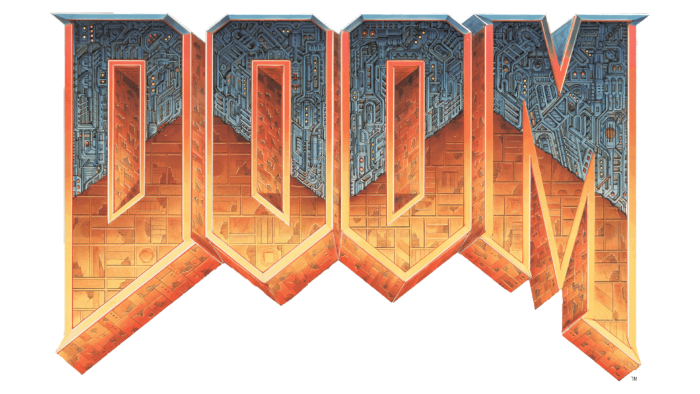
The Doom logo was designed by the renowned artist Donald Ivan Punchatz, known for his illustrations in magazines and science fiction publications. He presented the game’s name in a brutal style, “suspending” the massive inscription over space. This effect is created by the shape of the letters: horizontally aligned at the top, with sharp spikes protruding at the bottom. Even both “O” letters have angles resembling asymmetric heptagons. The “D” on the left and the “M” on the right are elongated downwards, making the word resemble an arch.
To enhance the impression of “archness,” the artist decorated the bottom part of the letters with a brown brick ornament. At the same time, the top part of the inscription looks completely different: it is adorned with a gray pattern of pipes and bulbs, resembling some complex mechanism. Such a design speaks of the variety of Doom’s locations. The inter-letter spaces of “D” and “O” look like corridors receding into the distance.
2016 – today
Modern designers simplified the logo, making the name of the computer game black and two-dimensional. They removed the lateral faces – those protruding at the edges – and freed space inside “D” and “O.” The external letters retained their sharp serifs, and both “O”s – their original heptagonal shape. But now the word “Doom” looks more symmetrical, as the disrupted proportions have been corrected. At least, the border between the two “O”s runs exactly in the center of the inscription.
Doom: Interesting Facts
“Doom” changed video games a lot when it came out in 1993. It was made by id Software and had some pretty neat things that no other games had.
- Cool Graphics: For its time, “Doom” looked amazing with 3D graphics. It let players feel like they were in the game.
- Free to Try: You could play part of “Doom” for free and then buy the rest if you liked it. This idea helped “Doom” become super popular.
- Making Your Own Stuff: “Doom” lets people create and share their game levels. This was one of the first games to do that, and it’s still a big deal in games today.
- Everywhere in Culture: “Doom” is discussed in movies and TV shows. It was so big that early games like it were called “Doom clones.”
- Playing Against Friends: “Doom” made it popular to play games where you try to beat your friends in a match, which many games do now.
- Big Talks: Some people didn’t like “Doom” because it was very violent, but it also gained many fans because of its style.
- Smart Tech Tricks: “Doom” used clever computer tricks to make its 3D worlds look good and run smoothly.
- Racing to Finish: People love speedrunning, which involves trying to beat “Doom” as fast as possible. It’s a big sport for gamers.
- Super Popular: “Doom” was so loved that, at one point, more people had “Doom” on their computers than the new Windows 95.
- More “Doom” Games: Because “Doom” was so great, they made more “Doom” games, each one trying to be as fun as the first.
“Doom” wasn’t just a game; it helped make video games what they are today. It brought new ideas to graphics, how we play games together, and even how games can be a part of our culture.
Font and Colors
The main symbol of Doom is a slanted inscription with letters of varying sizes. Despite being text, the signs in it are individual. The central “O” has pointed angles and truncated upper edges. The “D” and “M” have opposite sides that are equally elongated, making the letters appear mirror-identical. In shape, they resemble a guillotine blade. They also have two serifs: a small one at the bottom and a larger one at the top.
The font used for the shooter’s emblem is closely aligned with the Amazdoom font, created by the Amazingmax company. They have similarly pointed letters with elongated elements. The color of the emblem can vary and depends on the series.
Doom color codes
| Black | Hex color: | #000000 |
|---|---|---|
| RGB: | 0 0 0 | |
| CMYK: | 0 0 0 100 | |
| Pantone: | PMS Process Black C |

