The Dota logo unfolds before the viewer a picture of an extraordinary fantasy world where courage, bravery, and strength are essential attributes of life. The emblem hints at strategy, calculating moves, and mission execution.
Dota: Brand overview
| Founded: | 2003 |
| Founder: | Valve |
| Headquarters: | United States |
Meaning and History
The game has two versions. Among fans, they are called Dota and Dota 2. Their logos are entirely different because, despite the similar name, the versions are developed and owned by different owners. The first Dota is not quite a separate game. It is rather a map developed using the World Editor for Blizzard Entertainment’s Warcraft III game. The map has numerous variations, but the most famous ones are from the designers Eul, IceFrog, and Guinsoo. The fantasy-style emblem is entirely consistent with the world of Warcraft. Dota 2 is a separate game in which the Defense of the Ancients map is taken as the basis, but the content and participants are changed. Hence, the logo emphasizes modifications and features of the game world.
What is Dota?
A strategy game in which two teams of five players must destroy an ancient structure in each other’s base. The team comprises various races with differing abilities, power, and health. Each player controls one of the five characters. Team competitions are part of esports tournaments. The prize fund for International Dota 2 ranges from 1.6 to 40 million dollars.
2003 – today
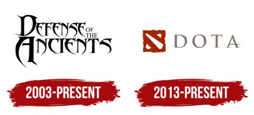
The first emblem is a fantasy-style inscription with modified letters, proposed by developer Eul in 2003. Each symbol has sharp edges and bends that remind:
- In Warcraft III, they use blades, axes, swords, and knives with interesting bends of blades, notches, and decorations.
- In the game world, there are four sides to the confrontation, three of which are non-humans – the undead, the horde, and the elves. The presence of claws and fangs is their distinguishing feature.
The title “Defense of the Ancients” is arranged in two levels in the logo, where the prepositions are downsized and placed one on top of the other next to “Defense.” Originally, the word ‘ancient’ referred to the tree-house of the night orcs in Warcraft, but later in the game, the term began to refer to the primary objectives – the World Tree and the Frozen Throne. If one of them is destroyed, the game ends. Therefore, the gameplay is focused on protecting and attacking these structures. The towers are very ancient, hence the name of the game.
Most of the characters in the emblem are not fully outlined. Their lower part is transformed into a handle of objects, emphasizing battles, fights, and resource gathering. Small notches on top of the letters are crossed over each other, like swords, to create an element of confrontation.
The overall look of the inscription gives the impression of confusion, intertwined roots and branches, a thick scrub, which the participant has to make their way through, as a large part of the map is initially hidden by the fog of war.
2013 – today
The game’s emblem was developed for the announcement of Dota 2 in 2010. The logo consists of a drawing and a name. The main figure of Dota is a red cube with three holes. Two on the sides are smaller, and one in the middle is the longest and widest.
The square symbolizes the gaming space. The player’s screen shows a square map of the terrain. The uneven edges convey the idea of a world without borders. The version features a specific area of land. Real mountains, hills, and valleys can’t have a smooth ending.
The slits symbolize the lines of combat: lower, upper, and center. There are five characters in a team. One team member controls each character. Upon encountering an enemy, they fight 5v5—two players on the upper and lower sidelines and one in the center. The participant’s position is determined beforehand before the start of the match.
Along the lines move the creeps – creatures either controlled by the team or hostile, with predetermined parameters. Every 30 seconds, new batches of warriors come out of the barracks. They fight each other simultaneously with the main players and contribute to victory or defeat. Killing creeps provides experience or gold.
Therefore, the lines on the logo’s square depict the main battle scheme, characterizing Dota 2.
The abbreviated name from Defense of the Ancients is used in the second emblem. The abbreviation was previously used for any map modifications until Valve registered Dota as the game’s trademark in 2009. Therefore, now only the second version is referred to as such.
Font and Colors
The rusty-red and gray-red shades of the Dota 2 logo hint at bloody battles. In the game, each character has a health reserve, damage points capable of inflicting, and armor. Participants fight in groups, and the battle is the main process.
The gray color embodies the missions and constantly repeating actions in mastering the world. Consistency and repetition are important features of the game. Characters can increase their experience and abilities through hard work and task completion.
The font of the inscription is unique due to the uneven edge of the letters and the sharp protrusion of the crossbar A. The letters embody a world with plains, mountains, and rivers. Sharp details are prototypes of heroes’ swords, arrows, and blades.
Dota color codes
| Rufous | Hex color: | #a32400 |
|---|---|---|
| RGB: | 163 36 0 | |
| CMYK: | 0 78 100 36 | |
| Pantone: | PMS 7597 C |
| Cinereous | Hex color: | #84756f |
|---|---|---|
| RGB: | 132 117 111 | |
| CMYK: | 0 4 20 7 | |
| Pantone: | PMS Warm Gray 9 C |
