


![]() DoubleClick Logo PNG
DoubleClick Logo PNG
The DoubleClick logo had an optimal color palette that captured users’ attention and provoked their interest. Calm tones evoked confidence, which is extremely important for an advertising-related platform. The emblem featured various designs, combining several styles.
DoubleClick began in 1995 in Kevin O’Connor’s basement in Alpharetta, near Atlanta. O’Connor and Dwight Merriman had recently sold Intercomputer Communications Corp. for about $25 million and were testing new internet business ideas. At first, they considered a subscription publishing model, but the economics of online media pushed them toward advertising.
At the same time, Poppe Tyson, a New York agency owned by Bozell, Jacobs, Kenyon & Eckhardt, was building an internet ad unit called DoubleClick. In early 1996, the two projects merged, and O’Connor became CEO of the new company. In January 1996, DoubleClick launched an ad network with about 30 websites, connecting advertisers with publishers and taking a commission from placements.
By late 1996, DoubleClick introduced DART (Dynamic Advertising Reporting and Targeting). The platform used data such as IP address, browser type, and browsing behavior to select banners in real time. Yahoo tried to buy DoubleClick in 1996, but the deal fell through due to a $5 million gap. In 1998, DoubleClick went public on NASDAQ under the ticker DCLK.
In 1999, DoubleClick bought Abacus Direct for $1.7 billion, raising privacy concerns over combining web behavior with consumer data. After the dot-com crash, the company cut staff and focused on DART. In 2005, Hellman & Friedman and JMI Equity bought DoubleClick for $1.1 billion. Google acquired it for $3.1 billion in 2008. In 2018, its tools were folded into Google Ad Manager and Display & Video 360.
Meaning and History
![]()
Startup software specialist O’Connor and computer scientist Merriman began developing DoubleClick under the wing of the offline advertising company Poppe Tyson. The value of the project lies in the technology for displaying banners to interested users, which has evolved into the DART system. The project quickly took off, selling advertising and its software to other agencies. Unique technologies led to the firm’s acquisition by a world-leading software company.
The DoubleClick logo has been updated three times. This was due to the new owners. However, the main theme of the double-click is repeated in each visual cue.
What is double click?
An American company has developed technologies for displaying ads to a target audience and has been owned by Google since 2008. As a result, online advertising accounts for 71% of the giant’s revenue. It was bought for $ 300 million and had 35 offices worldwide.
1996 – 2007
![]()
While O’Connor and Merriman owned the company, its logo did not change. There was no need for this since development went by leaps and bounds. In the year of its creation (1996), the company earned 6.5 million, and in the next year, 30.6 million. The sale of shares (1998) brought capital of 4 billion. Representative offices were opened in 25 countries over 4 years. All thanks to technology. The logo didn’t matter much.
For the first visual cue, the entrepreneurs chose a simple display of the company name, DoubleClick. They showed a double-click by repeating the word “Click”. The second copy, smaller and red, is located above and to the right of the main one. Despite its simplicity, the logo fully reflected the company’s direction.
Anyone with a computer is familiar with double-clicking. This is a well-known combination for opening files and websites. Therefore, after examining the emblem, there was no doubt about the company’s connection to the Internet.
According to the idea, only two clicks separated the DoubleClick client from selling the product to the target user through the site. Hence the name. The second click was decisive, so it was highlighted in red.
The piecework spelling of the words “double ” and “click ” indicated the pressing speed. For a double-click to work, it must be performed without interruption.
The angular serif typeface resembled the lines of microchips, the paths, and channels that DoubleClick’s programs used to find the information they needed about users as they roamed the web.
2007 – 2010
![]()
In 2005, the company was acquired by two investment firms, Hellman & Friedman and JMI Equity. But only to prepare the brand for a larger and more expensive deal. The logo update was part of the rebranding.
Using the same basic double-click idea, the new logo conveyed it slightly differently. Instead of the second word, a double circle appeared in place of the letter O. The first fully corresponded to the letter’s position, and the second was lower, intersecting with the upper figure only partially.
The circle was associated with hovering the index arrow on the desktop and double-clicking the mouse. This already clearly brought DoubleClick closer to the Internet space.
The picture suggested a quick and easy solution to the issue of advertising on the Internet (for firms) and buying goods (for users). Two clicks, and you’re done.
The two-level spelling of DoubleClick reinforced the idea of a double. Slender, thin letters, which replaced the massive font, embodied the idea of lightness and speed. The use of lowercase letters led away from the idea that this was the company’s name. It was as if the user was reading a “double-click” instruction. Thanks to this, the name turned into an advertisement, prompting action.
2010 – 2015
![]()
In 2008, Google acquired DoubleClick. Having acquired several computer companies, DoubleClick owned a unique set of mechanisms for advertising and collecting user information. Plus, it had an advertising exchange. Therefore, having bought the company for 1 billion, Hellman & Friedman sold it to Google for 3 billion.
The new owner updated the strategy and visual sign later, when the claims by Yahoo and Microsoft, which feared the competitor’s excessive power, subsided.
Google only slightly redesigned the previous logo. But it immediately acquired several meanings. The double circle was moved forward, placed in front of the words. Now, the tandem was not only a symbol of a double-click. It showed that the company’s products exist to unite: advertising and the Internet; sales and the Internet; sellers and users; firms and advertisers. DoubleClick technologies help them work in pairs that benefit both.
The two-level inscription “doubleclick from Google,” where each part is written opposite its circle, broadcasts the idea of \u200b\u200bmerging DoubleClick and Google.
The company name retained lowercase letters but was merged into a single word, restoring the feel of right-clicking speed. The thin font looked like a web. The black letters changed to green, symbolizing renewal.
In general, the logo was pale and nondescript. He pointed to the submission to Google. DoubleClick’s position within a corporation rather than as a well-known stand-alone company.
2015 – 2018
![]()
Google’s management company was reorganized and became part of Alphabet Inc. All Internet-related brands that have joined the new coalition have undergone rebranding.
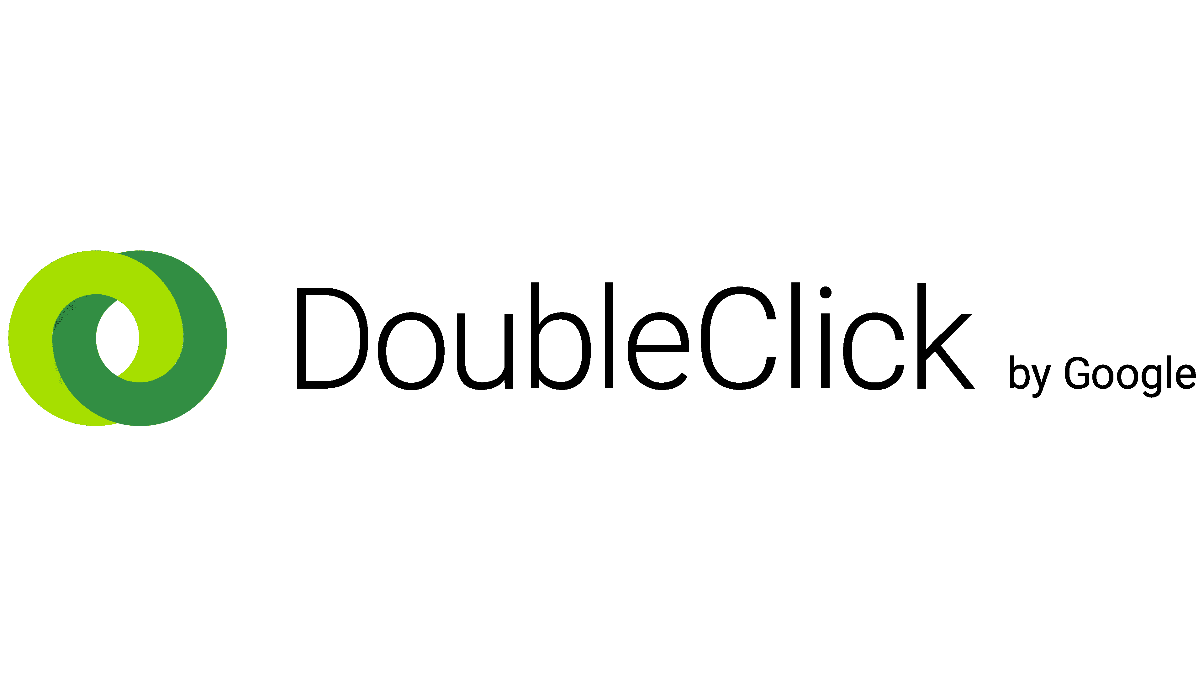
The two circles on the DoubleClick emblem have been replaced by two intertwined hoops at the same level. They are a symbol of technology. Reminiscent of wedding rings with their idea of association.
DoubleClick again found two capital letters, highlighting the two constituent words. The thin black font (the smallest of all used earlier) shifts attention from the inscription to the rings.
Two cliques, two words, two rings connected were a triple indication of unity, the close connection between advertising and the Internet. The company helps the advertiser meet their potential client and connects them through its technologies.
The Google inscription follows the title, but in even smaller print. A smooth transition from large rings to a small inscription in a row shows the brand’s dissolution and the preservation of only its technologies.
In 2018, the company joined the Google marketing platform and changed its name.
Font and Colors
Primary colors: black, light green, green, and dark green.
- In the case of DoubleClick, green shades meant money, earnings, and profit from sales. Light green symbolizes attracting new users, a new advertising approach, and modern technologies with a great future.
- Black – the power of the company, its global scale.

The font of the latest Araboto Light logo.