The DreamWorks Animation logo is as dreamy and fantastic as the films the studio produces. The emblem narrates the process of birthing new ideas for intriguing and gripping stories. Future tales are fished out of clouds of dreams.
DreamWorks Animation: Brand overview
| Founded: | October 12, 1994 |
| Founder: | Steven Spielberg, Jeffrey Katzenberg, David Geffen |
| Headquarters: | Glendale, California, U.S. |
| Website: | dreamworks.com |
DreamWorks Animation is an animation division of DreamWorks Pictures, founded in 1998 and spun off from SKG in 2004. They have released 44 feature-length animated films and announced four more in the next two years. It has been owned by Comcast via Universal Pictures since 2016.
Meaning and History
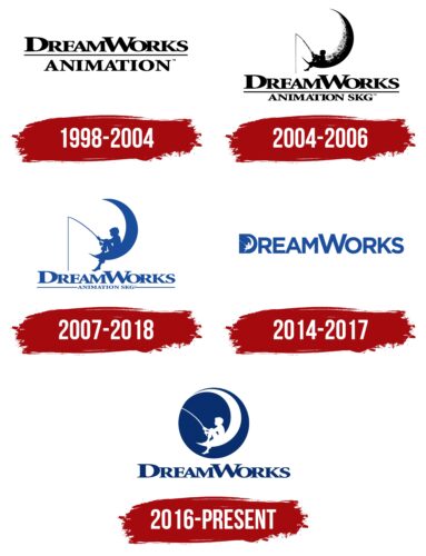
Despite the establishment of the main film company DreamWorks in 1994, its animation division received branding in 1998 when the first animated film, Antz, was released. That’s when the DreamWorks Animation logo first appeared. Later, when it became clear that cartoons would become an important part of the studio, the division was spun off into a separate company, and the iconic logo with a boy on the moon was born, which has accompanied the company’s films for many years. The rebranding of the image is associated with transitions to new technologies and changes in ownership.
What is DreamWorks Animation?
The studio that children of the world owe the most famous and beloved cartoons: Shrek, Chicken Run, Kung Fu Panda, How to Train Your Dragon, Madagascar, and others. About 1,500 employees work at the headquarters in California to produce these masterpieces.
1998 – 2004
The first DreamWorks Animation logo was not well-thought-out, as the company initially made movies. The sign was required for the studio’s first experience in animation, which was worked on by former members of Spielberg’s London company, Amblimation.
The logo, which was used for the initial release of Antz, simply represented the studio’s name, DreamWorks. Below the line followed the word Animation. The technique showed that animation was just one of the divisions of the young film studio. However, the use of capital letters suggested big ambitions.
2004 – 2006
In 2004, the studio moved to computer animation only and was spun off into a separate company. By this time, one of the box office animated films, Shrek, which won an Oscar, had been released. It was clear that the direction had a great future. Therefore, a more vibrant and memorable logo was designed for the studio.
At the center of the emblem was a black-and-white moon, on which sat a boy with a fishing rod. Below was the previous combination of a two-tiered name. However, next to Animation appeared the abbreviation SKG.
Spielberg himself came up with the image of a person fishing on the Moon. He envisioned it done as computer animation. However, visual effects specialist Dennis Muren recommended bringing in an artist to make the logo look like a painting. Artist Robert Hunt was invited to work on the image of the boy, and he is considered the author of the famous logo. As a model, he used his son William.
The studio presented a romantic story about the origin of the boy, along with the logo. According to the story, this was a seriously ill child living in one of the villages. The child’s father asked various representatives of nature to heal his son. But they did not help. Only the Moon agreed but for a heavy price. The boy had to live on the Moon forever and watch over the stars. The father agreed, and the Moon took the son up. From that time, the father and son communicated only at night. The boy himself told this story in the form of an older man. He fell in love, and the Moon allowed him to live on Earth with his beloved, giving him exactly 60 years. On his deathbed, leaving again for the Moon, he told people this fairy tale.
The image of the moon is a prototype of dreams and fantasies, dreams from which the boy fishes out ideas for subsequent cartoons. The idea goes well with the studio’s name.
SKG is an abbreviation of the first letters of the surnames of the famous founders of DreamWorks: Spielberg, Katzenberg, and Geffen. Breaking off into a separate firm, DreamWorks Animation received the imprint of its stellar owners.
2007 – 2018
In 2007, the company announced that it would release all of its animated films in stereoscopic 3D using a new technology developed with Intel. The progress was marked by changing the logo to a more voluminous and lively one.
The image was given a blue color. The tilt of the moon was removed, positioning it evenly, which straightened the boy’s figure. The words Animation SKG were significantly reduced, and lines were drawn from them to the ends of the large DreamWorks inscription.
This choice made the logo clearer and created a better focus point, reducing attention to detail. If before the moon and the child looked up, now they are more focused on reality. The boy seems alive and voluminous. The blue color looks softer and closer to the image of the sky and dream.
In 2006, Paramount Pictures bought DreamWorks SKG and, by agreement with DWA, acquired the rights to distribute all Animation SKG cartoons. The new logo was in harmony with the Paramount logo, which is also painted in blue and white.
2014 – 2017
In 2014, the studio significantly expanded its presence, announcing the creation of its own TV channel, DreamWorks Channel, a publishing division, and the DreamWorksTV YouTube channel.
The main focus in all subdivisions was the name DreamWorks, which was emphasized in the new logo. The emblem is presented as a large blue inscription. The boy, as a white image, was placed in the initial letter D, replacing the hole in the center of the symbol. This element served as a hint towards the studio since all channels used cartoons and stories created by the subdivision.
Following Comcast’s acquisition, DreamWorks Channel was transferred to the jurisdiction of NBCUniversal International Networks in 2017.
2016 – today
In 2016, Universal Pictures, a division of Comcast, acquired DreamWorks Animation. From that moment, the independent company became a subsidiary. As a result of the acquisition, the logo was again changed.
The modern interpretation consists of a blue circle, symbolizing the sky—the choice of shape hints at the planet – the planet of cartoons and dreams. The circle also suggests a view as if through a telescope, allowing you to examine details and the image of the boy on the moon. The circle also represents a camera lens in which you can see a snippet of a cartoon.
Inside the circle is a white image of the moon, on which the boy is fishing. The profile of the child has slightly changed. His curly hair and clothing resemble an elf. This fairy-tale character is closer to the animation studio.
In 2022, the logo became animated. The boy flies across the sky, meeting various cartoon characters.
Font and Colors
Blue and white are the primary colors of the emblem. They are close to the image of the sky, where the events of the logo take place.
- Blue – the blue sky, fantasies, dreams.
- White – clouds, stars, and the moon. New ideas and products for children.
The font is similar to Addington CF Extra Bold. The letters of the inscription are placed very close and are almost fused at the bottom, which is not so much a semantic technique as an attempt to make the logo more compact.
DreamWorks Animation color codes
| Cool Black | Hex color: | #082e6d |
|---|---|---|
| RGB: | 8 46 109 | |
| CMYK: | 93 58 0 57 | |
| Pantone: | PMS 288 C |
