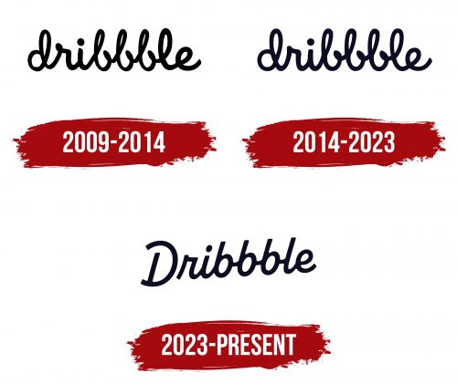
The Dribbble logo has transformed, enhancing its uniqueness by adopting a more legible and crisp style. Replacing the previous casual scribble is a formal calligraphic inscription that slants downward diagonally. The glyphs exhibit smooth contours with a harmonious transition between characters. Notably, the initial “D” stands alone, its curvature so pronounced that it evokes the lower part of a rocking chair. The text is rendered in lowercase letters, devoid of any serifs.
The upward slant of the inscription signifies a sense of growth, progress, and aspiration, qualities that align well with a platform known for showcasing creative work and design portfolios. It sends a message of dynamic upward movement, encouraging creators and consumers to aim high. The smooth transitions between glyphs suggest an effortless user experience and aesthetic harmony, key attributes for a design-focused platform.
The isolated first letter “D” is particularly intriguing. Its rounded shape that mirrors the lower part of a rocking chair suggests comfort and ease, subtly assuring users that they are in a space that values creativity and relaxation. While the lowercase style of the font is not only modern but also approachable, it implies that the platform is accessible and inclusive. There’s a humility and down-to-earth feel, contrasting sharply with platforms that seem too corporate or stuffy.
The use of calligraphy conveys a sense of artistic flair. This highlights Dribbble’s core ethos as a breeding ground for creativity and design talent. It manages to be formal without being stiff, mirroring the professional yet imaginative community that calls the platform home. It’s a calculated choice, considering that a majority of its users are designers, artists, or creatives in some capacity. They would undoubtedly appreciate each glyph and curve’s meticulous attention to detail.
The absence of serifs further modernizes the logo, resonating with the platform’s aim to be current, fresh, and in tune with the latest design trends. It exemplifies the brand’s focus on seamless usability and an uncluttered interface.
The logo is more than a mere identifier; it is a visual narrative of the platform’s representation. From the upward slant indicating progress to the isolated, curved ‘D’ symbolizing comfort, every element functions, contributing to a unified vision of creativity, ease, and aesthetic harmony.
Dribbble: Brand overview
| Founded: | 2009 |
| Founder: | Dan Cederholm and Rich Thornett |
| Headquarters: | Walnut Creek, CA |
| Website: | dribbble.com |
In 2009, Dribbble sprang to life as a pet project by neighbors Dan Cederholm and Rich Thornett in Salem, Massachusetts. Their aim was simple yet ambitious: to develop a digital space where designers could unveil snippets of their ongoing projects and receive constructive feedback. Initially an exclusive beta platform, Dribbble threw open its virtual doors to the public in 2010, quickly amassing a thriving designer community. Features like “Rebounds” were integrated into the site based on recommendations from its active user base.
Eschewing external capital injections, Dribbble opted for a bootstrapped approach, gradually enriching its platform by introducing job postings, freelance opportunities, and even an online store for designers. These organic growth strategies paid off, morphing Dribbble into a hub that now supports an impressive community of over 3 million designers from around the globe.
Today, under the stewardship of CEO Zack Onisko, Dribbble operates as a decentralized enterprise, shunning a traditional brick-and-mortar headquarters. As it continues its trajectory, Dribbble is an indispensable tool for designers looking to flaunt their portfolios, source creative inspiration, secure employment, or connect with like-minded professionals for collaborative ventures.
