The Dropbox logo is a symbol of the many cells for storing important information that the service has. Data will never be lost, the logo promises. Sign elements show: the available volume can be expanded, and there is enough space.
Dropbox: Brand overview
| Founded: | September 2008 |
| Founder: | Dropbox, Inc. |
| Headquarters: | San Francisco, California, U.S. |
| Website: | dropbox.com |
Meaning and History
Like any big project, Dropbox started with a trivial personal problem solution. Drew Houston conceived it after again forgetting his flash drive at home and did not have access to the completed task. Therefore, the student decided to do something to help him avoid such situations. Moreover, he did not like the services that existed since they suffered from Internet delay, difficulties in transferring large files, and simply from errors.
Having started doing a project for himself, he immediately realized that his startup would be useful to many users who face similar problems. As a result, in the spring of 2007, the student launched Evenflow, Inc. and received the necessary funding. But Dropbox’s official opening date is 2008, when the unusual service kicked off right at TechCrunch Disrupt, an annual technology conference. It was then that her logo appeared. In the fall of 2009, Evenflow, Inc. has already been officially renamed Dropbox, Inc.
What is Dropbox?
This is an American company and its eponymous file hosting service. Dropbox made it to the list of the most valuable startups in the world.
2008 – 2013
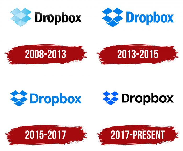
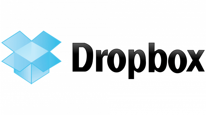
The debut logo of the cloud service was immediately associated with its name. Therefore, it depicts an ordinary cardboard box, which manufacturers use to store and deliver goods. The direct analogy stuck because it accurately reflected the service and did not clutter the logo with accompanying details. On the left was an icon in the form of an open square box. It was drawn as realistic as possible due to the shaded and lightened areas. On the right was the name of the company that provided this service. The text was black; the drawing was blue.
2013 – 2015
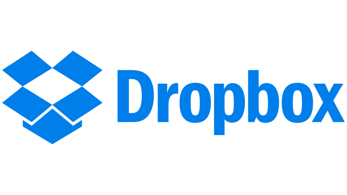
The changes made were related to style and color. The word “Dropbox” is now the same blue as the icon, and it has a different shape. The designers have made it more schematic and flat. The drawing in 2D format acquired the same color – without lightening or darkening. The depth was marked in white and indicated the bottomlessness of the cloud storage. The box does not merge with the lids, so the authors circled them with a thin light stripe.
2015 – 2017
The structure of the emblem remains the same – only the font has changed. Instead of elongated lines, squat and wide ones appeared. This was seen in the symbolic gaps: especially in letters where there are round and semicircular holes – in the lowercase “o,” “p,” “b,” and capital “D.”
2017 – today
The logo has evolved again. Now it has a thinner font compared to the previous version and corrected box proportions. Now the edges of the valves (covers) coincide with the bottom edge, so visually, the icon is perceived as five identical squares. Label color changed from black to blue.
Dropbox: Interesting Facts
Dropbox is a place on the internet where you can keep your files so you can get to them from any computer or phone. It started in 2007 when Drew Houston, a student, kept forgetting his USB drive and thought there should be an easier way to keep and share files.
- How It Began: Drew Houston got tired of forgetting his USB drive, so he made Dropbox to store files online.
- Getting Help to Start: In 2007, a group called Y Combinator, which helps new companies, gave Dropbox some money and advice to get started.
- Growing Fast: Dropbox quickly gained many users by giving extra space to people who told their friends about It.
- Becoming a Big Deal: In 2018, Dropbox became a public company, and it was worth over $9 billion, which shows that many people thought it was valuable.
- Working Together: Dropbox added tools so people can work on documents simultaneously without being in the same place.
- Keeping Files Safe: After some security problems, Dropbox added extra protections, such as two-step login and special coding, to keep files safe.
- Buying Other Companies: Dropbox bought other companies to manage emails better, keep photos, and edit documents.
- Project Infinite: In 2016, Dropbox enabled viewing all your files on your computer without taking up space on your hard drive.
- Used All Over the World: Millions use Dropbox to keep and share files. It works in many languages and helps people everywhere work together.
Dropbox started with a simple idea to make storing and sharing files easier and has grown into a big company that helps people work together no matter where they are.
Font and Colors
From the very beginning, the brand name was associated with the image of an open cardboard box. Her image passed from one version to another until it transformed into five rhombuses (or squares): two in the upper rows and one in the lower. Also, there is another rhombus in the negative space (between the four geometric shapes) – not blue, but white. It forms the inside of an impromptu box. The top corners are 115 degrees; the side corners are 65 degrees.
There are two types of typefaces used in Dropbox logos. The actual font was introduced in 2015. It belongs to the Franklin Gothic family and is called Condensed Demi Bold. The color scheme consists of white and blue DBX Blue (# 0061FF).
FAQ
What is the meaning of the Dropbox logo?
The logo uses various shades of blue with specific meanings. The gradient blue represents creativity and freshness, while the intense shade signifies power and reliability.
The logo’s design is simple and effective. It features an open box, symbolizing storage, sharing, and accessibility. This imagery aligns with the brand’s core function of providing a reliable and secure platform for storing and sharing files.
The choice of blue conveys trust and dependability, which is essential for a service handling important data. The gradient adds a modern touch, emphasizing the brand’s innovative approach.
What is the Dropbox icon?
The Dropbox icon in your taskbar or menu bar is a handy tool for accessing your work from your desktop. It provides quick access to:
- Your Activity: View recent activity to track changes or updates to your files and folders.
- Sync History: Check the status of your file synchronization to ensure all files are up-to-date across your devices.
- Notifications: See alerts about shared files, updates, and other important information.
The icon helps streamline your workflow by offering easy access to these essential features. It keeps you organized and efficient while managing your files.
What is the arrow symbol in Dropbox?
The Dropbox arrow symbol is a solid blue circle with two white arrows forming a circle. This icon means your file or folder is syncing. Dropbox is either uploading new files or updating existing ones in your account.
When you see this symbol, it shows that the platform is keeping your files up-to-date across all your devices. The syncing process ensures that the latest versions of your documents, photos, or other files are available wherever you use them. This icon helps users understand their file status and stay aware of ongoing updates.
What is the Dropbox logo?
The logo features five blue diamonds that look like an open cardboard box. This design symbolizes storage and file sharing, which aligns with the brand’s main services. The open box suggests that your files are securely stored yet easily accessible.
The wordmark is next to the diamond-shaped box, showing the brand name in bold blackbold black letters, similar to Motiva Sans. This clean and modern look creates a strong visual identity that is simple and effective.
The blue color of the diamonds represents trust, reliability, and professionalism, which are essential for a service that handles important data. The geometric shapes and bold wordmark reflect the brand’s commitment to clarity and simplicity in design.
The design elements create a recognizable and trustworthy image that resonates with users.
How do I open Dropbox?
To open Dropbox, follow these steps:
- Website Access:
- Open your web browser and go to dropbox.com.
- Click on “Sign In” at the top right corner.
- Enter your email and password, then click “Sign In.”
- Mobile Application:
- Download the Dropbox app from the App Store (iOS) or Google Play (Android).
- Open the app after installation.
- Enter your email and password, then tap “Sign In.”
Who created the Dropbox logo?
Drew Houston, one of Dropbox’s co-founders, designed the first logo and helped create the brand’s initial visual identity, which laid the groundwork for its recognition.
The recent logo redesign was done by the design firm Collins, led by Brian Collins. The goal was to modernize the logo while keeping its core elements, ensuring it stayed relevant and appealing.
The new logo keeps the recognizable diamond shapes arranged to look like an open box, symbolizing storage and accessibility. Brian Collins and his team ensured the updated logo resonated with users and represented the brand’s values and mission.
Is Dropbox a brand?
Yes, it is a brand with a visual identity system. This includes a recognizable logo, specific color schemes, and design elements that set it apart from other services. The brand represents a reliable and user-friendly platform for file storage, sharing, and collaboration.
The brand has built a strong reputation in the tech industry. Its visual identity is crucial in conveying its values of simplicity, accessibility, and trustworthiness. The logo, with blue diamond shapes arranged like an open box, symbolizes storage and accessibility. This design reflects the brand’s mission to provide a secure and easy-to-use service for managing digital files.
