DuckDuckGo Logo

DuckDuckGo LogoDuckDuckGo Logo PNG

The DuckDuckGo logo depicts both a professional approach and humorous simplicity. The platform is an assistant for finding the necessary information. The emblem advises: enter a command, and the cheerful duck will immediately search for pages.

DuckDuckGo: Brand overview

DuckDuckGo is one of the largest search engines, launched in 2008. The platform creator, Gabriel Weinberg, set himself the task of creating a competitive platform. The key advantage of the presented information system over the main competitors is the lack of a personalized approach, which directly affects the quality of the issuance at the user’s request. Also, DuckDuckGo’s representatives guarantee confidentiality and anonymity when searching for information.

The story of DuckDuckGo began in 2008 when Gabriel Weinberg, an entrepreneur from Pennsylvania, decided to create a search engine that respected user privacy. Weinberg, who had previously founded and sold several tech startups, saw potential in offering an alternative to the existing search giants that collected and used personal data.

The name “DuckDuckGo” was inspired by the children’s game “Duck, Duck, Goose” and was chosen for its memorability and uniqueness. Weinberg started development alone, working from his home in Pennsylvania.

The search engine was officially launched in September 2008. The service initially used Yahoo’s search results, combining them with its algorithms and sources. A key feature of the platform was the absence of user tracking and the non-personalization of search results.

2009 was a year of growth and development for the project. Weinberg continued to improve the search algorithms and add new features. One popular addition was “instant answers”—direct responses to user queries displayed above the search results.

In 2010, the company took an important step by announcing a policy of not storing users’ personal information. This decision attracted the attention of users who were concerned about online privacy. That same year, the service started generating its first profits from contextual advertising.

In 2011, the platform saw a significant increase in popularity, with the number of daily search queries reaching 1 million. The company also launched its first billboard in San Francisco with the slogan “Google tracks you. We don’t.”

In 2012, the company continued its expansion by launching mobile apps for iOS and Android, allowing users to maintain privacy while searching on mobile devices. That same year, the project received its first venture capital investment of $3 million from Union Square Ventures.

2013 was a pivotal year for the search engine. After Edward Snowden’s revelations about extensive surveillance on the Internet, interest in private search engines surged. The number of searches on the platform more than doubled, reaching 4 million per day by the end of the year.

In 2014, Apple added the service to the list of default search engines in Safari for iOS and macOS, significantly increasing its availability. The company also redesigned its website, improving the user interface.

The years 2015-2016 were marked by continued growth and improvements to the service. The platform expanded its “instant answers” feature by adding weather, sports scores, and other frequently requested information. The company also intensified its efforts to promote the importance of online privacy.

In 2017, the search engine reached 20 million searches per day. The company also launched updated versions of its mobile apps, adding a built-in web browser with enhanced privacy protection.

In 2018, several new features were introduced, including privacy-safe maps and an improved tracker-blocking system. The company also expanded its team by opening offices in several countries.

In 2019, the company launched DuckDuckGo Privacy Essentials, a browser extension that provides privacy protection beyond search queries. This extension quickly gained popularity among users who were concerned about online tracking.

From 2020 to 2021, the service has grown further, reaching 100 million daily searches, reflecting the increasing demand for private online services. The company also began developing its desktop browser, promising even higher levels of privacy protection.

By 2022-2023, the service had established itself as the leading alternative search engine focused on privacy. The company continued to develop its products, including mobile apps and browser extensions, constantly improving the protection of user data.

The platform has faced various challenges, including competition from large technology companies and the need to adapt to changing technologies and privacy threats. However, the company has maintained its commitment to protecting user data, allowing it to build a loyal audience and become a key player in online privacy.

Meaning and History

DuckDuckGo Logo History

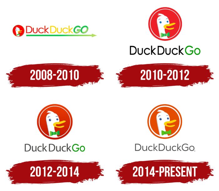
Even though this search engine was launched relatively recently, the history of the logo has four variants. Thus, the company tried to respond promptly to the trends of the global network, making minimal changes to the previous version of the logo. The main element remained unchanged, namely the image of a duck’s head, which made the platform famous worldwide. This image has remained unchanged since the beginning of DuckDuckGo.

What is DuckDuckGo?

First of all, there are millions of search queries daily. With the help of the platform, anyone can find the answer to their question in a matter of seconds. The intuitive interface allows both experienced users and beginners to surf the Internet.

2008 – 2010

DuckDuckGo Logo 2008

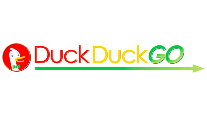
The first version of the logo appeared immediately after the platform’s launch. On a red background, in a frame, is the head of a goose, which looks to the right. The bird’s beak is slightly open. Moreover, this is done at such an angle that it seems that the goose is smiling. Of interest is the plumage on the head in the form of a forelock, which is the main “highlight” of the emblem, namely the green bow tie on the neck.

The original logo variation also included a verbal inscription, within which the search engine’s name was presented. Even though all three words are in solid text, without spaces, the user clearly understands where one element ends and the other element begins, thanks to the color scheme. Red, yellow, and green colors were used. “DuckDuck” was done in a classic sans-serif font. In turn, the “Go” element was distinguished by its italic font, which created a sense of the volume of the word. In addition, in this element, both characters were written in capital letters, while the first two words, “Duck,” had lowercase letters, not counting the first character.

Under the name, there was an arrow pointing to the right. The left side is darker than the right.

2010 – 2012

DuckDuckGo Logo 2010

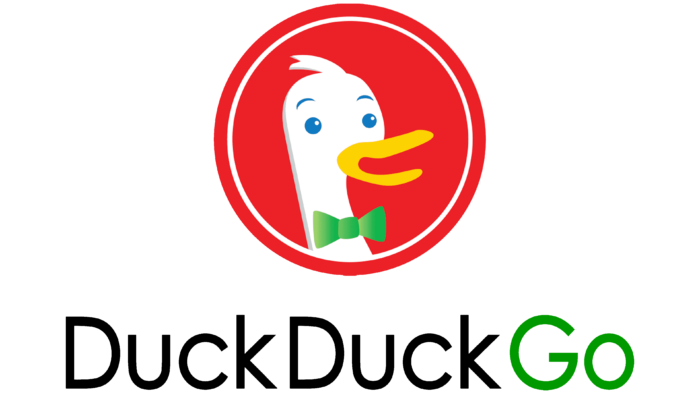
Two years after the launch of the original version, it was decided to simplify the search engine logo somewhat. It became somewhat smaller because the inscription was located under the image of the goose and not to the left of it. The emblem remains unchanged, except for adding a white outline, which makes it more modern than the previous version. At the same time, the verbal inscription was now made out in a single style. A classic sans-serif and rounded font were used. “DuckDuck” consisted of black, while green was used for “Go.”

2012 – 2014

DuckDuckGo Logo 2012

The changes made in 2012 were minimal; therefore, not every search engine user noticed the update. The emblem has become brighter compared to the previous version. The style of the word inscription remained identical. At the same time, the color of “DuckDuck” was changed from black to dark gray, and for “Go,” a brighter shade of green was used.

2014 – 2023

DuckDuckGo Logo 2014

At this stage, minimal changes were also made to the logo. First, the frame’s color became brighter, closer to orange. The white contour thickened, indicating the project’s completion and high quality. In turn, the verbal inscription consisted exclusively of gray; the changes occurred in the “Go” element.

2023 – today

DuckDuckGo Logo

The new DuckDuckGo logo has retained its signature style but undergone small changes, making it slightly more modern and softer. The main emblem— a duck in a green bow tie—remains, but its appearance is now more rounded and friendly. These are small but noticeable details: the duck’s head now looks a bit smoother, as does its beak. The beak now appears to be “speaking,” giving the impression that the duck engages in conversation, conveying the idea of friendliness and ease of use.

Another important change is the color. The background of the symbol and the duck itself have lost some contrast, becoming lighter and softer. The orange background color is less aggressive, suggesting that the brand is trying to make the logo more calm and pleasant to the eye. This underscores the core philosophy of the search engine—to be accessible and considerate to its users.

The emblem’s font has received slight modifications. While the text used to be dark gray, it is now closer to black, making it clearer and more contrasting. This has added more confidence to the visual mark while maintaining its softness through the rounded shapes of the letters. The font perfectly conveys openness and accessibility while keeping it simple and easy to understand.

The duck’s bow tie has become slightly more rounded with shadows, complementing the overall style and making the character even more friendly. Rounded eyebrows add a bit of innocence and goodwill to the image.

DuckDuckGo has always positioned itself as an alternative to major search engines, focusing on user privacy. This new logo reflects the brand’s attempt to make its offering even more accessible and friendly to a broader audience.

Font and Colors

DuckDuckGo Emblem

A classic sans serif font was used to create the logo at all stages of the DuckDuckGo search engine. As a rule, it was not bold or italic, adding credibility to the platform in the eyes of potential customers.

DuckDuckGo Symbol

The logo’s color palette contained many shades, including white, gray, black, yellow, red, and green. Thus, the platform indicated its versatility, that is, the ability to provide an answer to any question. The key element, namely the search engine logo, would not be so memorable if it were not for the white goose on a red background. With each new stage in the platform’s history, the colors became brighter, indicating the resource’s friendliness to the target audience.